- Making Power Point Slides

Содержание
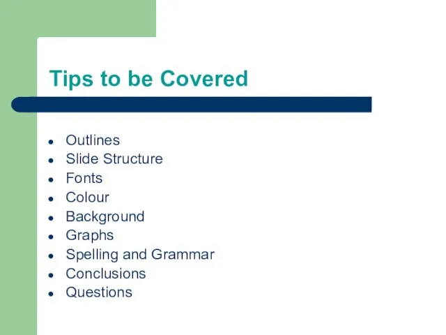
- 2. Tips to be Covered Outlines Slide Structure Fonts Colour Background Graphs Spelling and Grammar Conclusions Questions
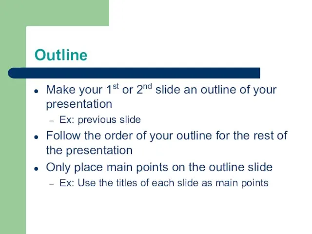
- 3. Outline Make your 1st or 2nd slide an outline of your presentation Ex: previous slide Follow
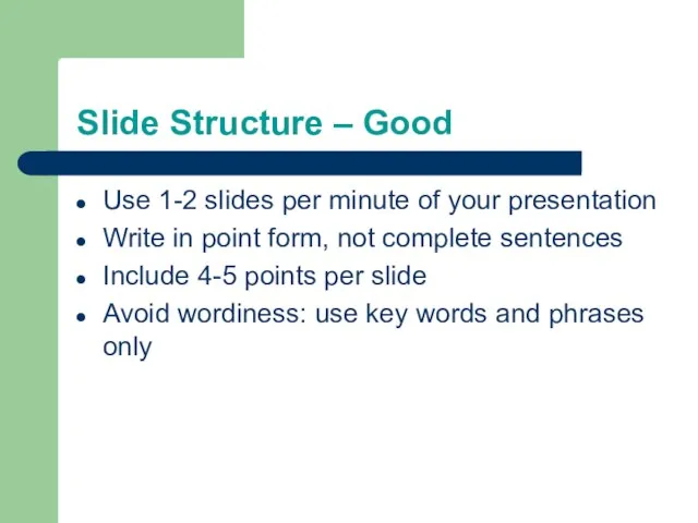
- 4. Slide Structure – Good Use 1-2 slides per minute of your presentation Write in point form,
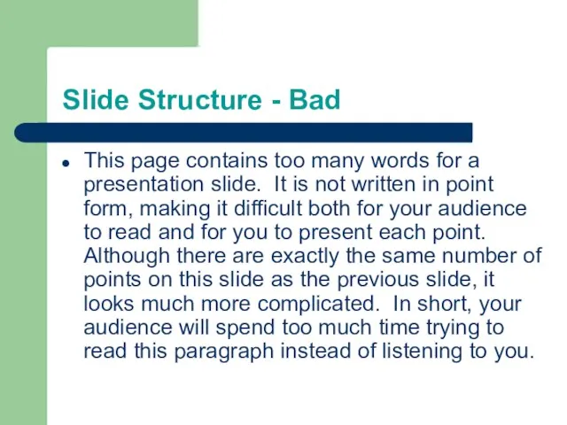
- 5. Slide Structure - Bad This page contains too many words for a presentation slide. It is
- 6. Slide Structure – Good Show one point at a time: Will help audience concentrate on what
- 7. Slide Structure - Bad Do not use distracting animation Do not go overboard with the animation
- 8. Fonts - Good Use at least an 18-point font Use different size fonts for main points
- 9. Fonts - Bad If you use a small font, your audience won’t be able to read
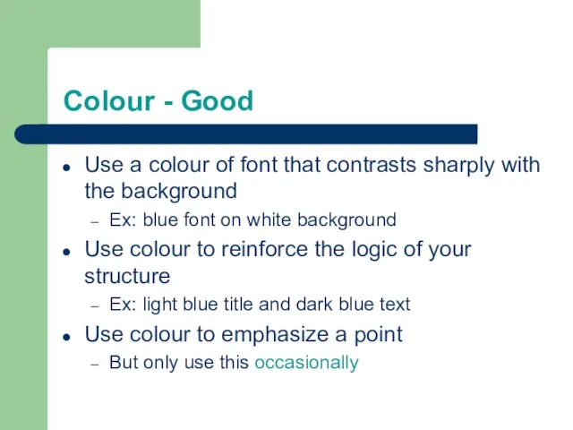
- 10. Colour - Good Use a colour of font that contrasts sharply with the background Ex: blue
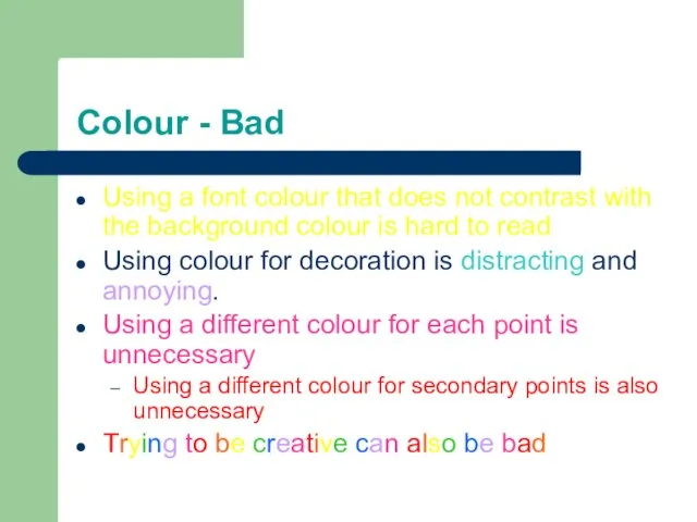
- 11. Colour - Bad Using a font colour that does not contrast with the background colour is
- 12. Background - Good Use backgrounds such as this one that are attractive but simple Use backgrounds
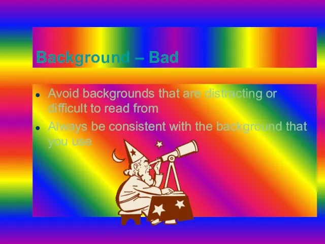
- 13. Background – Bad Avoid backgrounds that are distracting or difficult to read from Always be consistent
- 14. Graphs - Good Use graphs rather than just charts and words Data in graphs is easier
- 15. Graphs - Bad
- 16. Graphs - Good
- 17. Graphs - Bad
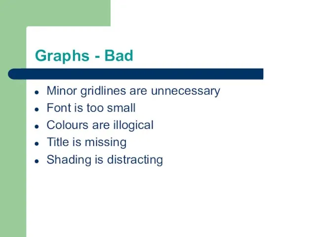
- 18. Graphs - Bad Minor gridlines are unnecessary Font is too small Colours are illogical Title is
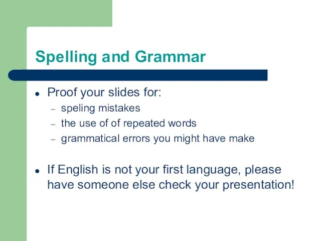
- 19. Spelling and Grammar Proof your slides for: speling mistakes the use of of repeated words grammatical
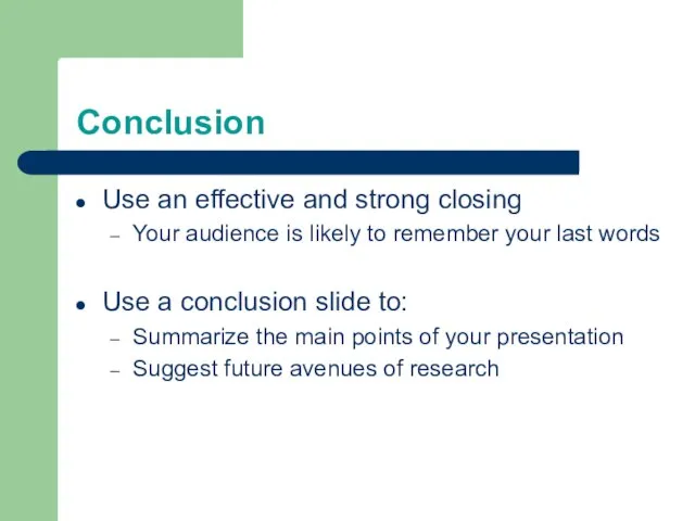
- 20. Conclusion Use an effective and strong closing Your audience is likely to remember your last words
- 22. Скачать презентацию
Слайд 2Tips to be Covered
Outlines
Slide Structure
Fonts
Colour
Background
Graphs
Spelling and Grammar
Conclusions
Questions
Tips to be Covered
Outlines
Slide Structure
Fonts
Colour
Background
Graphs
Spelling and Grammar
Conclusions
Questions
Слайд 3Outline
Make your 1st or 2nd slide an outline of your presentation
Ex: previous
Outline
Make your 1st or 2nd slide an outline of your presentation
Ex: previous
Слайд 4Slide Structure – Good
Use 1-2 slides per minute of your presentation
Write in
Slide Structure – Good
Use 1-2 slides per minute of your presentation
Write in
Слайд 5Slide Structure - Bad
This page contains too many words for a presentation
Slide Structure - Bad
This page contains too many words for a presentation
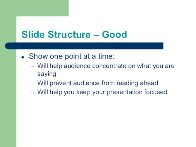
Слайд 6Slide Structure – Good
Show one point at a time:
Will help audience concentrate
Slide Structure – Good
Show one point at a time:
Will help audience concentrate
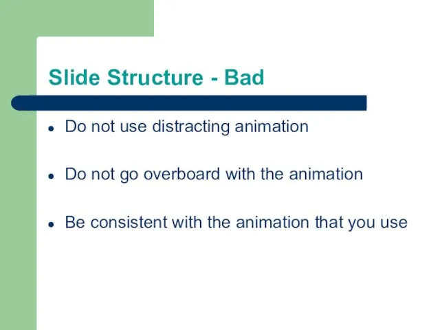
Слайд 7Slide Structure - Bad
Do not use distracting animation
Do not go overboard with
Slide Structure - Bad
Do not use distracting animation
Do not go overboard with
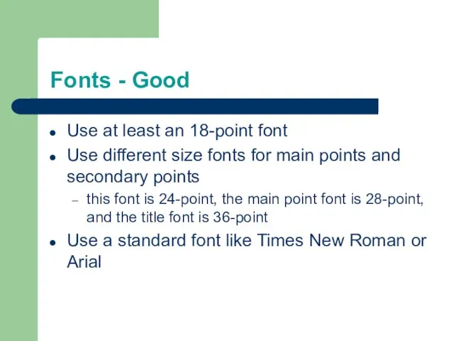
Слайд 8Fonts - Good
Use at least an 18-point font
Use different size fonts for
Fonts - Good
Use at least an 18-point font
Use different size fonts for
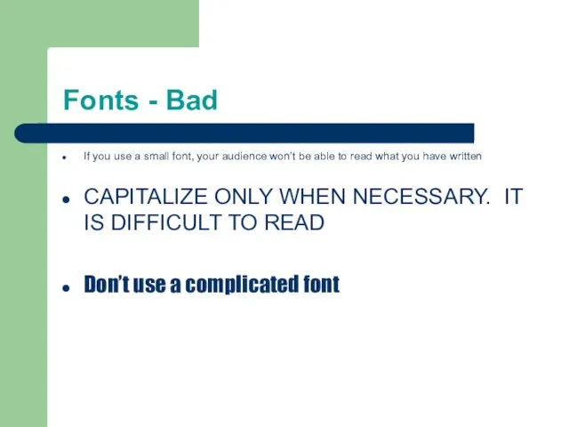
Слайд 9Fonts - Bad
If you use a small font, your audience won’t be
Fonts - Bad
If you use a small font, your audience won’t be
Слайд 10Colour - Good
Use a colour of font that contrasts sharply with the
Colour - Good
Use a colour of font that contrasts sharply with the
Слайд 11Colour - Bad
Using a font colour that does not contrast with the
Colour - Bad
Using a font colour that does not contrast with the
Слайд 12Background - Good
Use backgrounds such as this one that are attractive but
Background - Good
Use backgrounds such as this one that are attractive but
Слайд 13Background – Bad
Avoid backgrounds that are distracting or difficult to read from
Always
Background – Bad
Avoid backgrounds that are distracting or difficult to read from
Always
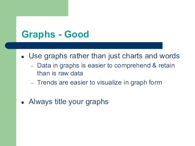
Слайд 14Graphs - Good
Use graphs rather than just charts and words
Data in graphs
Graphs - Good
Use graphs rather than just charts and words
Data in graphs
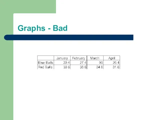
Слайд 15Graphs - Bad
Graphs - Bad
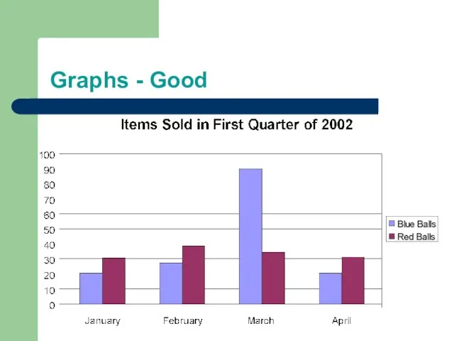
Слайд 16Graphs - Good
Graphs - Good
Слайд 17Graphs - Bad
Graphs - Bad
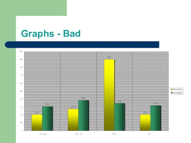
Слайд 18Graphs - Bad
Minor gridlines are unnecessary
Font is too small
Colours are illogical
Title is
Graphs - Bad
Minor gridlines are unnecessary
Font is too small
Colours are illogical
Title is
Слайд 19Spelling and Grammar
Proof your slides for:
speling mistakes
the use of of repeated words
grammatical
Spelling and Grammar
Proof your slides for:
speling mistakes
the use of of repeated words
grammatical
Слайд 20Conclusion
Use an effective and strong closing
Your audience is likely to remember your
Conclusion
Use an effective and strong closing
Your audience is likely to remember your
 ШИНЫ РАСШИРЕНИЯ Шина AGP
 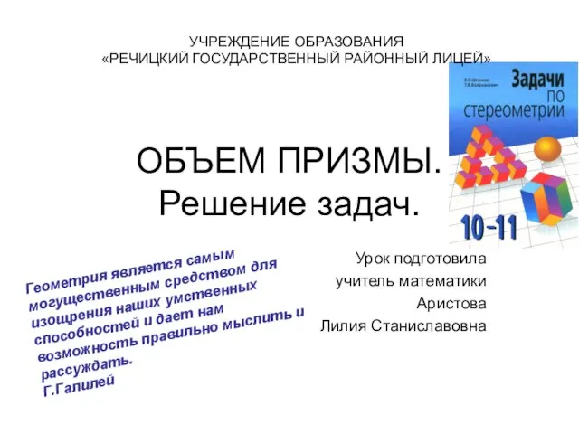 ОБЪЕМ ПРИЗМЫ.Решение задач.
 Дефекты штукатурных работ. Приемы устранения дефектов
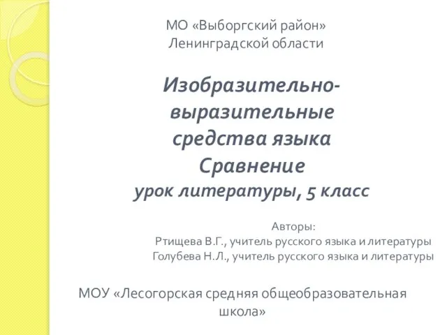 Изобразительно- выразительные средства языка Сравнение урок литературы, 5 класс
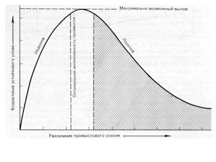 Рыболовство. Вылов тихоокеанской сардины
 Системы на программируемых кристаллах (SOPC)
 Оқушының сұрағына ынтыландыра жауап беру
 Диофантовы уравнения
 Основы академической работы(http://kursakadrab.narod.ru/)
 Концептуальный подход к созданию воспитательной системы 7 г класса «Становление личности в средней школе»
 Красногвардейский район Учитель биологии Питькова З.И. МОУ Калиновская СОШ с. Калиново-2010
 Международное авторское право. Тесты
 الواجب (1)
 Презентация на тему Модель McKinsey 7S
  Зарплатный проект
 Глагол (4 класс)
 Пушкин в Михайловском
 На севере Европы
 How Do I know the Bible?
 Презентация на тему Электроэнергетика России
 Сочинение по картине В.А.Васнецова «Три богатыря»
 Пенал
Пенал Источники и структура нормативно-правового регулирования образовательной деятельности. Тема 2
 Семинар- практикум: «Информационная компетентность учителя – одно из условий эффективности современного урока»
 Формирование уУД в начальной школе
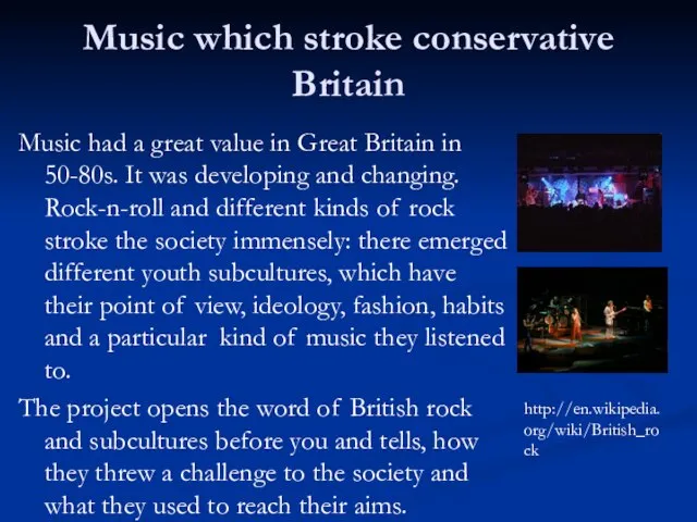 Music which stroke conservative Britain
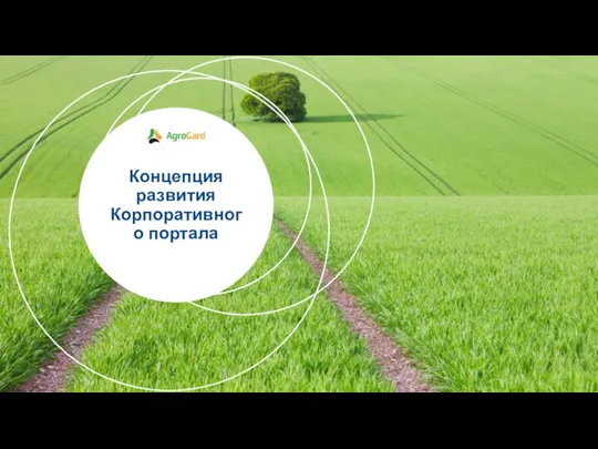 Концепция развития Корпоративного портала
 Организация хранения документов