 Slaidy.com
- 7. Bloklar 2

Содержание
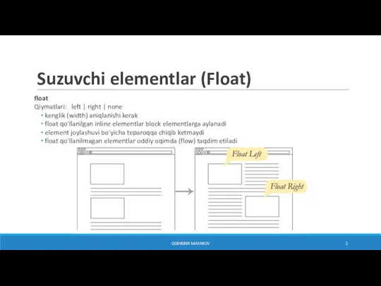
- 2. Suzuvchi elementlar (Float) float Qiymatlari: left | right | none kenglik (width) aniqlanishi kerak float qo'llanilgan
- 3. Suzuvchi elementlar (Float) p { border: 2px red solid; } #float { float: left; width: 300px;
- 4. Suzuvchi elementlarni tozalash clear (faqatgina blokli elementlarga qo'llaniladi) Qiymatlari: left | right | both | none
- 5. Bir nechta suzuvchi elementlar [PARAGRAPH 1] [P2]… [P3]… [P4]… [P5]… [P6]… [P7]… [P8]… [P9]… [P10]… ...
- 6. Bir nechta suzuvchi elementlar Lorem ipsum dolor! ... #header { background: #f2f5d5; border: 2px dashed green;
- 7. Bir nechta suzuvchi elementlar Lorem ipsum dolor! ... #header { ... } #header>div { ... }
- 8. Joylashuv position Qiymatlari: static | relative | absolute | fixed | sticky top, right, bottom, left
- 9. Nisbiy joylashuv (relative) em { position: relative; top: 2em; left: 3em; background-color: fuchsia; } QODIRBEK MAXAROV
- 10. Absolyut joylashuv (absolute) em { position: absolute; top: 2em; left: 3em; background-color: fuchsia; } * Absolyut
- 11. Absolyut joylashuv (absolute) p { position: relative; padding: 15px; background-color: #F2F5D5; border: 2px solid purple; }
- 12. Absolyut joylashuv (absolute) em { width: 200px; margin: 25px; position: absolute; top: 2em; left: 3em; background-color:
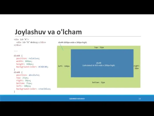
- 13. Joylashuv va o'lcham ... div#A { position: relative; width: 600px; height: 300px; background-color: #C6DE89; }
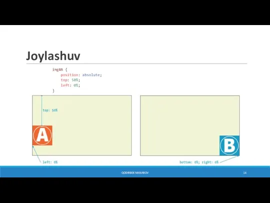
- 14. Joylashuv img#A { position: absolute; top: 50%; left: 0%; } img#B { position: absolute; bottom: 0%;
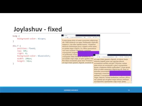
- 15. Joylashuv - fixed body { background-color: bisque; } div.f { position: fixed; top: 50%; right: 0;
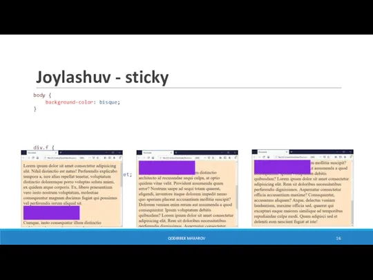
- 16. Joylashuv - sticky body { background-color: bisque; } div.f { position: sticky; top: 0; right: 0;
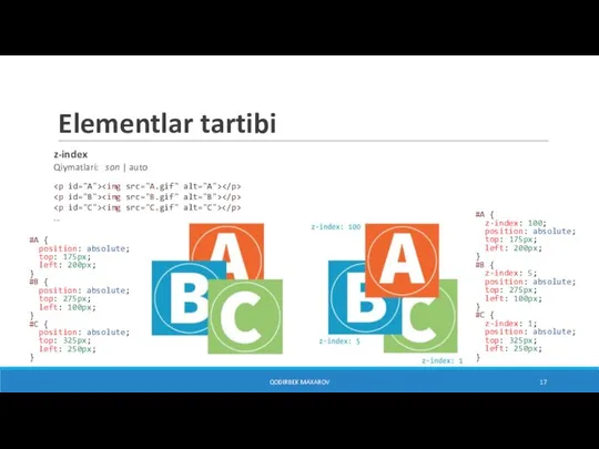
- 17. Elementlar tartibi z-index Qiymatlari: son | auto ... QODIRBEK MAXAROV #A { position: absolute; top: 175px;
- 18. Soya box-shadow Qiymatlari: none | h-offset v-offset [blur] [spread] [color] [inset]; .a1 { box-shadow: 6px 6px
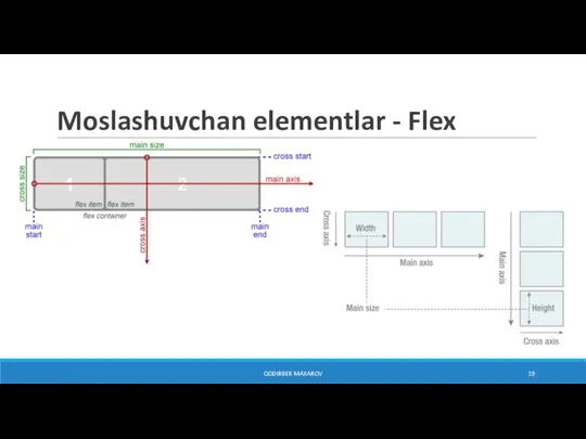
- 19. Moslashuvchan elementlar - Flex QODIRBEK MAXAROV
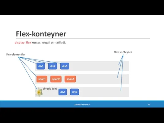
- 20. Flex-konteyner display: flex xossasi orqali o'rnatiladi. QODIRBEK MAXAROV flex-konteyner flex-elementlar
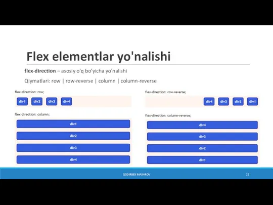
- 21. Flex elementlar yo'nalishi flex-direction – asosiy o'q bo'yicha yo'nalishi Qiymatlari: row | row-reverse | column |
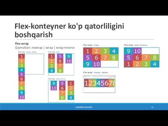
- 22. Flex-konteyner ko'p qatorliligini boshqarish QODIRBEK MAXAROV flex-wrap Qiymatlari: nowrap | wrap | wrap-reverse
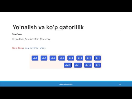
- 23. Yo'nalish va ko'p qatorlilik QODIRBEK MAXAROV flex-flow Qiymatlari: flex-direction flex-wrap flex-flow: row-reverse wrap;
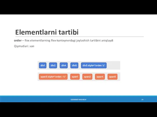
- 24. Elementlarni tartibi QODIRBEK MAXAROV order – flex elementlarning flex-konteynerdagi joylashish tartibini aniqlaydi Qiymatlari: son
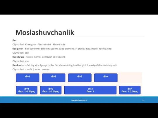
- 25. Moslashuvchanlik QODIRBEK MAXAROV flex Qiymatlari: flex-grow flex-shrink flex-basis flex-grow – flex konteyner bo'sh maydonni avlod elementlari
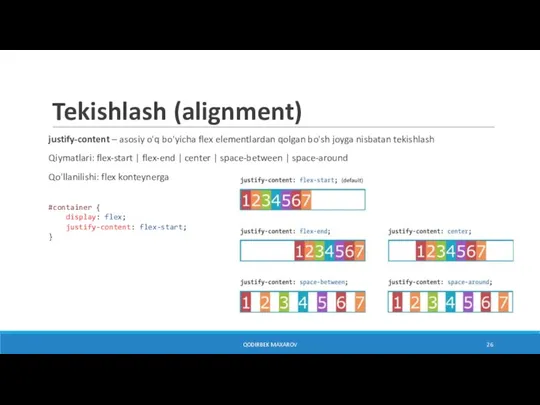
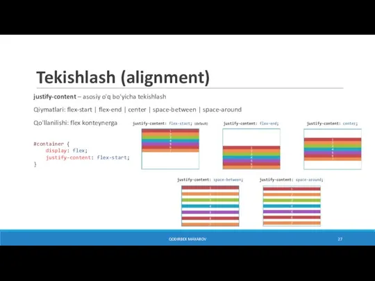
- 26. Tekishlash (alignment) QODIRBEK MAXAROV justify-content – asosiy o'q bo'yicha flex elementlardan qolgan bo'sh joyga nisbatan tekishlash
- 27. Tekishlash (alignment) QODIRBEK MAXAROV justify-content – asosiy o'q bo'yicha tekishlash Qiymatlari: flex-start | flex-end | center
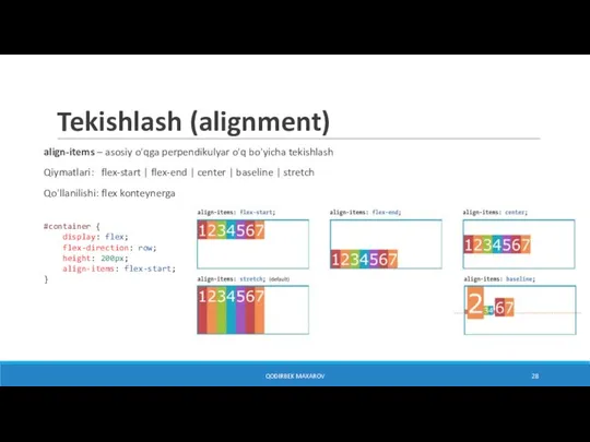
- 28. Tekishlash (alignment) QODIRBEK MAXAROV align-items – asosiy o'qga perpendikulyar o'q bo'yicha tekishlash Qiymatlari: flex-start | flex-end
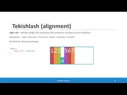
- 29. Tekishlash (alignment) QODIRBEK MAXAROV align-self – alohida olingan flex elementni flex konteyner uzunligi bo'yicha tekishlash Qiymatlari:
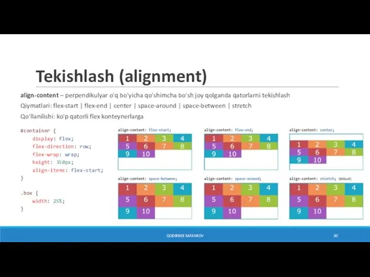
- 30. Tekishlash (alignment) QODIRBEK MAXAROV align-content – perpendikulyar o'q bo'yicha qo'shimcha bo'sh joy qolganda qatorlarni tekishlash Qiymatlari:
- 32. Скачать презентацию
Слайд 2Suzuvchi elementlar (Float)
float
Qiymatlari: left | right | none
kenglik (width) aniqlanishi kerak
float
Suzuvchi elementlar (Float)
float
Qiymatlari: left | right | none
kenglik (width) aniqlanishi kerak
float
Слайд 3Suzuvchi elementlar (Float)
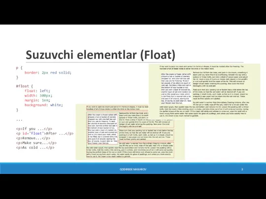
p {
border: 2px red solid;
}
#float {
float: left;
width: 300px;
margin: 1em;
background: white;
}
...
If you ...
After ...
Remove...
Make sure...
As cold ...
QODIRBEK MAXAROV
Suzuvchi elementlar (Float)
p {
border: 2px red solid;
}
#float {
float: left;
width: 300px;
margin: 1em;
background: white;
}
...
If you ...
Remove...
Make sure...
As cold ...
QODIRBEK MAXAROV
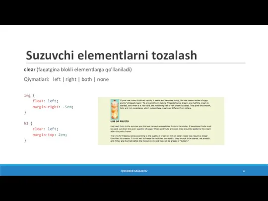
Слайд 4Suzuvchi elementlarni tozalash
clear (faqatgina blokli elementlarga qo'llaniladi)
Qiymatlari: left | right | both
Suzuvchi elementlarni tozalash
clear (faqatgina blokli elementlarga qo'llaniladi)
Qiymatlari: left | right | both
Слайд 5Bir nechta suzuvchi elementlar
[PARAGRAPH 1]
[P2]…
[P3]…
[P4]…
[P5]…
[P6]…
[P7]…
[P8]…
[P9]…
[P10]…
...
p.float {
float: left;
width: 200px;
margin: 0px;
background: #F2F5d5;
color: #DAEAB1;
}
QODIRBEK MAXAROV
Elementlar bir qatorda chap tomondan joylashgan
Ammo joy yetarli
Bir nechta suzuvchi elementlar
[PARAGRAPH 1]
[P6]…
[P7]…
[P8]…
[P9]…
[P10]…
...
p.float {
float: left;
width: 200px;
margin: 0px;
background: #F2F5d5;
color: #DAEAB1;
}
QODIRBEK MAXAROV
Elementlar bir qatorda chap tomondan joylashgan
Ammo joy yetarli
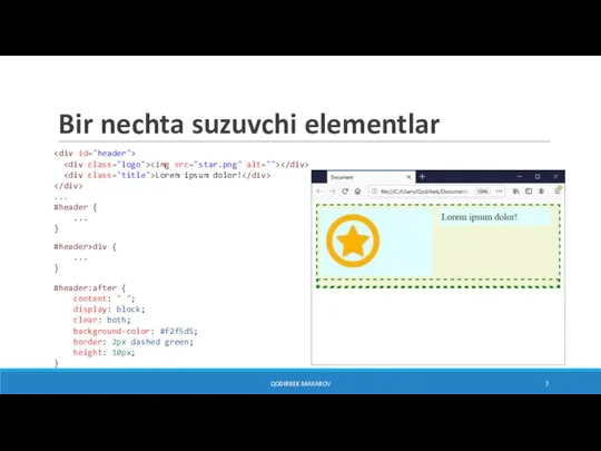
![Bir nechta suzuvchi elementlar [PARAGRAPH 1] [P2]… [P3]… [P4]… [P5]… [P6]… [P7]…](/_ipx/f_webp&q_80&fit_contain&s_1440x1080/imagesDir/jpg/1175083/slide-4.jpg)
...
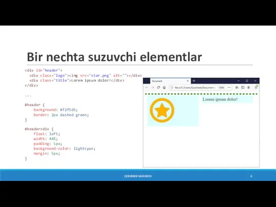
#header {
background: #f2f5d5;
border: 2px dashed green;
}
#header>div {
float: left;
width: 44%;
padding: 5px;
background-color: lightcyan;
margin: 5px;
}
QODIRBEK MAXAROV
...
#header {
...
}
#header>div {
...
}
#header:after {
content: " ";
display: block;
clear: both;
background-color: #f2f5d5;
border: 2px dashed green;
height: 10px;
}
QODIRBEK MAXAROV
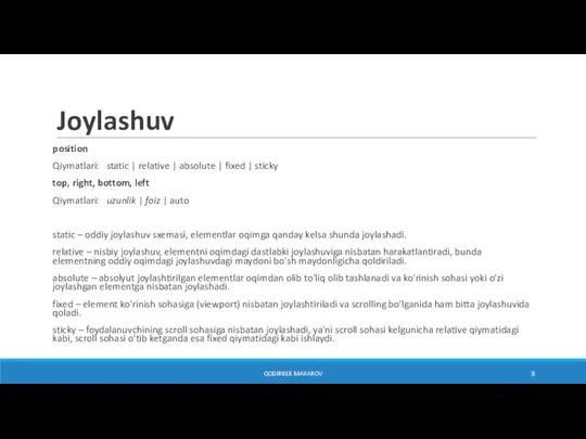
Слайд 8Joylashuv
position
Qiymatlari: static | relative | absolute | fixed | sticky
top, right, bottom,
Joylashuv
position
Qiymatlari: static | relative | absolute | fixed | sticky
top, right, bottom,
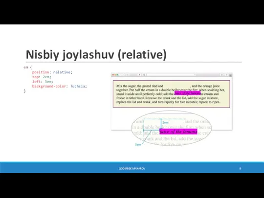
Слайд 9Nisbiy joylashuv (relative)
em {
position: relative;
top: 2em;
left: 3em;
background-color: fuchsia;
}
QODIRBEK MAXAROV
Nisbiy joylashuv (relative)
em {
position: relative;
top: 2em;
left: 3em;
background-color: fuchsia;
}
QODIRBEK MAXAROV
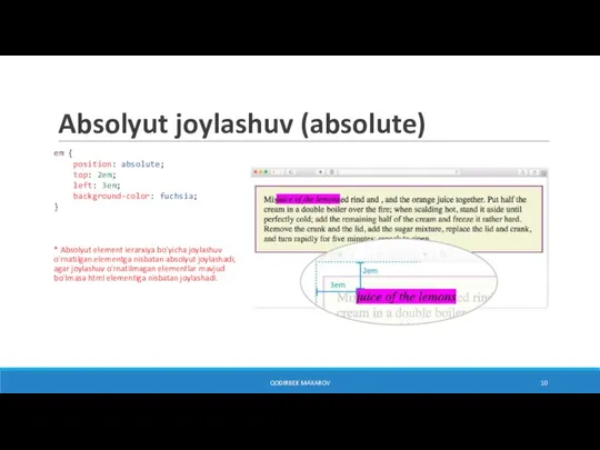
Слайд 10Absolyut joylashuv (absolute)
em {
position: absolute;
top: 2em;
left: 3em;
background-color: fuchsia;
}
* Absolyut element ierarxiya bo'yicha joylashuv o'rnatilgan elementga nisbatan absolyut
Absolyut joylashuv (absolute)
em {
position: absolute;
top: 2em;
left: 3em;
background-color: fuchsia;
}
* Absolyut element ierarxiya bo'yicha joylashuv o'rnatilgan elementga nisbatan absolyut
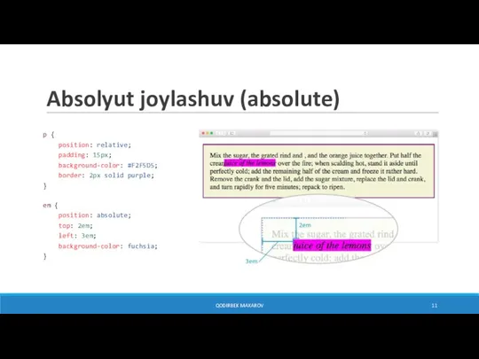
Слайд 11Absolyut joylashuv (absolute)
p {
position: relative;
padding: 15px;
background-color: #F2F5D5;
border: 2px solid purple;
}
em {
position: absolute;
top: 2em;
left: 3em;
background-color: fuchsia;
}
QODIRBEK MAXAROV
Absolyut joylashuv (absolute)
p {
position: relative;
padding: 15px;
background-color: #F2F5D5;
border: 2px solid purple;
}
em {
position: absolute;
top: 2em;
left: 3em;
background-color: fuchsia;
}
QODIRBEK MAXAROV
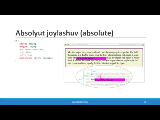
Слайд 12Absolyut joylashuv (absolute)
em {
width: 200px;
margin: 25px;
position: absolute;
top: 2em;
left: 3em;
background-color: fuchsia;
}
QODIRBEK MAXAROV
Absolyut joylashuv (absolute)
em {
width: 200px;
margin: 25px;
position: absolute;
top: 2em;
left: 3em;
background-color: fuchsia;
}
QODIRBEK MAXAROV
![Soya box-shadow Qiymatlari: none | h-offset v-offset [blur] [spread] [color] [inset]; .a1](/_ipx/f_webp&q_80&fit_contain&s_1440x1080/imagesDir/jpg/1175083/slide-17.jpg)
 Бухгалтерия ОАО Махачкалинский мясокомбинат
 Методы стандартизации
 Нанесение размеров
 Презентация "Русская икона Художественный язык: канон и стиль" - скачать презентации по МХК
 Завоевание Римом Италии 5 класс
 Наука в современном обществе
 Арт-студия Дионис. Мы не пьем вино, мы делаем праздники!
 Комплекс программных средств сбора данных электронных копий деклараций на товары
 DPD (2)
 Техника эстафетного бега: прием - передача эстафетной палочки
 Урок - исследование
 Рабле Франсуа
 МУЛЬТИЛИД
 Презентация на тему Центральная Россия 9 класс
 Рождённым в 1977-78 гг. Прогноз
 Дорожная карта. Твой план дальнейших действий
 Движение и его относительность
 Биография Бориса Николаевича Ельцина
 Презентация к уроку “MY DAY”
 «Психологический климат в семье как основа формирования личности ребенка»( родительское собрание)
 Введение. Историческое познание сегодня 10 класс
 Отчет Студенческого совета ИУЭиЮ о проведенных мероприятиях за 2019-2020 гг
 Виды тепловой обработки домашней птицы (на примере перепела)
 Добро пожаловать
 Доказательный подход к управлению социальными проектами и программами
 Тренировка. Упражнения на статику
 Значение физической культуры и спорта в жизни человека
 Услуга«УВЕРЕННЫЙ ПРИЕМ»