- Title Slide. Adobe Systems Incorporated

Содержание
- 2. White Content Slide – Graphic Footer & Header Use this layout for content that looks best
- 3. White Content Slide – Graphic Footer Use this layout for content that looks best on white.
- 4. White Content Slide – No Graphic Use this layout for content that looks best on white.
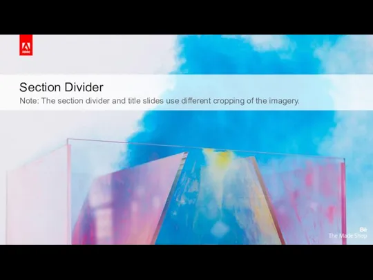
- 5. Section Divider Note: The section divider and title slides use different cropping of the imagery.
- 6. Gray Content Slide – Graphic Footer & Header Use this layout for content that looks best
- 7. Gray Content Slide – Graphic Footer Use this layout for content that looks best on gray.
- 8. Gray Content Slide – No Graphic Use this layout for content that looks best on gray.
- 11. Скачать презентацию
Слайд 3White Content Slide – Graphic Footer
Use this layout for content that looks
White Content Slide – Graphic Footer
Use this layout for content that looks
Слайд 4White Content Slide – No Graphic
Use this layout for content that looks
White Content Slide – No Graphic
Use this layout for content that looks
Слайд 5Section Divider
Note: The section divider and title slides use different cropping of
Section Divider
Note: The section divider and title slides use different cropping of
Слайд 6Gray Content Slide – Graphic Footer & Header
Use this layout for content
Gray Content Slide – Graphic Footer & Header
Use this layout for content
Слайд 7Gray Content Slide – Graphic Footer
Use this layout for content that looks
Gray Content Slide – Graphic Footer
Use this layout for content that looks
Слайд 8Gray Content Slide – No Graphic
Use this layout for content that looks
Gray Content Slide – No Graphic
Use this layout for content that looks

 Лекция о научных публикациях
 Помехоустойчивость. Достоверность. Полоса пропускания
 Процедуры и функции. Лабораторная работа
 Материалы курса Система автоматического программирования. Основные принципы & Подводные камни
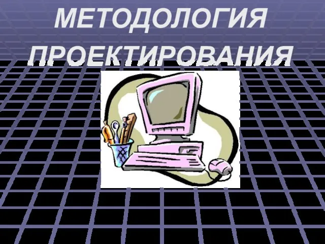 МЕТОДОЛОГИЯ ПРОЕКТИРОВАНИЯ
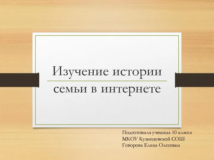 Изучение истории семьи в интернете
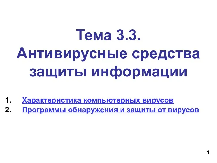 Антивирусная защита. Тема 3.3
 Работа с событиями аплета
 Базовые алгоритмические конструкции. Лекция 5
 Тармаклануны Паскаль телендә программалау
 Презентация на тему История развития ЭВМ
  Инструменты графического редактора костюмов и фонов: растровый и векторный режим
 2022_10_07_AO_i_PO_PK
 Online fine system for drivers
 Основы алгоритмизации и программирования
 Сервис интерактивных упражнений – Wordwall
 Системное программирование (лекция 1)
 Дизайн проектирование (композиция, макетирование, современные концепции в искусстве)
 Загрузка источников из базы данных
 Дискретное представление информации
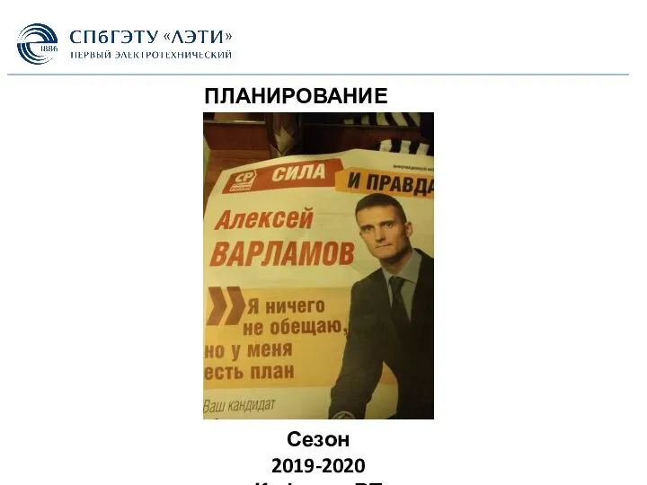 Планирование задач
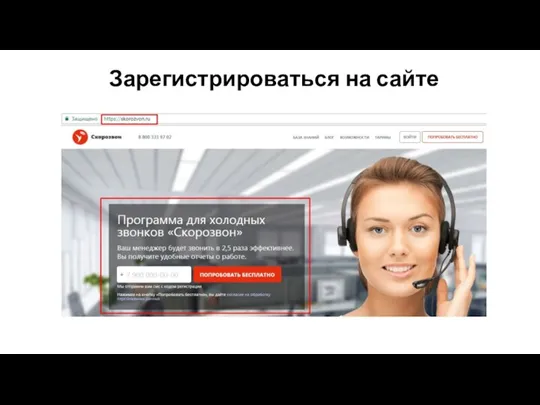 Старт партнерки
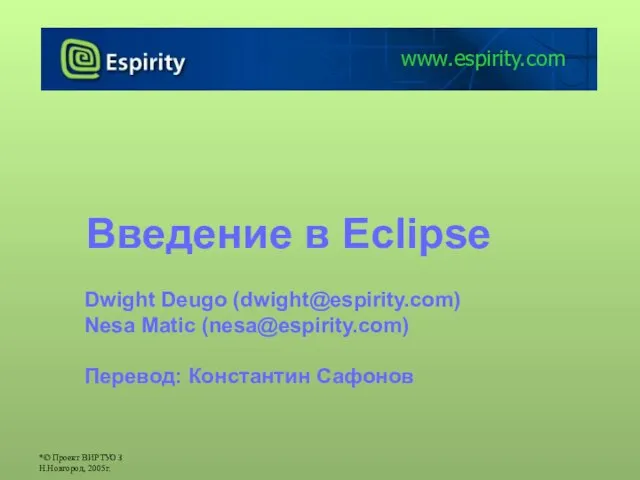 Введение в Eclipse
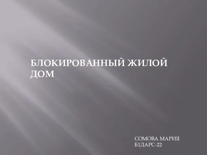 Блокированный жилой дом
 Устройства образующие типовой компьютер
 BazyDannykh_Teoria
 Как попасть в киберспорт
 Модели данных. Современные СУБД (Урок 2)