- Коварные диаграммы

Содержание
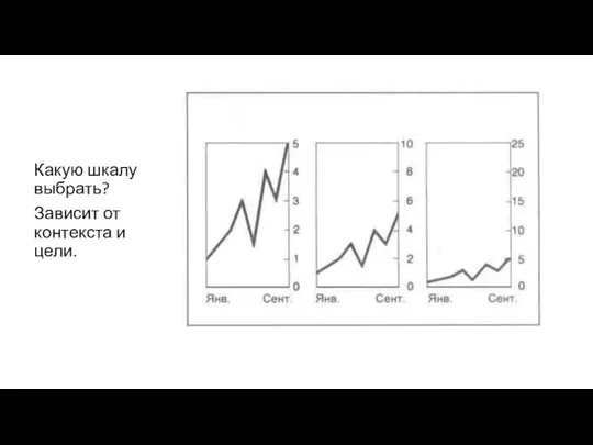
- 8. Какую шкалу выбрать? Зависит от контекста и цели.
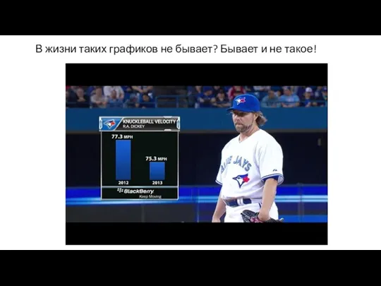
- 9. В жизни таких графиков не бывает? Бывает и не такое!
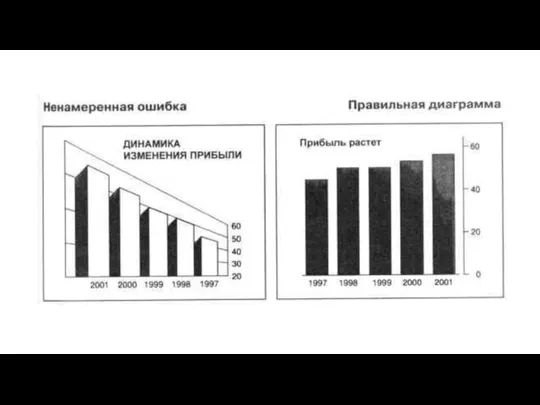
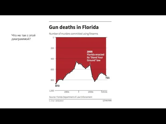
- 11. Что не так с этой диаграммой?
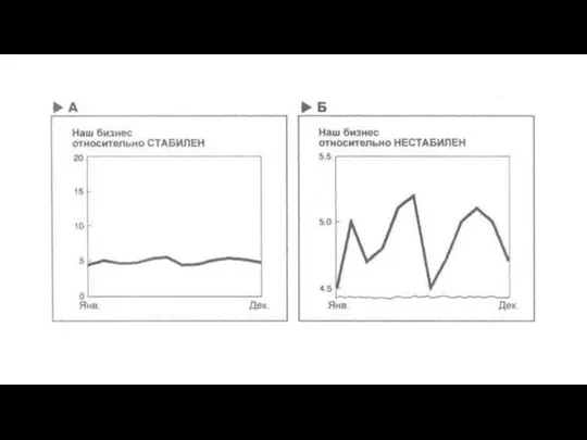
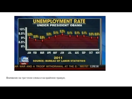
- 12. Внимание на три точки слева и на крайнюю правую.
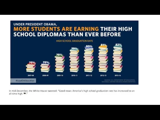
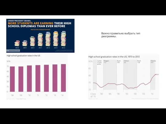
- 13. In mid-December, the White House tweeted: “Good news: America’s high school graduation rate has increased to
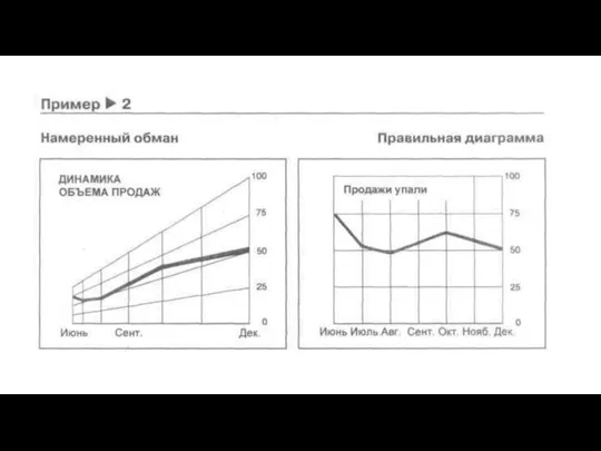
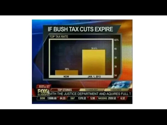
- 14. Важно правильно выбрать тип диаграммы.
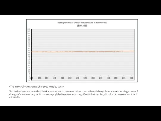
- 15. «The only #climatechange chart you need to see.» This is the chart we should all think
- 16. #NROgraphics
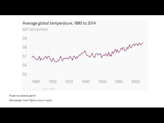
- 17. А как на самом деле? Не всегда стоит брать ось от нуля
- 19. Продажи Burger King в три раза больше продаж Starbucks. Но площади логотипов отличаются в 9 раз!
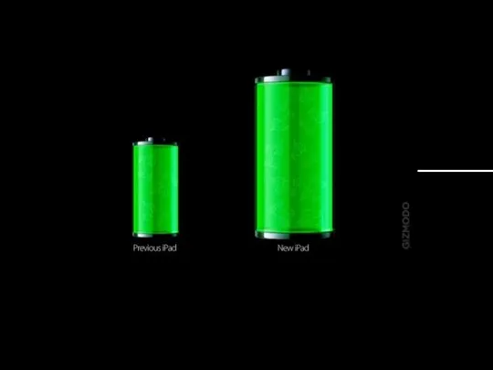
- 20. Gizmodo was trying to demonstrate that the new iPad battery gained 70% in capacity. They did
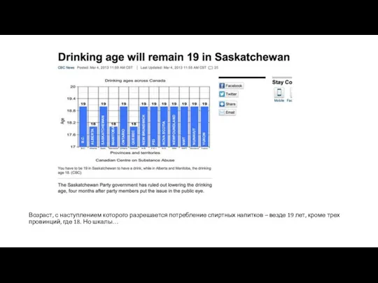
- 21. Возраст, с наступлением которого разрешается потребление спиртных напитков – везде 19 лет, кроме трех провинций, где
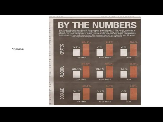
- 22. Чтооооо?
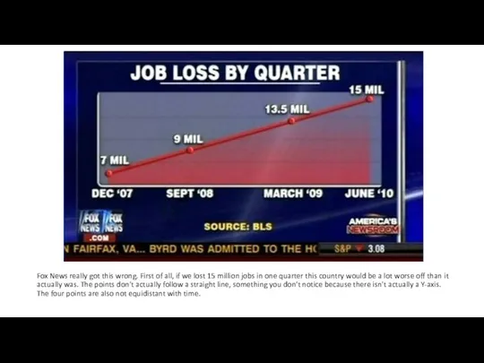
- 23. Fox News really got this wrong. First of all, if we lost 15 million jobs in
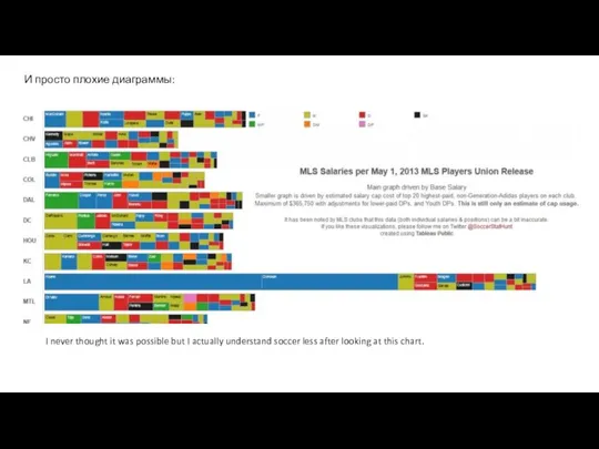
- 24. I never thought it was possible but I actually understand soccer less after looking at this
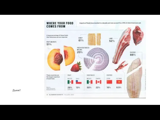
- 25. Дыни?
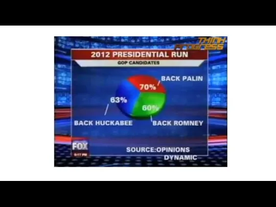
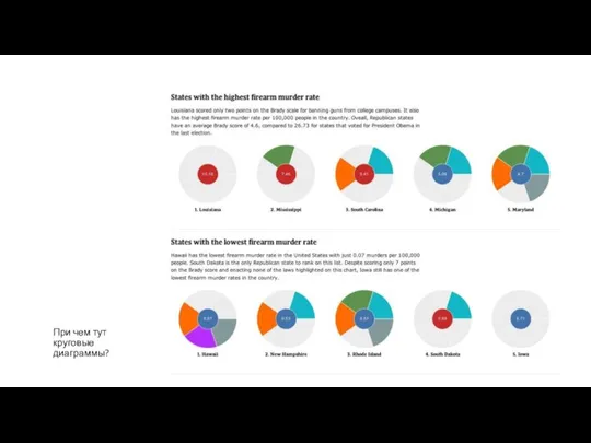
- 26. При чем тут круговые диаграммы?
- 27. DataLiteracy Edward Tufte — the guy who invented the word "chartjunk" — personally held this up
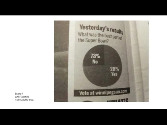
- 28. В этой диаграмме прекрасно все.
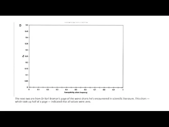
- 29. The next two are from Dr Karl Broman's page of the worst charts he's encountered in
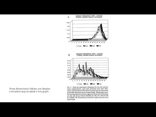
- 30. Three dimensional ribbons are likewise a senseless way to tweak a line graph. Wall Street Journal
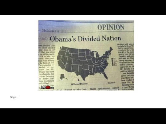
- 31. Oops… Wall Street Journal
- 33. Скачать презентацию
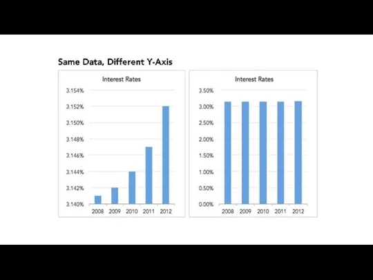
Слайд 8Какую шкалу выбрать?
Зависит от контекста и цели.
Какую шкалу выбрать?
Зависит от контекста и цели.
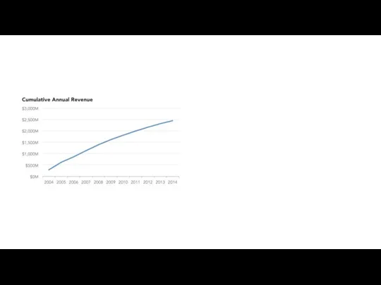
Слайд 9В жизни таких графиков не бывает? Бывает и не такое!
В жизни таких графиков не бывает? Бывает и не такое!
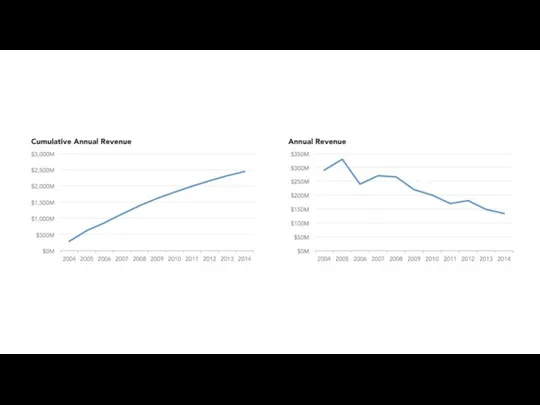
Слайд 11Что не так с этой диаграммой?
Что не так с этой диаграммой?
Слайд 12
Внимание на три точки слева и на крайнюю правую.
Внимание на три точки слева и на крайнюю правую.
Слайд 13In mid-December, the White House tweeted: “Good news: America’s high school graduation
In mid-December, the White House tweeted: “Good news: America’s high school graduation
Слайд 14Важно правильно выбрать тип диаграммы.
Важно правильно выбрать тип диаграммы.
Слайд 15«The only #climatechange chart you need to see.»
This is the chart we
«The only #climatechange chart you need to see.»
This is the chart we
Слайд 16#NROgraphics
#NROgraphics
Слайд 17А как на самом деле?
Не всегда стоит брать ось от нуля
А как на самом деле?
Не всегда стоит брать ось от нуля
Слайд 19Продажи Burger King в три раза больше продаж Starbucks.
Но площади логотипов
Продажи Burger King в три раза больше продаж Starbucks.
Но площади логотипов

Слайд 20Gizmodo was trying to demonstrate that the new iPad battery gained 70%
Gizmodo was trying to demonstrate that the new iPad battery gained 70%
Слайд 21Возраст, с наступлением которого разрешается потребление спиртных напитков – везде 19 лет,
Возраст, с наступлением которого разрешается потребление спиртных напитков – везде 19 лет,
Слайд 22Чтооооо?
Чтооооо?
Слайд 23Fox News really got this wrong. First of all, if we lost
Fox News really got this wrong. First of all, if we lost
Слайд 24I never thought it was possible but I actually understand soccer less
I never thought it was possible but I actually understand soccer less
Слайд 25Дыни?
Дыни?
Слайд 26При чем тут круговые диаграммы?
При чем тут круговые диаграммы?
Слайд 27
DataLiteracy
Edward Tufte — the guy who invented the word "chartjunk"
DataLiteracy
Edward Tufte — the guy who invented the word "chartjunk"

Слайд 28В этой диаграмме прекрасно все.
В этой диаграмме прекрасно все.
Слайд 29The next two are from Dr Karl Broman's page of the worst
The next two are from Dr Karl Broman's page of the worst
Слайд 30Three dimensional ribbons are likewise a senseless way to tweak a line
Three dimensional ribbons are likewise a senseless way to tweak a line
Слайд 31Oops…
Wall Street Journal
Oops…
Wall Street Journal
 Определение безэквивалентной лексики
 Позициониране на Схемата за екомаркировка в държавната политика за устойчив туризъм ДЪРЖАВНА АГЕНЦИЯ ПО ТУРИЗЪМ Десислава Михалкова – Станимирова Гл. експерт в дирекция “Туристическа политика” 20 октомври, 2008 г, гр. София
 Презентация на тему Просто сказочные вопросы
 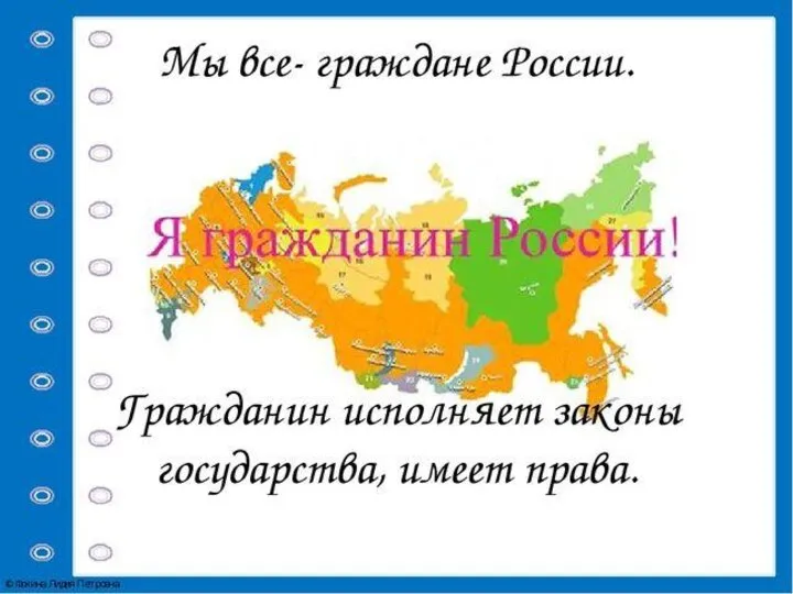 Я Гражданин России
 Же-Ким
 Корпоративный мессенджер для брейнштормов
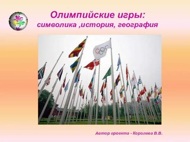 Олимпийские игры: символика ,история, география
 Чичиков – беда или надежда России? Образ Чичикова в поэме Николая Васильевича Гоголя «Мёртвые души»
 Событийные мероприятия
 Трение в нашей жизни
 О повышении эффективности и безопасного использования отраслевого парка исследовательских ядерных установок
 Всероссийский инженерный конкурс. Лесопосадочные машины
 Презентация на тему Значение птиц в природе и жизни человека
 Презентация на тему Экстремумы функции
 Джинсы
 Презентация к методической разработке для спецкурса: «Обратные тригонометрические функции» (10-11 кл.).
 Хороших знаний и отличного настроения!
 Поддержка стандарта OpenGIS в СУБД ЛИНТЕР
 Презентация на тему Транспорт
 Три вида бизнеса, востребованные в г. Кострома
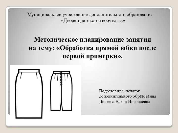 Обработка юбки после первой примерки
 Конкурс среди социально ориентированных некоммерческих организаций на право получения субсидий из бюджета города Екатеринбурга
 Fun Activities (Развлечения)
 Мониторинг направлений актуального профессионального развития научно-педагогических, руководящих кадров, сотрудников ПетрГУ
 КУБА – УКРАЙНА 1990 – 2011
 Презентация на тему Дифракция света
 Родители трудолюбивы и дети не ленивы
 Ліпікар. Очищувальний гель