- Making Power Point Slides

Содержание
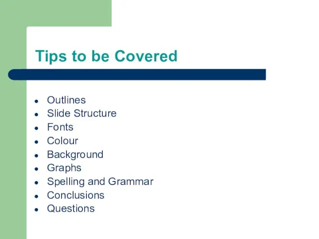
- 2. Tips to be Covered Outlines Slide Structure Fonts Colour Background Graphs Spelling and Grammar Conclusions Questions
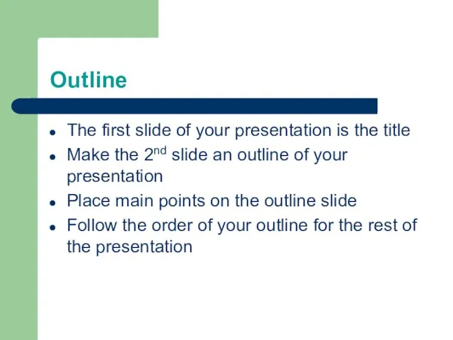
- 3. Outline The first slide of your presentation is the title Make the 2nd slide an outline
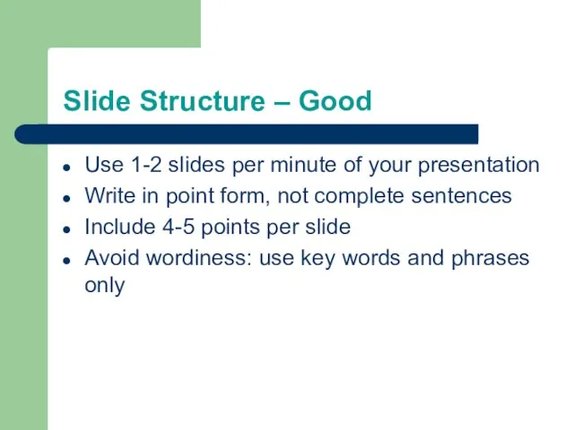
- 4. Slide Structure – Good Use 1-2 slides per minute of your presentation Write in point form,
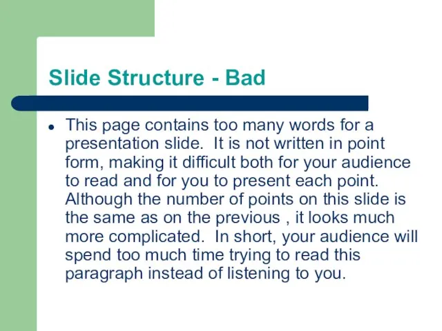
- 5. Slide Structure - Bad This page contains too many words for a presentation slide. It is
- 6. Slide Structure – Good Show one point at a time: Will help audience concentrate on what
- 7. Slide Structure - Bad Do not use distracting animation (ex. falling letters) Do not go overboard
- 8. Fonts - Good Use at least an 18-point font Use different size fonts for main points
- 9. Fonts - Bad If you use a small font, your audience won’t be able to read
- 10. Colour - Good Use a colour of font that contrasts sharply with the background Ex: blue
- 11. Colour - Bad Using a font colour that does not contrast with the background colour is
- 12. The Color Wheel Colors separated by another color are contrasting colors Adjacent colors (next to each
- 13. Clashing Colors Colors that are directly opposite from one another are said to clash. These provide
- 14. Background - Good Use backgrounds that are attractive but simple Use backgrounds which are light Use
- 15. Background – Bad Avoid backgrounds that are distracting or difficult to read from Always be consistent
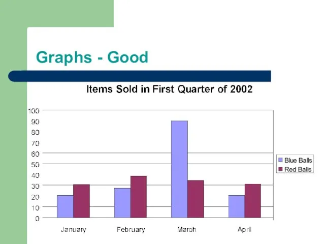
- 16. Graphs - Good Use graphs rather than just charts and words Data in graphs is easier
- 17. Graphs - Bad
- 18. Graphs - Good
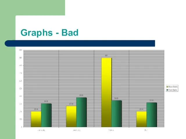
- 19. Graphs - Bad
- 20. Graphs - Bad Minor gridlines are unnecessary Font is too small Colours are illogical Title is
- 21. Spelling and Grammar Proof your slides for: spelling mistakes the use of repeated words grammatical errors
- 22. Conclusion Use an effective and strong closing Your audience is likely to remember your last words
- 23. Questions?? End your presentation with a simple question slide to: Invite your audience to ask questions
- 25. Скачать презентацию
Слайд 2Tips to be Covered
Outlines
Slide Structure
Fonts
Colour
Background
Graphs
Spelling and Grammar
Conclusions
Questions
Tips to be Covered
Outlines
Slide Structure
Fonts
Colour
Background
Graphs
Spelling and Grammar
Conclusions
Questions
Слайд 3Outline
The first slide of your presentation is the title
Make the 2nd slide
Outline
The first slide of your presentation is the title
Make the 2nd slide
Слайд 4Slide Structure – Good
Use 1-2 slides per minute of your presentation
Write in
Slide Structure – Good
Use 1-2 slides per minute of your presentation
Write in
Слайд 5Slide Structure - Bad
This page contains too many words for a presentation
Slide Structure - Bad
This page contains too many words for a presentation
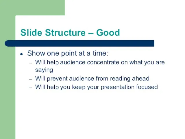
Слайд 6Slide Structure – Good
Show one point at a time:
Will help audience concentrate
Slide Structure – Good
Show one point at a time:
Will help audience concentrate
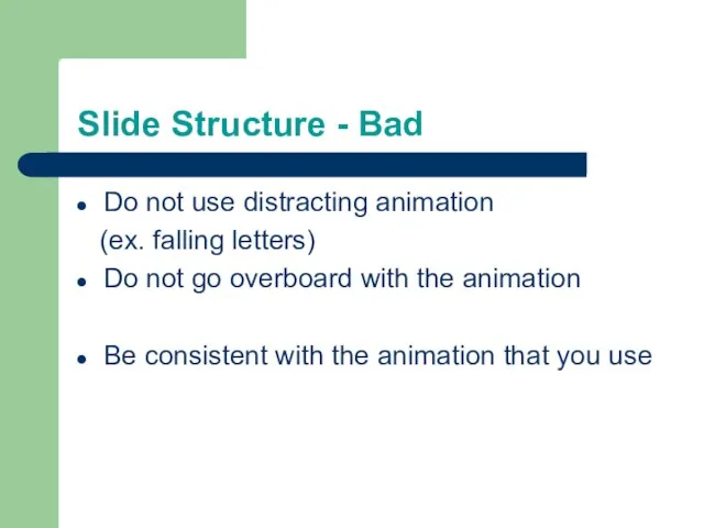
Слайд 7Slide Structure - Bad
Do not use distracting animation
(ex. falling letters)
Do not
Slide Structure - Bad
Do not use distracting animation
(ex. falling letters)
Do not
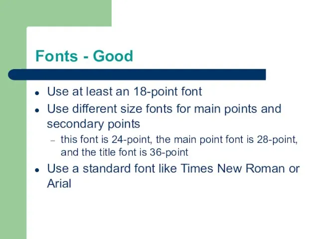
Слайд 8Fonts - Good
Use at least an 18-point font
Use different size fonts for
Fonts - Good
Use at least an 18-point font
Use different size fonts for
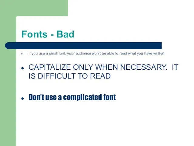
Слайд 9Fonts - Bad
If you use a small font, your audience won’t be
Fonts - Bad
If you use a small font, your audience won’t be
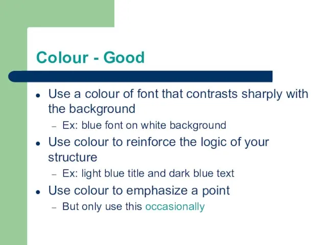
Слайд 10Colour - Good
Use a colour of font that contrasts sharply with the
Colour - Good
Use a colour of font that contrasts sharply with the
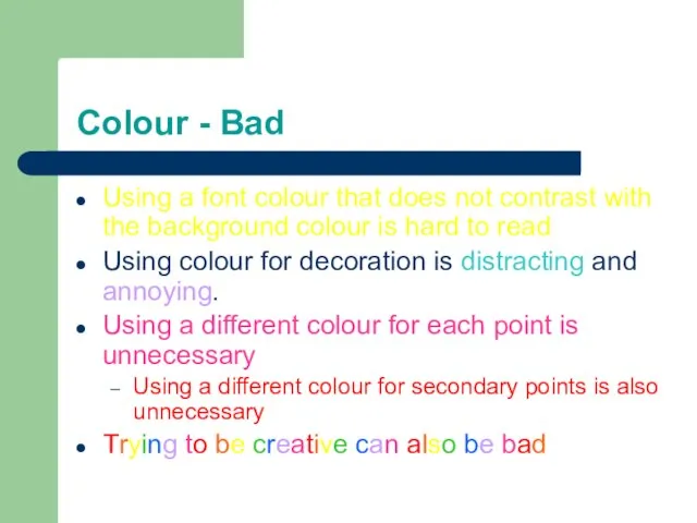
Слайд 11Colour - Bad
Using a font colour that does not contrast with the
Colour - Bad
Using a font colour that does not contrast with the
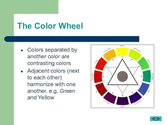
Слайд 12The Color Wheel
Colors separated by another color are contrasting colors
Adjacent colors
The Color Wheel
Colors separated by another color are contrasting colors
Adjacent colors
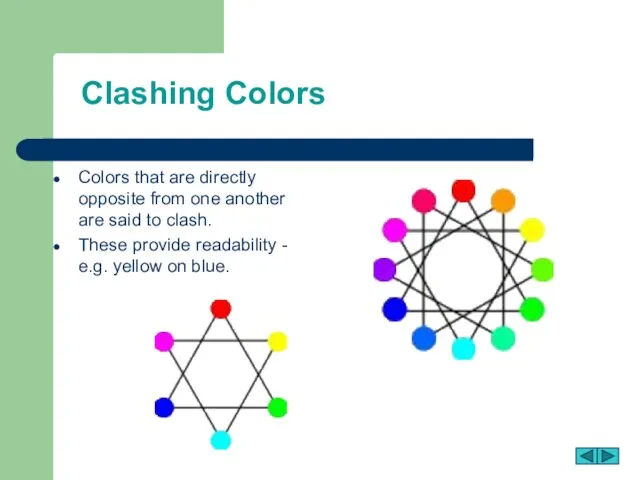
Слайд 13Clashing Colors
Colors that are directly opposite from one another are said to
Clashing Colors
Colors that are directly opposite from one another are said to
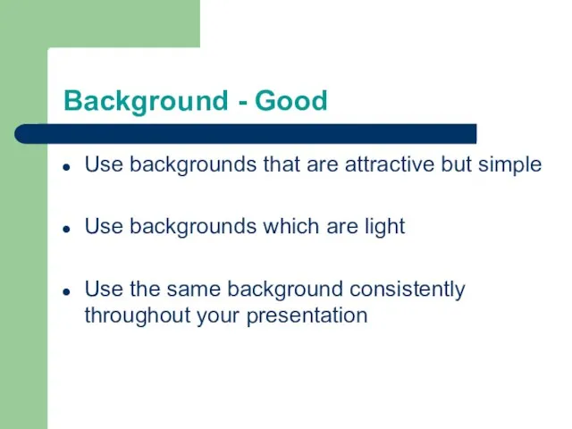
Слайд 14Background - Good
Use backgrounds that are attractive but simple
Use backgrounds which are
Background - Good
Use backgrounds that are attractive but simple
Use backgrounds which are
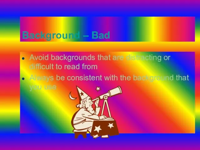
Слайд 15Background – Bad
Avoid backgrounds that are distracting or difficult to read from
Always
Background – Bad
Avoid backgrounds that are distracting or difficult to read from
Always
Слайд 16Graphs - Good
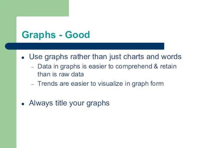
Use graphs rather than just charts and words
Data in graphs
Graphs - Good
Use graphs rather than just charts and words
Data in graphs
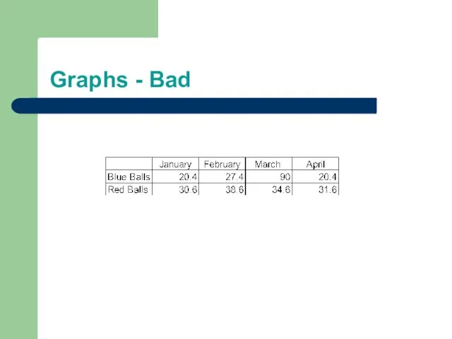
Слайд 17Graphs - Bad
Graphs - Bad
Слайд 18Graphs - Good
Graphs - Good
Слайд 19Graphs - Bad
Graphs - Bad
Слайд 20Graphs - Bad
Minor gridlines are unnecessary
Font is too small
Colours are illogical
Title is
Graphs - Bad
Minor gridlines are unnecessary
Font is too small
Colours are illogical
Title is
Слайд 21Spelling and Grammar
Proof your slides for:
spelling mistakes
the use of repeated words
grammatical errors
Spelling and Grammar
Proof your slides for:
spelling mistakes
the use of repeated words
grammatical errors
Слайд 22Conclusion
Use an effective and strong closing
Your audience is likely to remember your
Conclusion
Use an effective and strong closing
Your audience is likely to remember your
Слайд 23Questions??
End your presentation with a simple question slide to:
Invite your audience to
Questions??
End your presentation with a simple question slide to:
Invite your audience to
 О происхождении знакомых вещей. Из истории известных брендов
 Автоматизация учета домашних финансов
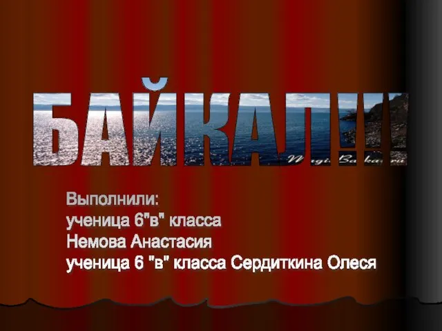 БАЙКАЛ!!!
 Мобильное устройство для диагностики состояния древесины
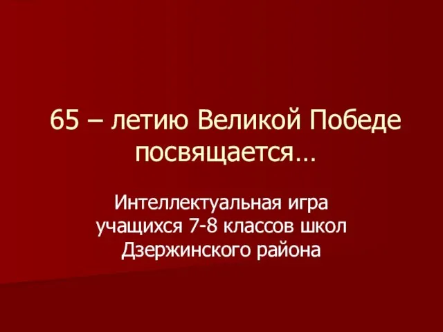 65 – летию Великой Победе посвящается…
 Презентация на тему Культура России 16 века
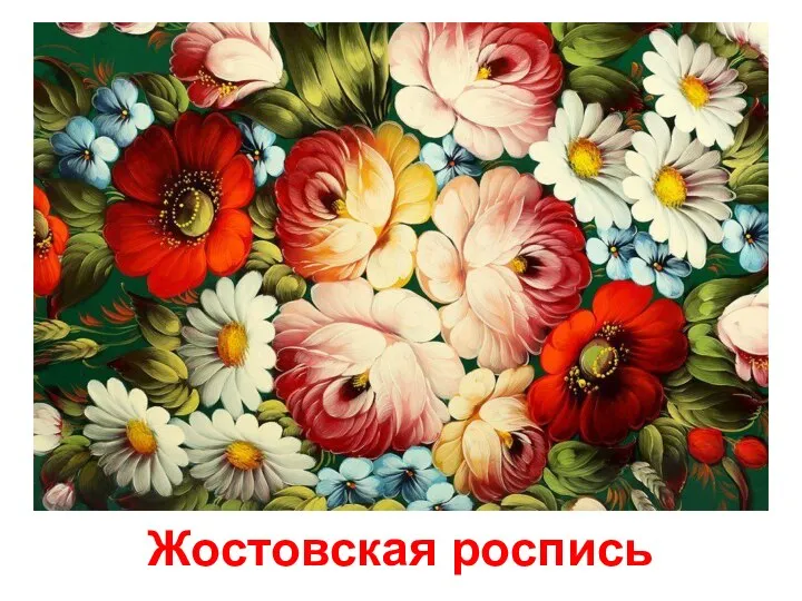 Жостовская роспись
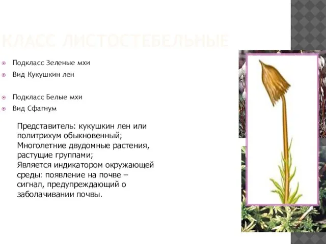 Класс Листостебельные
 Системный метод научных исследований
 Проектирование печатных плат
  Прогрессивное, регрессивное и пропорциональное налогообложение: сравнительная характеристика и опыт государств
 Легенда о Змеиной горе
 Учимся улыбаться
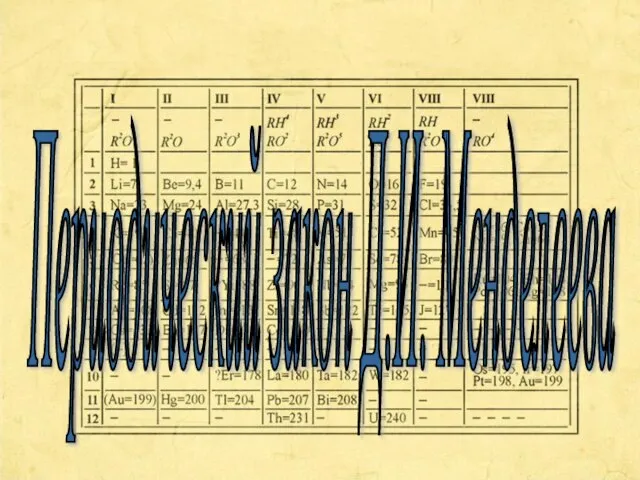 Периодический закон Д.И. Менделеева
 Уместность речи
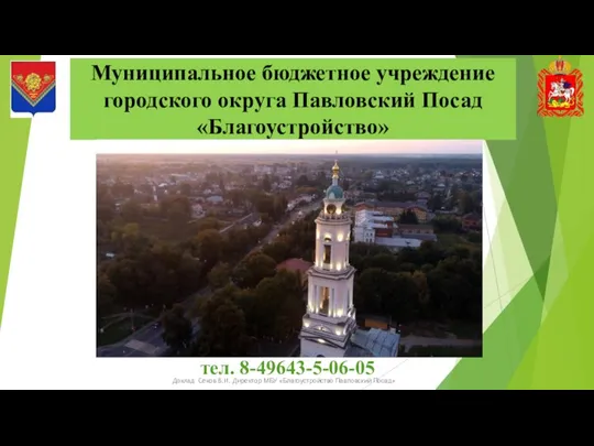 Деятельность МБУ Благоустройство Павловский Посад:
 Розничая торговля лекарственными средствами
 Автоматизированная поддержка пользовательской документацииWeb-приложений, разрабатываемых в среде WebRatio
 Презентация на тему Поездка в трамвае
  Мастер – класс. Что? Для чего? Как?
 Доклад главы Сусанинского муниципального района С.А. Журавлева «О реализации инвестиционных проектов в Сусанинском муниципаль
 Региональный центр развития образования
 Кожа
Кожа Системы противопожарной защиты
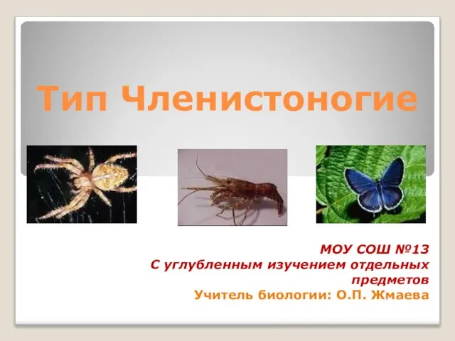 Презентация на тему Тип Членистоногие
 История интерьера
 Архитектура современных информационных систем. Введение
 Презентация на тему Школа