- Visual storytelling &data visualization best practices

Содержание
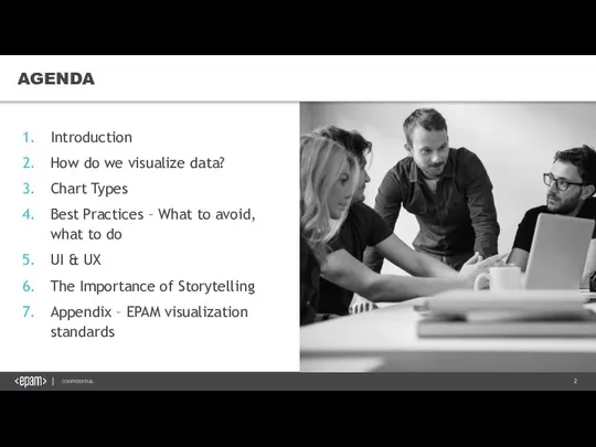
- 2. Introduction How do we visualize data? Chart Types Best Practices – What to avoid, what to
- 3. 1. INTRODUCTION VISUAL STORYTELLING &DATA VISUALIZATION BEST PRACTICES
- 4. WHY DO WE NEED THIS COURSE? „ Stephen Few
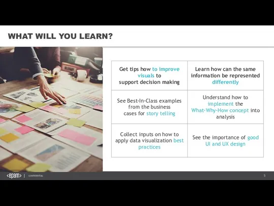
- 5. WHAT WILL YOU LEARN?
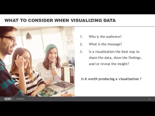
- 6. WHAT TO CONSIDER WHEN VISUALIZING DATA Who is the audience? What is the message? Is a
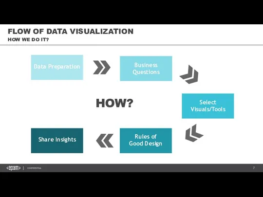
- 7. FLOW OF DATA VISUALIZATION HOW WE DO IT? Business Questions Data Preparation Share Insights Select Visuals/Tools
- 8. 2. HOW DO WE VISUALIZE DATA? VISUAL STORYTELLING &DATA VISUALIZATION BEST PRACTICES
- 9. HOW DO WE VISUALIZE DATA? THE NEXT PART IS ABOUT INTUITION. Try to think about the
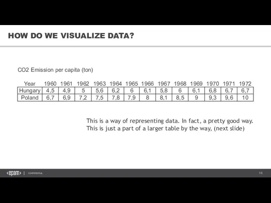
- 10. HOW DO WE VISUALIZE DATA? This is a way of representing data. In fact, a pretty
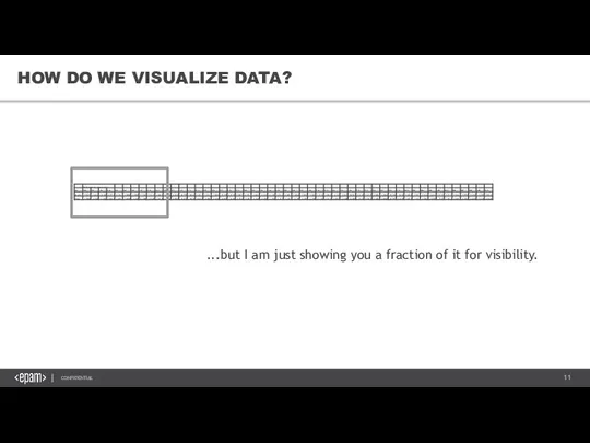
- 11. HOW DO WE VISUALIZE DATA? ...but I am just showing you a fraction of it for
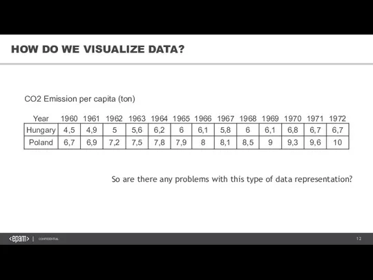
- 12. HOW DO WE VISUALIZE DATA? So are there any problems with this type of data representation?
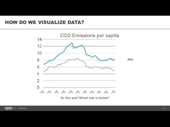
- 13. Or this one? Which one is better? HOW DO WE VISUALIZE DATA?
- 14. WHICH ONE IS BETTER? As said, tables are pretty good... ...for their limited role. These types
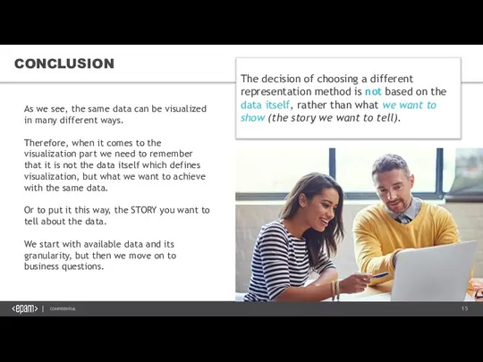
- 15. CONCLUSION As we see, the same data can be visualized in many different ways. Therefore, when
- 16. 3. CHART TYPES VISUAL STORYTELLING &DATA VISUALIZATION BEST PRACTICES
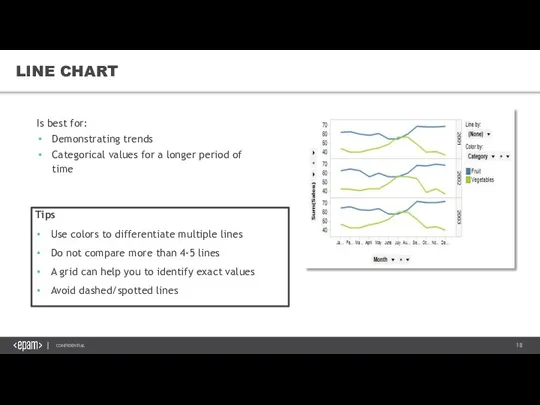
- 18. LINE CHART Is best for: Demonstrating trends Categorical values for a longer period of time Representing
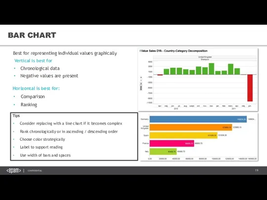
- 19. BAR CHART Best for representing individual values graphically Vertical is best for Chronological data Negative values
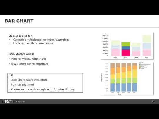
- 20. BAR CHART Stacked is best for: Comparing multiple part-to-whole relatonships Emphasis is on the sums of
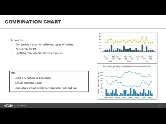
- 21. COMBINATION CHART Is best for: Comparing trends for different types of values Actual vs. Target Spotting
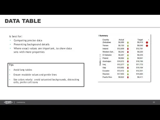
- 22. DATA TABLE Is best for: Comparing precise data Presenting background details Where exact values are important,
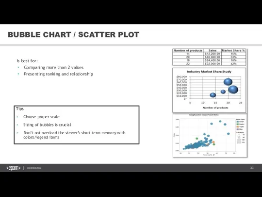
- 23. BUBBLE CHART / SCATTER PLOT Is best for: Comparing more than 2 values Presenting ranking and
- 24. PIE CHART Is best for: Part-to-whole comparison for small data set Presenting values on maps Tips
- 25. AREA CHART Is best for: Simple comparison of quantitative progression over time Stacked part-to-whole relationship 100%
- 26. TREEMAP Is best for: Presenting catalog with further drill down Showing distributions per different categories: sub-categories,
- 27. BOX PLOT Is best for: Showing several simultaneous comparisons Showing the location and degree of dispersion
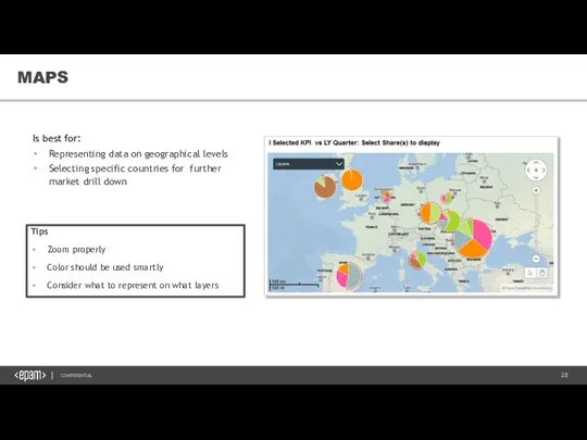
- 28. MAPS Is best for: Representing data on geographical levels Selecting specific countries for further market drill
- 29. 4. CHECKLIST FOR GOOD VISUALIZATION VISUAL STORYTELLING &DATA VISUALIZATION BEST PRACTICES
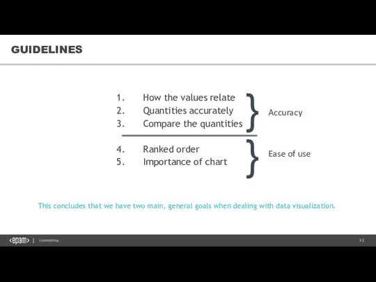
- 30. GUIDELINES Clearly indicates how the values relate to one another (part-to whole, etc.) Represents the quantities
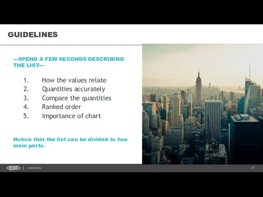
- 31. GUIDELINES Notice that the list can be divided to two main parts. ---SPEND A FEW SECONDS
- 32. GUIDELINES This concludes that we have two main, general goals when dealing with data visualization. How
- 33. GUIDELINES
- 34. AVOID MISLEADING VISUALIZATIONS
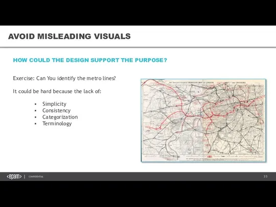
- 35. AVOID MISLEADING VISUALS AVOID MISLEADING VISUALS Exercise: Can You identify the metro lines? It could be
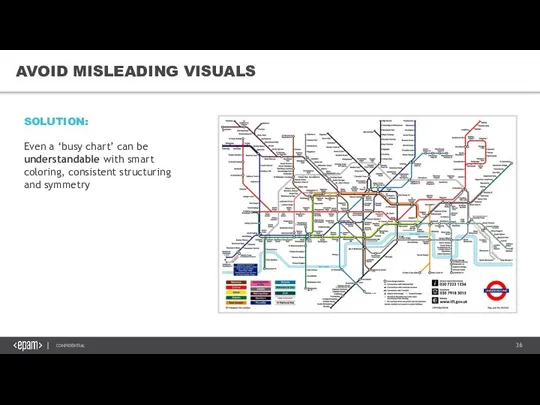
- 36. AVOID MISLEADING VISUALS SOLUTION: Even a ‘busy chart’ can be understandable with smart coloring, consistent structuring
- 37. AVOIDING MISLEADING VISUALS AVOIDING MISLEADING VISUALS – 3D Why to avoid them? See the next slide
- 38. AVOIDING MISLEADING VISUALS AVOIDING MISLEADING VISUALS – 3D „Represents data accurately” Representation: Length Distance Area Angle
- 39. AVOIDING MISLEADING VISUALS – 3D HERE’S AN EXAMPLE. WHAT’S THE PROBLEM WITH THIS CHART? Angle distortion!
- 40. AVOIDING MISLEADING VISUALS – 3D ...Unless you want distortion. You may have seen this image. This
- 41. AVOIDING MISLEADING VISUALS – BAR CHART AVOIDING MISLEADING VISUALS – BAR CHART Let’s take a look
- 42. AVOIDING MISLEADING VISUALS – BAR CHART ...and if we extend to zero?
- 43. AVOIDING MISLEADING VISUALS – BAR CHART So if we check our list, this does not perform
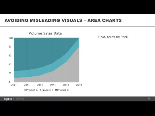
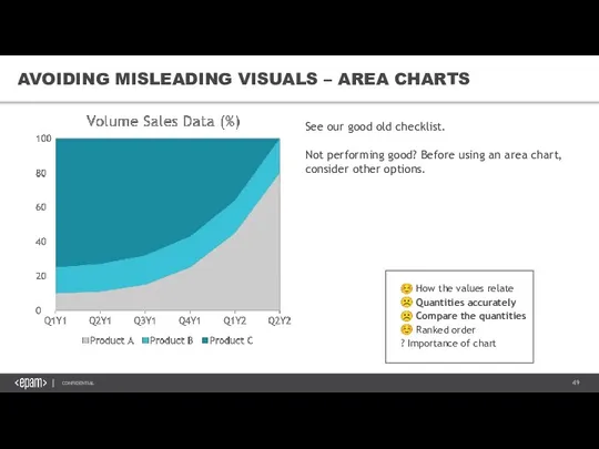
- 44. AVOIDING MISLEADING VISUALS – AREA CHARTS How do Product B (orange) perform over time? Curious if
- 45. If not, here’s the trick: AVOIDING MISLEADING VISUALS – AREA CHARTS
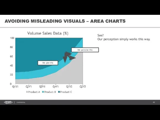
- 46. We perceive this We plot this See? Our perception simply works this way. AVOIDING MISLEADING VISUALS
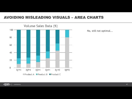
- 47. No, still not optimal... AVOIDING MISLEADING VISUALS – AREA CHARTS
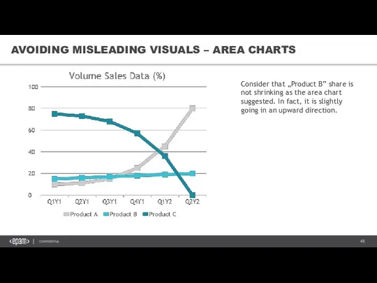
- 48. Consider that „Product B” share is not shrinking as the area chart suggested. In fact, it
- 49. ☺ How the values relate ☹ Quantities accurately ☹ Compare the quantities ☺ Ranked order ?
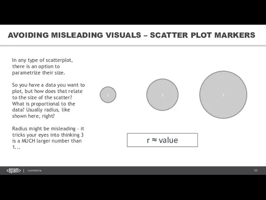
- 50. 1 2 3 r ≈ value AVOIDING MISLEADING VISUALS – SCATTER PLOT MARKERS In any type
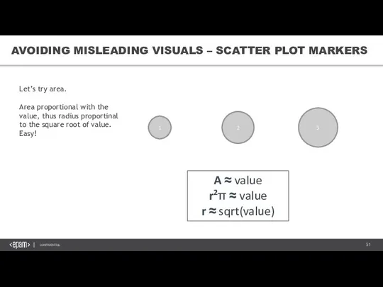
- 51. 1 2 3 A ≈ value r2π ≈ value r ≈ sqrt(value) AVOIDING MISLEADING VISUALS –
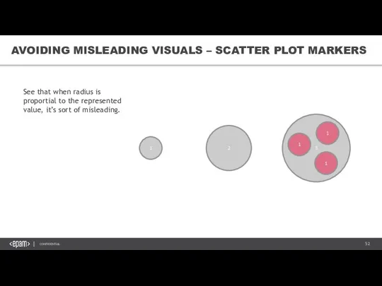
- 52. 1 2 3 1 1 1 AVOIDING MISLEADING VISUALS – SCATTER PLOT MARKERS See that when
- 53. 1 2 3 1 1 1 AVOIDING MISLEADING VISUALS – SCATTER PLOT MARKERS Much better, right?
- 54. IMPROVE EASE OF UNDERSTANDING THE FUNDAMENTAL PRINCIPLES
- 55. IMPROVE EASE OF UNDERSTANDING – VISUAL HIERARCHY The system should always keep users informed about what
- 56. IMPROVE EASE OF UNDERSTANDING – VISUAL HIERARCHY Based on The Jeffrey Veen Model ‘Where I am?’
- 57. IMPROVE EASE OF UNDERSTANDING – DIRECT LABELING Our previous chart...
- 58. Product A Product C Product B IMPROVE EASE OF UNDERSTANDING – DIRECT LABELING With direct labels.
- 59. DATA-INK RATIO: Try to improve it Remove everything unnecessary Wisely use ink of necessary elements Improve
- 60. IMPROVE EASE OF UNDERSTANDING – DATA-INK RATIO You will get the concept in a moment. See
- 61. IMPROVE EASE OF UNDERSTANDING – DATA-INK RATIO This. This is the part of the chart that
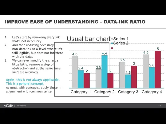
- 62. IMPROVE EASE OF UNDERSTANDING – DATA-INK RATIO Let’s start by removing every ink that’s not necessary.
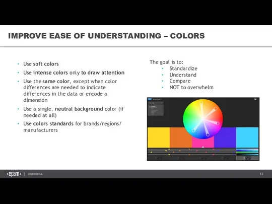
- 63. IMPROVE EASE OF UNDERSTANDING – COLORS Use soft colors Use intense colors only to draw attention
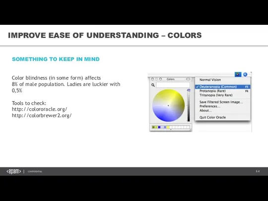
- 64. IMPROVE EASE OF UNDERSTANDING – COLORS SOMETHING TO KEEP IN MIND Color blindness (in some form)
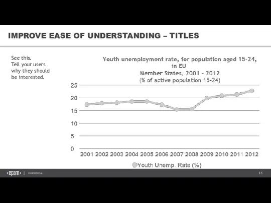
- 65. IMPROVE EASE OF UNDERSTANDING – TITLES See this. Tell your users why they should be interested.
- 66. IMPROVE EASE OF UNDERSTANDING – TITLES Getting there. You can even „abuse it”, so, again, use
- 67. IMPROVE EASE OF UNDERSTANDING – TITLES This is not good. Why? Because you are suggesting something
- 68. IMPROVE EASE OF UNDERSTANDING – TITLES Totally different story. By the way, this statement is obviously
- 69. IMPROVE EASE OF UNDERSTANDING – CHART JUNK Everything that is not necessary „Let’s make it more
- 70. 5. UX & UI VISUAL STORYTELLING &DATA VISUALIZATION BEST PRACTICES
- 71. UNDERSTANDING UI ELEMENTS & PRINCIPLES Know your audience The essence of interface The MAYA principle Input
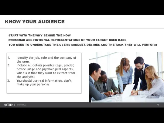
- 72. KNOW YOUR AUDIENCE START WITH THE WHY BEHIND THE HOW PERSONAS ARE FICTIONAL REPRESENTATIONS OF YOUR
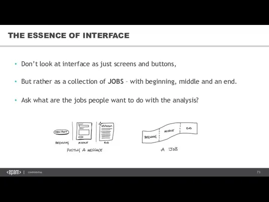
- 73. THE ESSENCE OF INTERFACE Don’t look at interface as just screens and buttons, But rather as
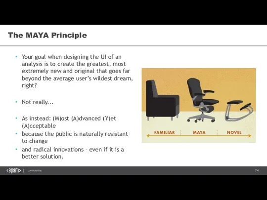
- 74. The MAYA Principle Your goal when designing the UI of an analysis is to create the
- 75. UNDERSTANDING VISUAL ELEMENTS OF UI Contrast Color Theory Color Schemes Typography
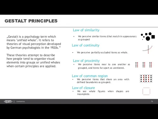
- 76. GESTALT PRINCIPLES „Gestalt is a psychology term which means "unified whole". It refers to theories of
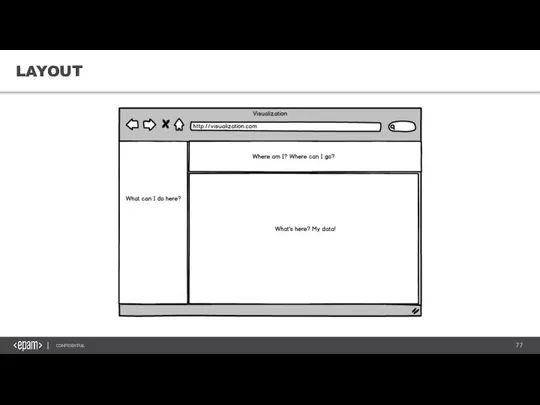
- 77. LAYOUT
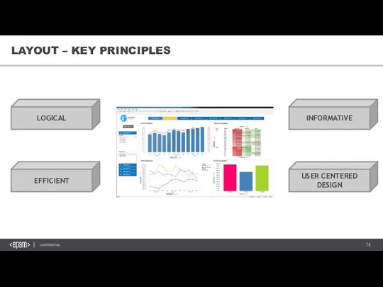
- 78. LAYOUT – KEY PRINCIPLES LOGICAL EFFICIENT INFORMATIVE USER CENTERED DESIGN
- 79. CREATING VISUAL ORGANIZATION Scanning patterns Contrast: Generating interest Color, size and space Know your auidence
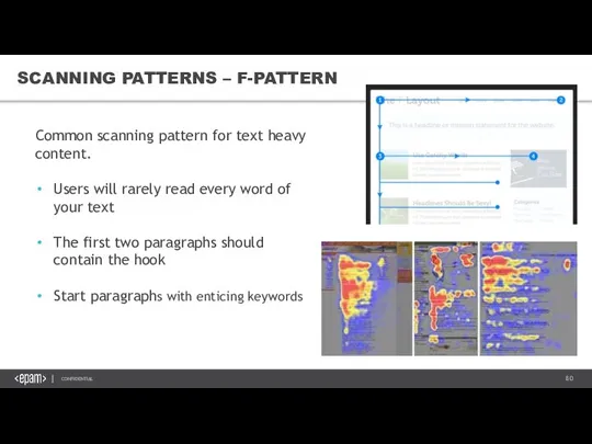
- 80. SCANNING PATTERNS – F-PATTERN Common scanning pattern for text heavy content. Users will rarely read every
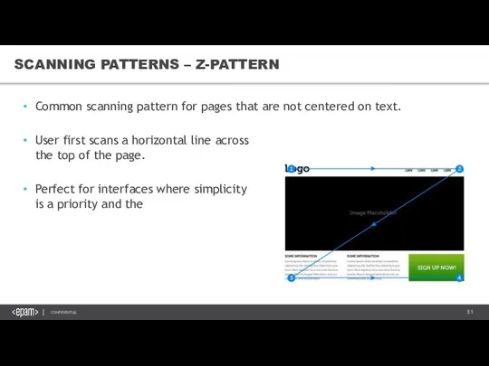
- 81. SCANNING PATTERNS – Z-PATTERN Common scanning pattern for pages that are not centered on text. User
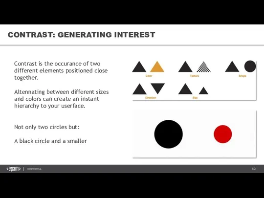
- 82. CONTRAST: GENERATING INTEREST Contrast is the occurance of two different elements positioned close together. Altennating between
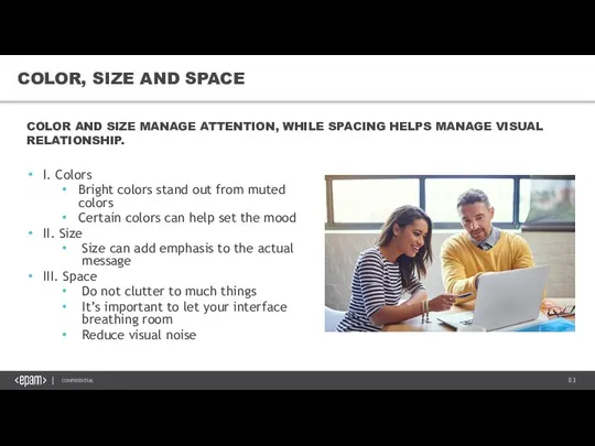
- 83. COLOR, SIZE AND SPACE I. Colors Bright colors stand out from muted colors Certain colors can
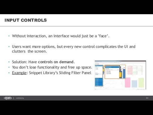
- 84. INPUT CONTROLS Without interaction, an interface would just be a ’face’. Users want more options, but
- 85. NAVIGATION It’s hard to appreciate an analysis if you are lost, which is why having navigation
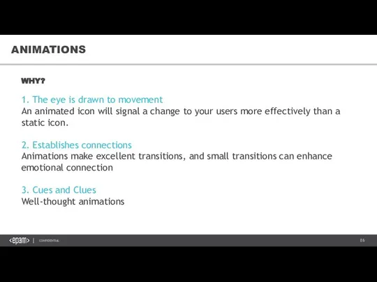
- 86. ANIMATIONS WHY? 1. The eye is drawn to movement An animated icon will signal a change
- 87. GUIDED ACTIONS Guided actions can be used by emphasizing key functions, controls and buttons. At EPAM
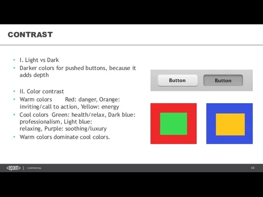
- 88. CONTRAST I. Light vs Dark Darker colors for pushed buttons, because it adds depth II. Color
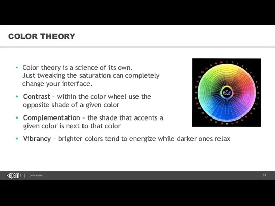
- 89. COLOR THEORY Color theory is a science of its own. Just tweaking the saturation can completely
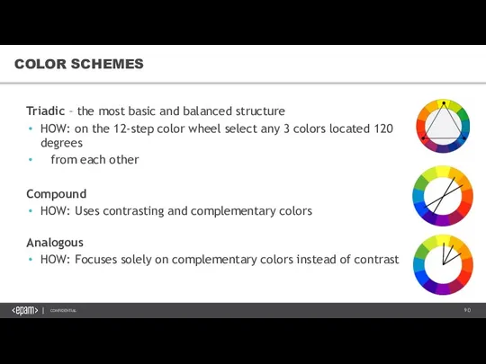
- 90. COLOR SCHEMES Triadic – the most basic and balanced structure HOW: on the 12-step color wheel
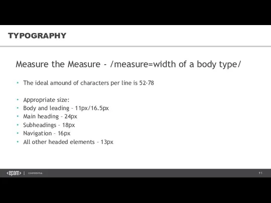
- 91. TYPOGRAPHY Measure the Measure - /measure=width of a body type/ The ideal amound of characters per
- 92. 6. STORYTELLING VISUAL STORYTELLING &DATA VISUALIZATION BEST PRACTICES
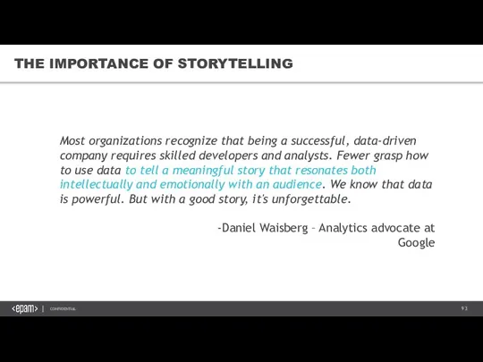
- 93. THE IMPORTANCE OF STORYTELLING Most organizations recognize that being a successful, data-driven company requires skilled developers
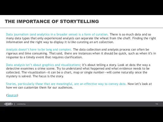
- 94. THE IMPORTANCE OF STORYTELLING Data journalism (and analytics in a broader sense) is a form of
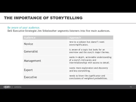
- 95. THE IMPORTANCE OF STORYTELLING Be aware of your audience. Dell Executive Strategist Jim Stikeleather segments listeners
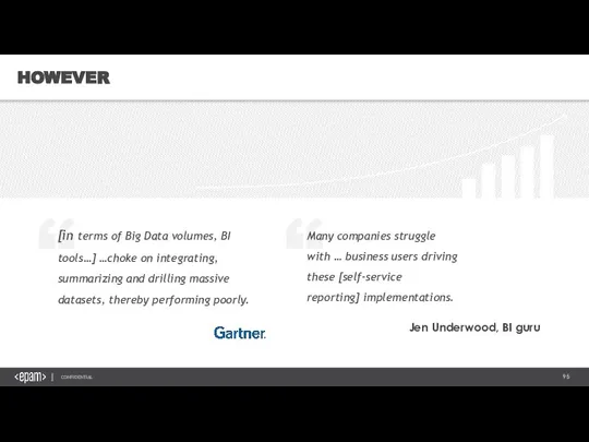
- 96. HOWEVER
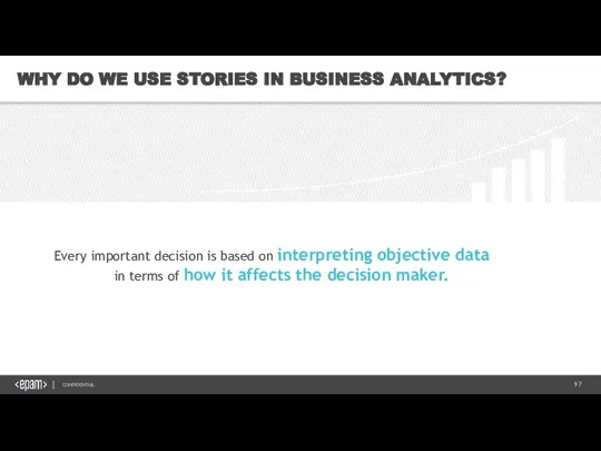
- 97. WHY DO WE USE STORIES IN BUSINESS ANALYTICS? Every important decision is based on interpreting objective
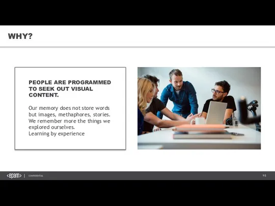
- 98. WHY? PEOPLE ARE PROGRAMMED TO SEEK OUT VISUAL CONTENT. Our memory does not store words but
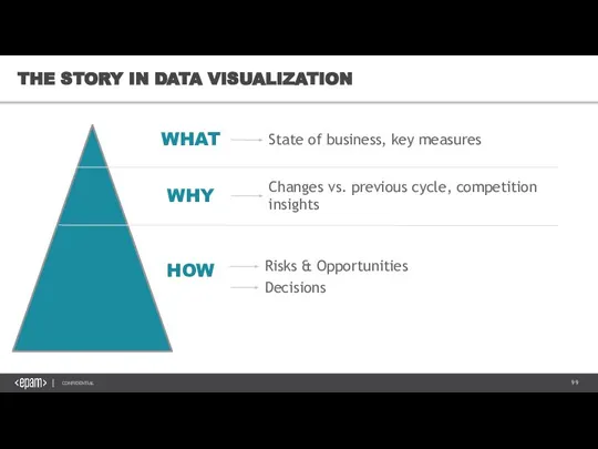
- 99. THE STORY IN DATA VISUALIZATION WHAT WHY HOW State of business, key measures Changes vs. previous
- 100. UNDERSTAND AND GUIDE WHAT is happening in my business? Market trends Company performance (shares) WHY is
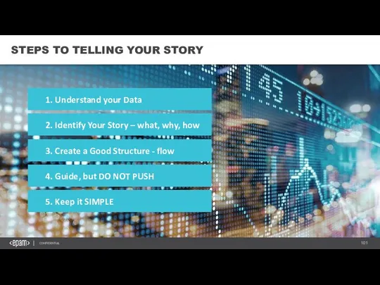
- 101. STEPS TO TELLING YOUR STORY 1. Understand your Data 2. Identify Your Story – what, why,
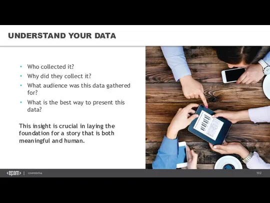
- 102. UNDERSTAND YOUR DATA Who collected it? Why did they collect it? What audience was this data
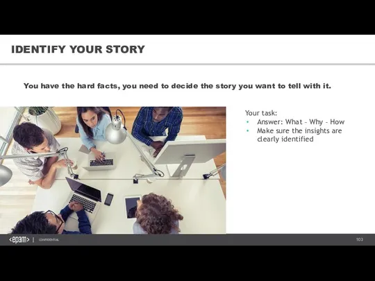
- 103. IDENTIFY YOUR STORY You have the hard facts, you need to decide the story you want
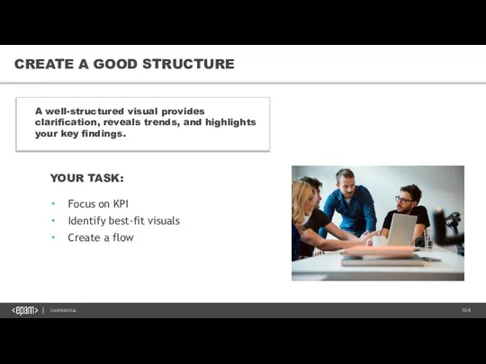
- 104. CREATE A GOOD STRUCTURE A well-structured visual provides clarification, reveals trends, and highlights your key findings.
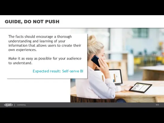
- 105. GUIDE, DO NOT PUSH The facts should encourage a thorough understanding and learning of your information
- 106. KEEP IS SIMPLE
- 107. +1 LEARNING BEFORE YOU START NEVER UNDERESTIMATE THE IMPORTANCE OF USER EXPERIENCE KNOW YOUR AUDIENCE (=KEY
- 108. WHAT DO WE SEE HERE?
- 109. ANOTHER POINT OF VIEW
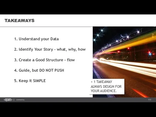
- 110. TAKEAWAYS + 1 TAKEAWAY ALWAYS DESIGN FOR YOUR AUDIENCE. 1. Understand your Data 2. Identify Your
- 111. 7. EPAM VISUALIZATION STANDARDS VISUAL STORYTELLING &DATA VISUALIZATION BEST PRACTICES
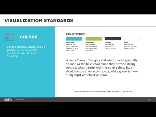
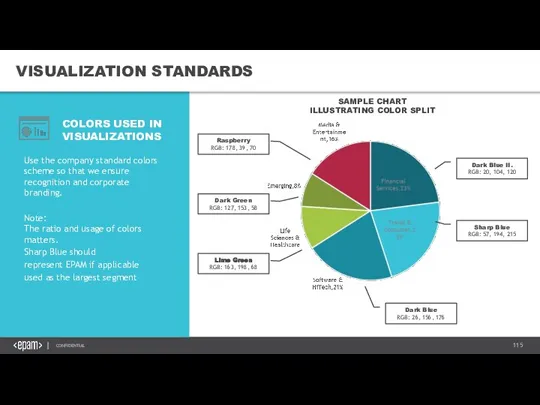
- 112. VISUALIZATION STANDARDS Use the company standard colors scheme so that we ensure recognition and corporate branding.
- 113. VISUALIZATION STANDARDS Use the company standard colors scheme so that we ensure recognition and corporate branding.
- 114. VISUALIZATION STANDARDS Use the company standard colors scheme so that we ensure recognition and corporate branding.
- 115. VISUALIZATION STANDARDS Use the company standard colors scheme so that we ensure recognition and corporate branding.
- 116. VISUALIZATION STANDARDS Use the company standard colors scheme so that we ensure recognition and corporate branding.
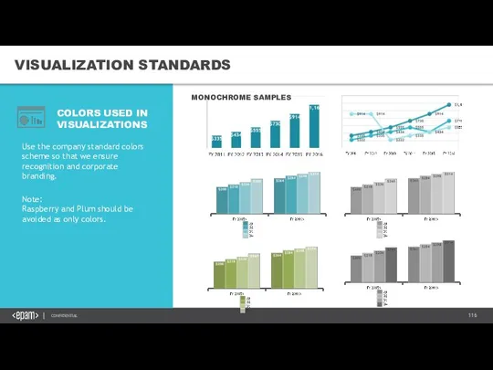
- 117. VISUALIZATION STANDARDS COLORS USED IN VISUALIZATIONS MONOCHROME SAMPLES Use the company standard colors scheme so that
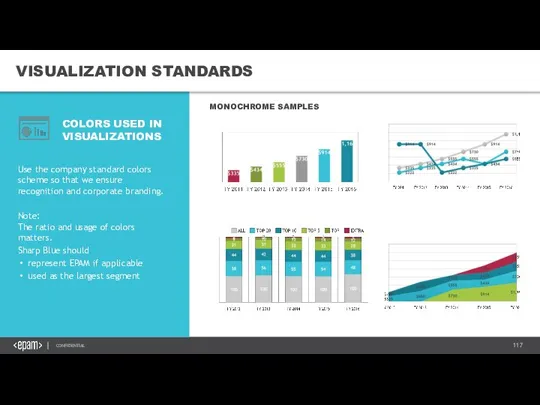
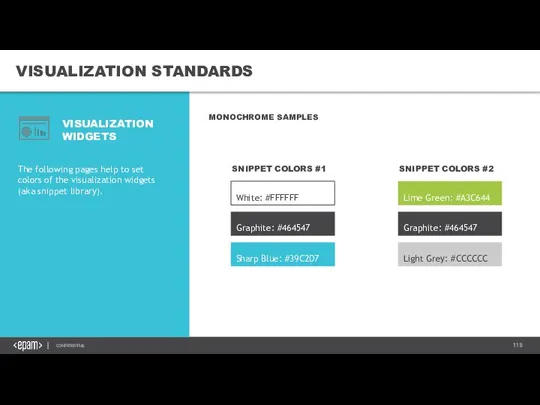
- 118. VISUALIZATION STANDARDS VISUALIZATION WIDGETS MONOCHROME SAMPLES The following pages help to set colors of the visualization
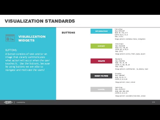
- 119. VISUALIZATION STANDARDS VISUALIZATION WIDGETS BUTTONS: A button consists of text and/or an image that clearly communicates
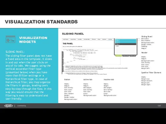
- 120. VISUALIZATION STANDARDS VISUALIZATION WIDGETS SLIDING PANEL: The sliding filter panel does not have a fixed area
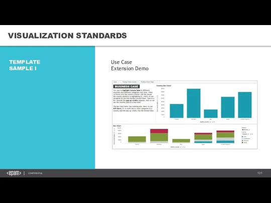
- 121. VISUALIZATION STANDARDS TEMPLATE SAMPLE I Use Case Extension Demo
- 123. Скачать презентацию
Слайд 31. INTRODUCTION
VISUAL STORYTELLING &DATA VISUALIZATION BEST PRACTICES
1. INTRODUCTION
VISUAL STORYTELLING &DATA VISUALIZATION BEST PRACTICES
Слайд 4WHY DO WE NEED THIS COURSE?
„
Stephen Few
WHY DO WE NEED THIS COURSE?
„
Stephen Few

Слайд 5WHAT WILL YOU LEARN?
WHAT WILL YOU LEARN?
Слайд 6WHAT TO CONSIDER WHEN VISUALIZING DATA
Who is the audience?
What is the
WHAT TO CONSIDER WHEN VISUALIZING DATA
Who is the audience?
What is the
Слайд 7FLOW OF DATA VISUALIZATION
HOW WE DO IT?
Business Questions
Data Preparation
Share Insights
Select Visuals/Tools
Rules of
Good
FLOW OF DATA VISUALIZATION
HOW WE DO IT?
Business Questions
Data Preparation
Share Insights
Select Visuals/Tools
Rules of
Good
Слайд 82. HOW DO WE VISUALIZE DATA?
VISUAL STORYTELLING &DATA VISUALIZATION BEST PRACTICES
2. HOW DO WE VISUALIZE DATA?
VISUAL STORYTELLING &DATA VISUALIZATION BEST PRACTICES
Слайд 9HOW DO WE VISUALIZE DATA?
THE NEXT PART IS ABOUT INTUITION.
Try to think
HOW DO WE VISUALIZE DATA?
THE NEXT PART IS ABOUT INTUITION.
Try to think
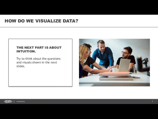
Слайд 10HOW DO WE VISUALIZE DATA?
This is a way of representing data. In
HOW DO WE VISUALIZE DATA?
This is a way of representing data. In
Слайд 11HOW DO WE VISUALIZE DATA?
...but I am just showing you a fraction
HOW DO WE VISUALIZE DATA?
...but I am just showing you a fraction
Слайд 12HOW DO WE VISUALIZE DATA?
So are there any problems with this type
HOW DO WE VISUALIZE DATA?
So are there any problems with this type
Слайд 13Or this one? Which one is better?
HOW DO WE VISUALIZE DATA?
Or this one? Which one is better?
HOW DO WE VISUALIZE DATA?
Слайд 14WHICH ONE IS BETTER?
As said, tables are pretty good...
...for their limited role.
These
WHICH ONE IS BETTER?
As said, tables are pretty good...
...for their limited role.
These
Слайд 15CONCLUSION
As we see, the same data can be visualized in many different
CONCLUSION
As we see, the same data can be visualized in many different
Слайд 163. CHART TYPES
VISUAL STORYTELLING &DATA VISUALIZATION BEST PRACTICES
3. CHART TYPES
VISUAL STORYTELLING &DATA VISUALIZATION BEST PRACTICES

Слайд 18LINE CHART
Is best for:
Demonstrating trends
Categorical values for a longer period of time
Representing
LINE CHART
Is best for:
Demonstrating trends
Categorical values for a longer period of time
Representing
Слайд 19BAR CHART
Best for representing individual values graphically
Vertical is best for
Chronological data
BAR CHART
Best for representing individual values graphically
Vertical is best for
Chronological data
Слайд 20BAR CHART
Stacked is best for:
Comparing multiple part-to-whole relatonships
Emphasis is on the
BAR CHART
Stacked is best for:
Comparing multiple part-to-whole relatonships
Emphasis is on the
Слайд 21COMBINATION CHART
Is best for:
Comparing trends for different types of values
Actual vs. Target
Spotting
COMBINATION CHART
Is best for:
Comparing trends for different types of values
Actual vs. Target
Spotting
Слайд 22DATA TABLE
Is best for:
Comparing precise data
Presenting background details
Where exact values are important,
DATA TABLE
Is best for:
Comparing precise data
Presenting background details
Where exact values are important,
Слайд 23BUBBLE CHART / SCATTER PLOT
Is best for:
Comparing more than 2 values
Presenting ranking
BUBBLE CHART / SCATTER PLOT
Is best for:
Comparing more than 2 values
Presenting ranking
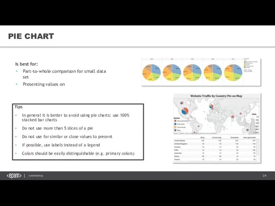
Слайд 24PIE CHART
Is best for:
Part-to-whole comparison for small data set
Presenting values on maps
Tips
In
PIE CHART
Is best for:
Part-to-whole comparison for small data set
Presenting values on maps
Tips
In
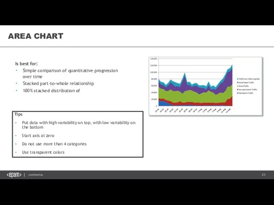
Слайд 25AREA CHART
Is best for:
Simple comparison of quantitative progression over time
Stacked part-to-whole relationship
100%
AREA CHART
Is best for:
Simple comparison of quantitative progression over time
Stacked part-to-whole relationship
100%
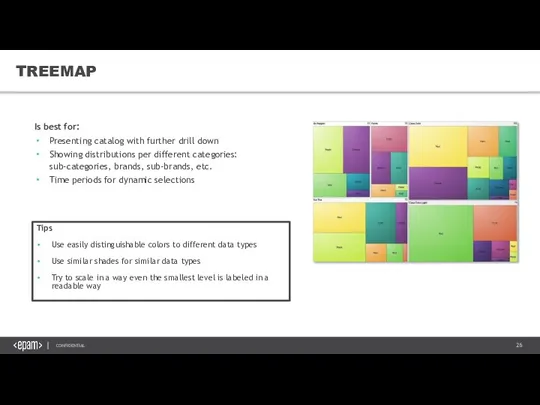
Слайд 26TREEMAP
Is best for:
Presenting catalog with further drill down
Showing distributions per different categories:
TREEMAP
Is best for:
Presenting catalog with further drill down
Showing distributions per different categories:
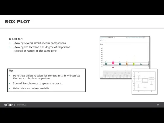
Слайд 27BOX PLOT
Is best for:
Showing several simultaneous comparisons
Showing the location and degree of
BOX PLOT
Is best for:
Showing several simultaneous comparisons
Showing the location and degree of
Слайд 28MAPS
Is best for:
Representing data on geographical levels
Selecting specific countries for further market
MAPS
Is best for:
Representing data on geographical levels
Selecting specific countries for further market
Слайд 294. CHECKLIST FOR
GOOD VISUALIZATION
VISUAL STORYTELLING &DATA VISUALIZATION BEST PRACTICES
4. CHECKLIST FOR
GOOD VISUALIZATION
VISUAL STORYTELLING &DATA VISUALIZATION BEST PRACTICES
Слайд 30GUIDELINES
Clearly indicates how the values relate to one another (part-to whole, etc.)
Represents
GUIDELINES
Clearly indicates how the values relate to one another (part-to whole, etc.)
Represents
Слайд 31GUIDELINES
Notice that the list can be divided to two main parts.
---SPEND A
GUIDELINES
Notice that the list can be divided to two main parts.
---SPEND A
Слайд 32GUIDELINES
This concludes that we have two main, general goals when dealing with
GUIDELINES
This concludes that we have two main, general goals when dealing with
Слайд 33GUIDELINES
GUIDELINES

Слайд 34AVOID MISLEADING VISUALIZATIONS
AVOID MISLEADING VISUALIZATIONS
Слайд 35AVOID MISLEADING VISUALS
AVOID MISLEADING VISUALS
Exercise: Can You identify the metro lines?
It could
AVOID MISLEADING VISUALS
AVOID MISLEADING VISUALS
Exercise: Can You identify the metro lines?
It could
Слайд 36AVOID MISLEADING VISUALS
SOLUTION:
Even a ‘busy chart’ can be understandable with smart
AVOID MISLEADING VISUALS
SOLUTION:
Even a ‘busy chart’ can be understandable with smart
Слайд 37AVOIDING MISLEADING VISUALS
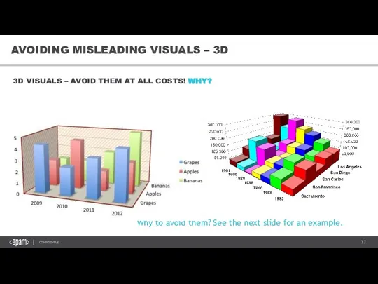
AVOIDING MISLEADING VISUALS – 3D
Why to avoid them? See the
AVOIDING MISLEADING VISUALS
AVOIDING MISLEADING VISUALS – 3D
Why to avoid them? See the
Слайд 38AVOIDING MISLEADING VISUALS
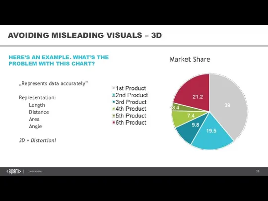
AVOIDING MISLEADING VISUALS – 3D
„Represents data accurately”
Representation:
Length
Distance
Area
Angle
3D = Distortion!
HERE’S AN
AVOIDING MISLEADING VISUALS
AVOIDING MISLEADING VISUALS – 3D
„Represents data accurately”
Representation:
Length
Distance
Area
Angle
3D = Distortion!
HERE’S AN
Слайд 39AVOIDING MISLEADING VISUALS – 3D
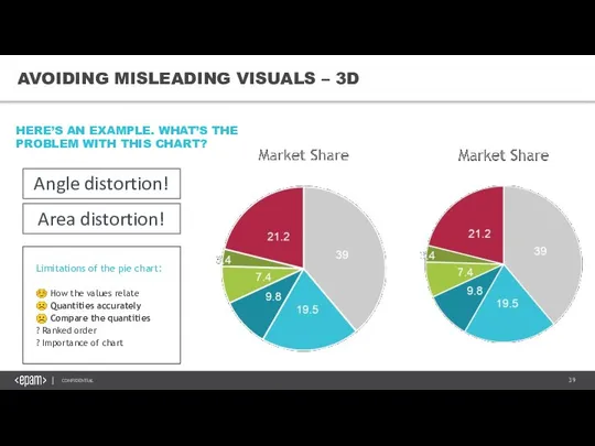
HERE’S AN EXAMPLE. WHAT’S THE PROBLEM WITH THIS
AVOIDING MISLEADING VISUALS – 3D
HERE’S AN EXAMPLE. WHAT’S THE PROBLEM WITH THIS
Слайд 40AVOIDING MISLEADING VISUALS – 3D
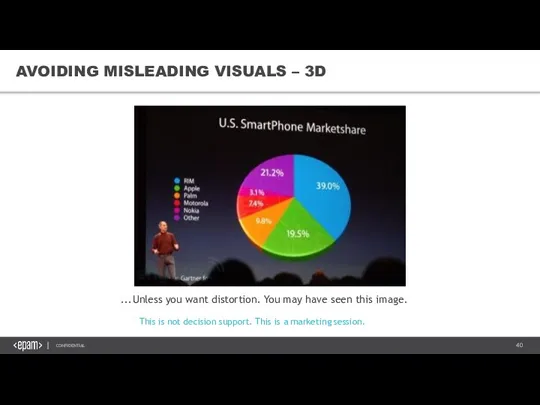
...Unless you want distortion. You may have seen
AVOIDING MISLEADING VISUALS – 3D
...Unless you want distortion. You may have seen
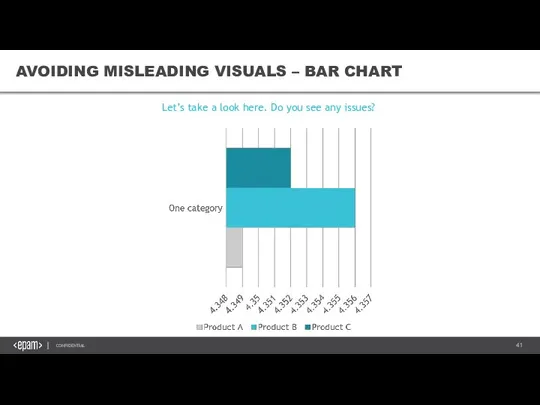
Слайд 41AVOIDING MISLEADING VISUALS – BAR CHART
AVOIDING MISLEADING VISUALS – BAR CHART
Let’s take
AVOIDING MISLEADING VISUALS – BAR CHART
AVOIDING MISLEADING VISUALS – BAR CHART
Let’s take
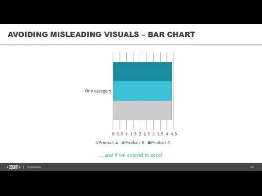
Слайд 42AVOIDING MISLEADING VISUALS – BAR CHART
...and if we extend to zero?
AVOIDING MISLEADING VISUALS – BAR CHART
...and if we extend to zero?
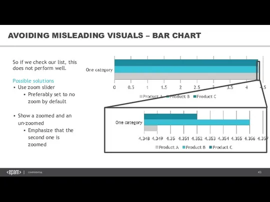
Слайд 43AVOIDING MISLEADING VISUALS – BAR CHART
So if we check our list, this
AVOIDING MISLEADING VISUALS – BAR CHART
So if we check our list, this
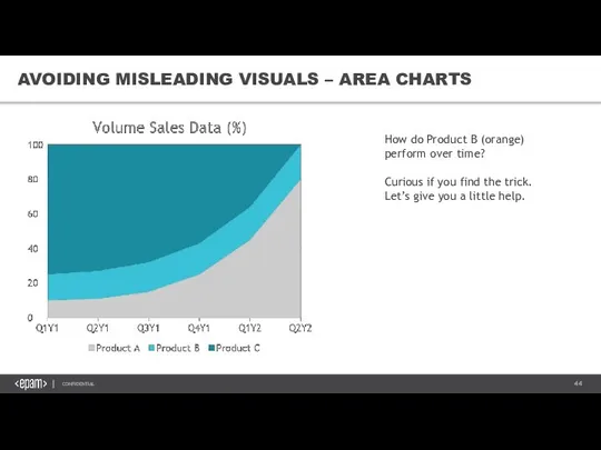
Слайд 44AVOIDING MISLEADING VISUALS – AREA CHARTS
How do Product B (orange) perform
AVOIDING MISLEADING VISUALS – AREA CHARTS
How do Product B (orange) perform
Слайд 45If not, here’s the trick:
AVOIDING MISLEADING VISUALS – AREA CHARTS
If not, here’s the trick:
AVOIDING MISLEADING VISUALS – AREA CHARTS
Слайд 46We perceive this
We plot this
See?
Our perception simply works this way.
AVOIDING MISLEADING VISUALS
We perceive this
We plot this
See?
Our perception simply works this way.
AVOIDING MISLEADING VISUALS
Слайд 47No, still not optimal...
AVOIDING MISLEADING VISUALS – AREA CHARTS
No, still not optimal...
AVOIDING MISLEADING VISUALS – AREA CHARTS
Слайд 48Consider that „Product B” share is not shrinking as the area chart
Consider that „Product B” share is not shrinking as the area chart
Слайд 49☺ How the values relate
☹ Quantities accurately
☹ Compare the quantities
☺ Ranked order
?
☺ How the values relate
☹ Quantities accurately
☹ Compare the quantities
☺ Ranked order
?
Слайд 501
2
3
r ≈ value
AVOIDING MISLEADING VISUALS – SCATTER PLOT MARKERS
In any type of
1
2
3
r ≈ value
AVOIDING MISLEADING VISUALS – SCATTER PLOT MARKERS
In any type of
Слайд 511
2
3
A ≈ value
r2π ≈ value
r ≈ sqrt(value)
AVOIDING MISLEADING VISUALS – SCATTER PLOT
1
2
3
A ≈ value
r2π ≈ value
r ≈ sqrt(value)
AVOIDING MISLEADING VISUALS – SCATTER PLOT
Слайд 521
2
3
1
1
1
AVOIDING MISLEADING VISUALS – SCATTER PLOT MARKERS
See that when radius is proportial
1
2
3
1
1
1
AVOIDING MISLEADING VISUALS – SCATTER PLOT MARKERS
See that when radius is proportial
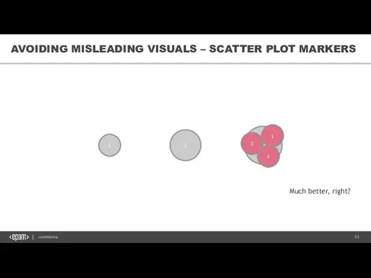
Слайд 531
2
3
1
1
1
AVOIDING MISLEADING VISUALS – SCATTER PLOT MARKERS
Much better, right?
1
2
3
1
1
1
AVOIDING MISLEADING VISUALS – SCATTER PLOT MARKERS
Much better, right?
Слайд 54IMPROVE EASE OF UNDERSTANDING
THE FUNDAMENTAL PRINCIPLES
IMPROVE EASE OF UNDERSTANDING
THE FUNDAMENTAL PRINCIPLES

Слайд 55IMPROVE EASE OF UNDERSTANDING – VISUAL HIERARCHY
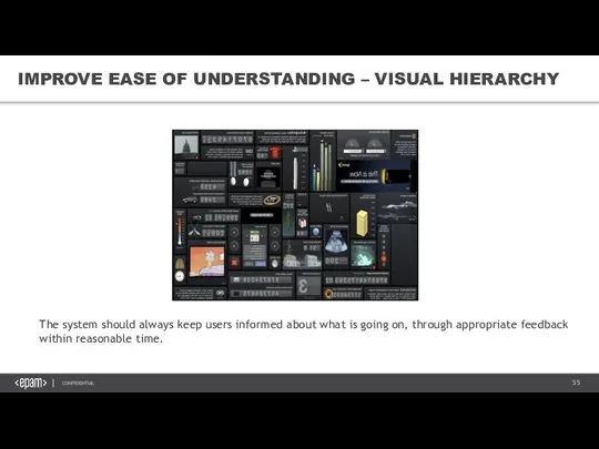
The system should always keep users
IMPROVE EASE OF UNDERSTANDING – VISUAL HIERARCHY
The system should always keep users
Слайд 56IMPROVE EASE OF UNDERSTANDING – VISUAL HIERARCHY
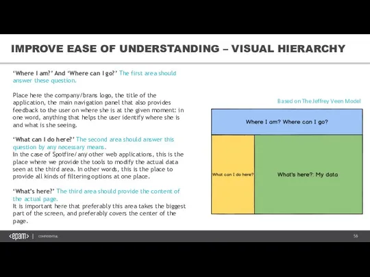
Based on The Jeffrey Veen Model
‘Where
IMPROVE EASE OF UNDERSTANDING – VISUAL HIERARCHY
Based on The Jeffrey Veen Model
‘Where
Слайд 57IMPROVE EASE OF UNDERSTANDING – DIRECT LABELING
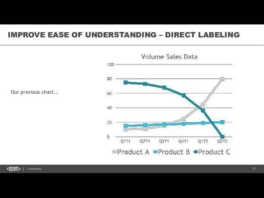
Our previous chart...
IMPROVE EASE OF UNDERSTANDING – DIRECT LABELING
Our previous chart...
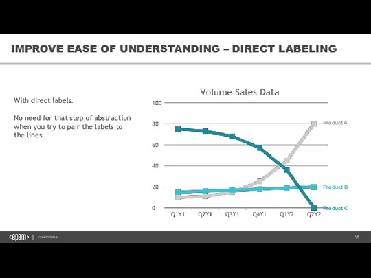
Слайд 58Product A
Product C
Product B
IMPROVE EASE OF UNDERSTANDING – DIRECT LABELING
With direct labels.
No
Product A
Product C
Product B
IMPROVE EASE OF UNDERSTANDING – DIRECT LABELING
With direct labels.
No
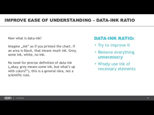
Слайд 59DATA-INK RATIO:
Try to improve it
Remove everything unnecessary
Wisely use ink of necessary elements
Improve
DATA-INK RATIO:
Try to improve it
Remove everything unnecessary
Wisely use ink of necessary elements
Improve
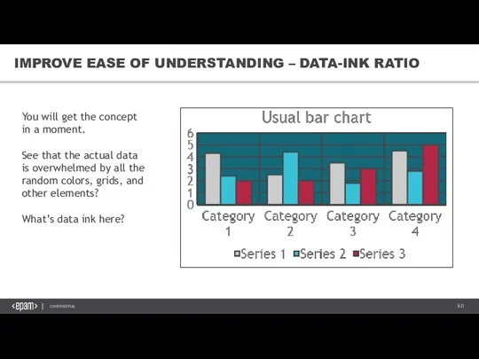
Слайд 60IMPROVE EASE OF UNDERSTANDING – DATA-INK RATIO
You will get the concept in
IMPROVE EASE OF UNDERSTANDING – DATA-INK RATIO
You will get the concept in
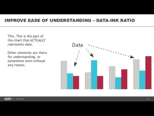
Слайд 61IMPROVE EASE OF UNDERSTANDING – DATA-INK RATIO
This. This is the part of
IMPROVE EASE OF UNDERSTANDING – DATA-INK RATIO
This. This is the part of
Слайд 62IMPROVE EASE OF UNDERSTANDING – DATA-INK RATIO
Let’s start by removing every ink
IMPROVE EASE OF UNDERSTANDING – DATA-INK RATIO
Let’s start by removing every ink
Слайд 63IMPROVE EASE OF UNDERSTANDING – COLORS
Use soft colors
Use intense colors only
IMPROVE EASE OF UNDERSTANDING – COLORS
Use soft colors
Use intense colors only
Слайд 64IMPROVE EASE OF UNDERSTANDING – COLORS
SOMETHING TO KEEP IN MIND
Color blindness
IMPROVE EASE OF UNDERSTANDING – COLORS
SOMETHING TO KEEP IN MIND
Color blindness
Слайд 65IMPROVE EASE OF UNDERSTANDING – TITLES
See this.
Tell your users why they should
IMPROVE EASE OF UNDERSTANDING – TITLES
See this.
Tell your users why they should
Слайд 66IMPROVE EASE OF UNDERSTANDING – TITLES
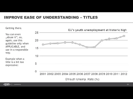
Getting there.
You can even „abuse it”, so,
IMPROVE EASE OF UNDERSTANDING – TITLES
Getting there.
You can even „abuse it”, so,
Слайд 67IMPROVE EASE OF UNDERSTANDING – TITLES
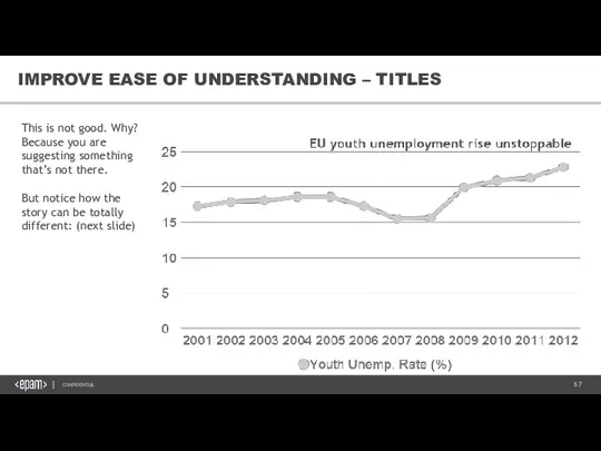
This is not good. Why? Because you
IMPROVE EASE OF UNDERSTANDING – TITLES
This is not good. Why? Because you
Слайд 68IMPROVE EASE OF UNDERSTANDING – TITLES
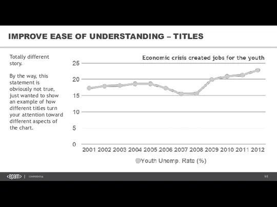
Totally different story.
By the way, this statement
IMPROVE EASE OF UNDERSTANDING – TITLES
Totally different story.
By the way, this statement
Слайд 69IMPROVE EASE OF UNDERSTANDING – CHART JUNK
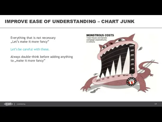
Everything that is not necessary
„Let’s make
IMPROVE EASE OF UNDERSTANDING – CHART JUNK
Everything that is not necessary
„Let’s make
Слайд 705. UX & UI
VISUAL STORYTELLING &DATA VISUALIZATION BEST PRACTICES
5. UX & UI
VISUAL STORYTELLING &DATA VISUALIZATION BEST PRACTICES

Слайд 71UNDERSTANDING UI ELEMENTS & PRINCIPLES
Know your audience
The essence of interface
The MAYA principle
Input
UNDERSTANDING UI ELEMENTS & PRINCIPLES
Know your audience
The essence of interface
The MAYA principle
Input

Слайд 72KNOW YOUR AUDIENCE
START WITH THE WHY BEHIND THE HOW
PERSONAS ARE FICTIONAL REPRESENTATIONS
KNOW YOUR AUDIENCE
START WITH THE WHY BEHIND THE HOW
PERSONAS ARE FICTIONAL REPRESENTATIONS
Слайд 73THE ESSENCE OF INTERFACE
Don’t look at interface as just screens and buttons,
But
THE ESSENCE OF INTERFACE
Don’t look at interface as just screens and buttons,
But
Слайд 74The MAYA Principle
Your goal when designing the UI of an analysis is
The MAYA Principle
Your goal when designing the UI of an analysis is
Слайд 75UNDERSTANDING VISUAL ELEMENTS OF UI
Contrast
Color Theory
Color Schemes
Typography
UNDERSTANDING VISUAL ELEMENTS OF UI
Contrast
Color Theory
Color Schemes
Typography

Слайд 76GESTALT PRINCIPLES
„Gestalt is a psychology term which means "unified whole". It refers
GESTALT PRINCIPLES
„Gestalt is a psychology term which means "unified whole". It refers
Слайд 77LAYOUT
LAYOUT
Слайд 78LAYOUT – KEY PRINCIPLES
LOGICAL
EFFICIENT
INFORMATIVE
USER CENTERED DESIGN
LAYOUT – KEY PRINCIPLES
LOGICAL
EFFICIENT
INFORMATIVE
USER CENTERED DESIGN
Слайд 79CREATING VISUAL ORGANIZATION
Scanning patterns
Contrast: Generating interest
Color, size and space
Know your auidence
CREATING VISUAL ORGANIZATION
Scanning patterns
Contrast: Generating interest
Color, size and space
Know your auidence

Слайд 80SCANNING PATTERNS – F-PATTERN
Common scanning pattern for text heavy content.
Users will rarely
SCANNING PATTERNS – F-PATTERN
Common scanning pattern for text heavy content.
Users will rarely
Слайд 81SCANNING PATTERNS – Z-PATTERN
Common scanning pattern for pages that are not centered
SCANNING PATTERNS – Z-PATTERN
Common scanning pattern for pages that are not centered
Слайд 82CONTRAST: GENERATING INTEREST
Contrast is the occurance of two different elements positioned close
CONTRAST: GENERATING INTEREST
Contrast is the occurance of two different elements positioned close
Слайд 83COLOR, SIZE AND SPACE
I. Colors
Bright colors stand out from muted colors
Certain colors
COLOR, SIZE AND SPACE
I. Colors
Bright colors stand out from muted colors
Certain colors
Слайд 84INPUT CONTROLS
Without interaction, an interface would just be a ’face’.
Users want
INPUT CONTROLS
Without interaction, an interface would just be a ’face’.
Users want
Слайд 85NAVIGATION
It’s hard to appreciate an analysis if you are lost, which is
NAVIGATION
It’s hard to appreciate an analysis if you are lost, which is
Слайд 86ANIMATIONS
WHY?
1. The eye is drawn to movement
An animated icon will signal
ANIMATIONS
WHY?
1. The eye is drawn to movement
An animated icon will signal
Слайд 87GUIDED ACTIONS
Guided actions can be used by emphasizing key functions, controls and
GUIDED ACTIONS
Guided actions can be used by emphasizing key functions, controls and

Слайд 88CONTRAST
I. Light vs Dark
Darker colors for pushed buttons, because it adds depth
II.
CONTRAST
I. Light vs Dark
Darker colors for pushed buttons, because it adds depth
II.
Слайд 89COLOR THEORY
Color theory is a science of its own.
Just tweaking the
COLOR THEORY
Color theory is a science of its own. Just tweaking the
Слайд 90COLOR SCHEMES
Triadic – the most basic and balanced structure
HOW: on the 12-step
COLOR SCHEMES
Triadic – the most basic and balanced structure
HOW: on the 12-step
Слайд 91TYPOGRAPHY
Measure the Measure - /measure=width of a body type/
The ideal amound of
TYPOGRAPHY
Measure the Measure - /measure=width of a body type/
The ideal amound of
Слайд 926. STORYTELLING
VISUAL STORYTELLING &DATA VISUALIZATION BEST PRACTICES
6. STORYTELLING
VISUAL STORYTELLING &DATA VISUALIZATION BEST PRACTICES

Слайд 93THE IMPORTANCE OF STORYTELLING
Most organizations recognize that being a successful, data-driven company
THE IMPORTANCE OF STORYTELLING
Most organizations recognize that being a successful, data-driven company
Слайд 94THE IMPORTANCE OF STORYTELLING
Data journalism (and analytics in a broader sense) is
THE IMPORTANCE OF STORYTELLING
Data journalism (and analytics in a broader sense) is
Слайд 95THE IMPORTANCE OF STORYTELLING
Be aware of your audience.
Dell Executive Strategist Jim
THE IMPORTANCE OF STORYTELLING
Be aware of your audience.
Dell Executive Strategist Jim
Слайд 96HOWEVER
HOWEVER
Слайд 97WHY DO WE USE STORIES IN BUSINESS ANALYTICS?
Every important decision is based
WHY DO WE USE STORIES IN BUSINESS ANALYTICS?
Every important decision is based
Слайд 98WHY?
PEOPLE ARE PROGRAMMED TO SEEK OUT VISUAL CONTENT.
Our memory does not store
WHY?
PEOPLE ARE PROGRAMMED TO SEEK OUT VISUAL CONTENT.
Our memory does not store
Слайд 99THE STORY IN DATA VISUALIZATION
WHAT
WHY
HOW
State of business, key measures
Changes vs. previous cycle,
THE STORY IN DATA VISUALIZATION
WHAT
WHY
HOW
State of business, key measures
Changes vs. previous cycle,
Слайд 100UNDERSTAND AND GUIDE
WHAT is happening in my business?
Market trends
Company performance (shares)
WHY is
UNDERSTAND AND GUIDE
WHAT is happening in my business?
Market trends
Company performance (shares)
WHY is

Слайд 101STEPS TO TELLING YOUR STORY
1. Understand your Data
2. Identify Your Story –
STEPS TO TELLING YOUR STORY
1. Understand your Data
2. Identify Your Story –
Слайд 102UNDERSTAND YOUR DATA
Who collected it?
Why did they collect it?
What audience was this
UNDERSTAND YOUR DATA
Who collected it?
Why did they collect it?
What audience was this
Слайд 103IDENTIFY YOUR STORY
You have the hard facts, you need to decide the
IDENTIFY YOUR STORY
You have the hard facts, you need to decide the
Слайд 104CREATE A GOOD STRUCTURE
A well-structured visual provides clarification, reveals trends, and highlights your key
CREATE A GOOD STRUCTURE
A well-structured visual provides clarification, reveals trends, and highlights your key
Слайд 105GUIDE, DO NOT PUSH
The facts should encourage a thorough understanding and learning
GUIDE, DO NOT PUSH
The facts should encourage a thorough understanding and learning
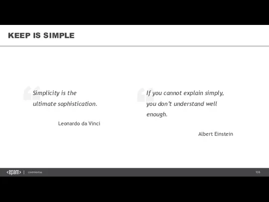
Слайд 106KEEP IS SIMPLE
KEEP IS SIMPLE
Слайд 107+1 LEARNING BEFORE YOU START
NEVER UNDERESTIMATE THE IMPORTANCE OF USER EXPERIENCE
KNOW YOUR
+1 LEARNING BEFORE YOU START
NEVER UNDERESTIMATE THE IMPORTANCE OF USER EXPERIENCE
KNOW YOUR

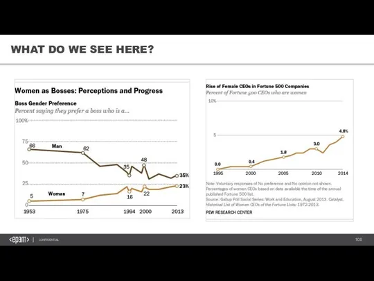
Слайд 108WHAT DO WE SEE HERE?
WHAT DO WE SEE HERE?
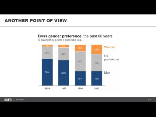
Слайд 109ANOTHER POINT OF VIEW
ANOTHER POINT OF VIEW
Слайд 110TAKEAWAYS
+ 1 TAKEAWAY
ALWAYS DESIGN FOR YOUR AUDIENCE.
1. Understand your Data
2. Identify Your
TAKEAWAYS
+ 1 TAKEAWAY
ALWAYS DESIGN FOR YOUR AUDIENCE.
1. Understand your Data
2. Identify Your
Слайд 1117. EPAM VISUALIZATION STANDARDS
VISUAL STORYTELLING &DATA VISUALIZATION BEST PRACTICES
7. EPAM VISUALIZATION STANDARDS
VISUAL STORYTELLING &DATA VISUALIZATION BEST PRACTICES

Слайд 112VISUALIZATION STANDARDS
Use the company standard colors scheme so that we ensure recognition
VISUALIZATION STANDARDS
Use the company standard colors scheme so that we ensure recognition
Слайд 113VISUALIZATION STANDARDS
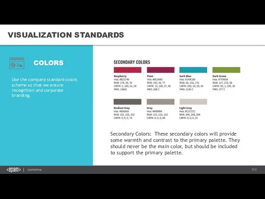
Use the company standard colors scheme so that we ensure recognition
VISUALIZATION STANDARDS
Use the company standard colors scheme so that we ensure recognition
Слайд 114VISUALIZATION STANDARDS
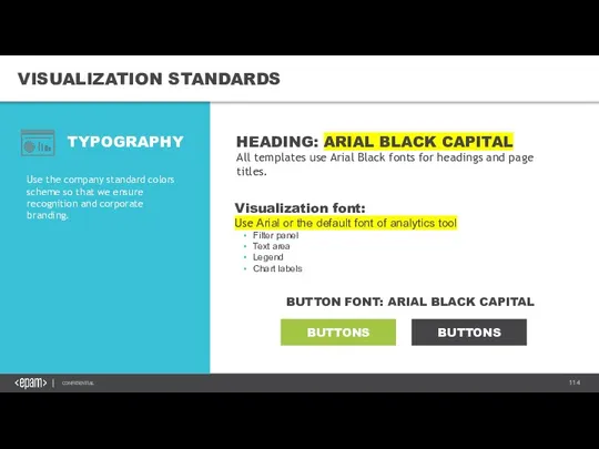
Use the company standard colors scheme so that we ensure recognition
VISUALIZATION STANDARDS
Use the company standard colors scheme so that we ensure recognition
Слайд 115VISUALIZATION STANDARDS
Use the company standard colors scheme so that we ensure recognition
VISUALIZATION STANDARDS
Use the company standard colors scheme so that we ensure recognition
Слайд 116VISUALIZATION STANDARDS
Use the company standard colors scheme so that we ensure recognition
VISUALIZATION STANDARDS
Use the company standard colors scheme so that we ensure recognition
Слайд 117VISUALIZATION STANDARDS
COLORS USED IN VISUALIZATIONS
MONOCHROME SAMPLES
Use the company standard colors scheme so
VISUALIZATION STANDARDS
COLORS USED IN VISUALIZATIONS
MONOCHROME SAMPLES
Use the company standard colors scheme so
Слайд 118VISUALIZATION STANDARDS
VISUALIZATION WIDGETS
MONOCHROME SAMPLES
The following pages help to set colors of the
VISUALIZATION STANDARDS
VISUALIZATION WIDGETS
MONOCHROME SAMPLES
The following pages help to set colors of the
Слайд 119VISUALIZATION STANDARDS
VISUALIZATION WIDGETS
BUTTONS:
A button consists of text and/or an image that clearly
VISUALIZATION STANDARDS
VISUALIZATION WIDGETS
BUTTONS:
A button consists of text and/or an image that clearly
Слайд 120VISUALIZATION STANDARDS
VISUALIZATION WIDGETS
SLIDING PANEL:
The sliding filter panel does not have a fixed
VISUALIZATION STANDARDS
VISUALIZATION WIDGETS
SLIDING PANEL:
The sliding filter panel does not have a fixed
Слайд 121VISUALIZATION STANDARDS
TEMPLATE
SAMPLE I
Use Case
Extension Demo
VISUALIZATION STANDARDS
TEMPLATE
SAMPLE I
Use Case
Extension Demo
 Игры, основанные на реальных исторических событиях
 Операционная система MacOS
 Как найти свою первую работу программистом?
 Информационные технологии в турагентской деятельности
 Подключение смс уведомлений
 Цифровая схемотехника. Системы счисления. Логические элементы
 Алгоритмы с ветвящейся структурой. Контрольная работа
 Язык программирования Java
 Содержание технической документации и методы разработки
 Анализ платформ по реализации web-решений
 Компьютерная графика
 Что такое Google
 Preprocessors and SCSS
 Представление чисел в компьютере. Математические основы информатики
 Язык программирования Pascal
 Клуба журналистики ПМК Альфа
 Интернет-угрозы в молодёжной среде
 SQLXML. Синтаксис XMLFOREST
 Информационные ресурсы в активе учителя биологии
 Анализ и формирование информационного поля
 Интернет – телевидение (IPTV)
 Информатика. Информация. Данные. Кодирование информации
 Мир 3Д. Моделирование брелка
 Занятие 1. Понятие об основных законах регулирования. Пропорциональный закон регулирования
 Презентация на тему Элементы статистической обработки данных
  Моделирование и формализация
 Digital versatile disc
 Monatsübersicht august. Посещаемость, время на сайте