 Slaidy.com
- Кроссбраузерная CSS-вёрстка

Содержание
- 2. Часть I. Что такое CSS Cascading Style Sheets (Каскадные таблицы стилей) Определяют, каким образом отображать HTML-элементы
- 3. Стиль и расположение
- 4. Синтаксис. Селектор {свойство: значение;} .right, li { text-align: right; color: red; font-family: Times; border: 1 solid
- 5. Последовательность наложения Стили браузера по умолчанию Внешний css-файл Внутреннее объявление в блоке Внутреннее объявление в теге
- 6. Ужасы CSS-селекторов ☺ (1 из 3) Descendant Combinator div.sidebar p Любой параграф, вложенный в блок с
- 7. Ужасы CSS-селекторов ☺ (2 из 3) Child Combinator /Pseudo-element selector #maincontent blockquote > p:first-child:first-line Первая строка
- 8. Ужасы CSS-селекторов ☺ (3 из 3) Adjacent Sibling Combinator div.sidebar p + p Любой параграф, перед
- 9. Box model. Border/Margin/Padding (1 из 2) http://www.w3.org/TR/CSS21/box.html
- 10. Box model. Border/Margin/Padding (2 из 2) Любое из этих трёх свойств может быть разбито на 4
- 11. CSS Reset Чтобы избавиться от браузерных различий зачастую необходим CSS Reset. Простейший вариант: * { margin:
- 12. @media Rule Метод 1: @media screen { p.test {font-family:verdana,sans-serif; font-size:14px} } @media print { p.test {font-family:times,serif;
- 13. Часть II. CSS-Вёрстка. Категории макетов Фиксированной ширины (fixed width) По ширине браузера с авто-масштабированием (liquid layout)
- 14. Популярные виды макетов http://matthewjamestaylor.com/blog/perfect-multi-column-liquid-layouts
- 15. 3 column liquid layout http://matthewjamestaylor.com/blog/perfect-3-column.htm Рис. 1 Размерности блоков Рис.2 Структура вложенности
- 16. Пример макета с содержимым http://matthewjamestaylor.com/blog/perfect-3-column.htm
- 17. Спецификации не кроссбраузерны! http://www.w3.org/TR/CSS21/visuren.html#fixed-positioning
- 18. Как же верстать? http://matthewjamestaylor.com/blog/perfect-3-column.htm
- 19. CSS магия (1 из 3) #header { clear:both; float:left; width:100%; border-bottom:1px solid #000; } #footer {
- 20. CSS магия (2 из 3) .colmask { position:relative; /* This fixes the IE7 overflow hidden bug
- 21. CSS магия (3 из 3) /* 3 Column settings */ .threecol { background:#eee; /* right column
- 22. Фиксированный «подвал» CSS html, body { margin:0; padding:0; height:100%; } #container { min-height:100%; position:relative; } #header
- 24. Скачать презентацию
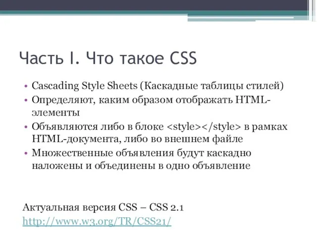
Слайд 2Часть I. Что такое CSS
Cascading Style Sheets (Каскадные таблицы стилей)
Определяют, каким образом
Часть I. Что такое CSS
Cascading Style Sheets (Каскадные таблицы стилей)
Определяют, каким образом
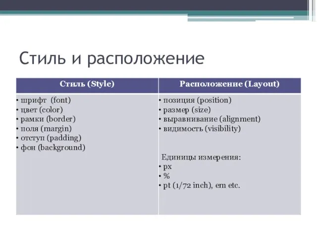
Слайд 3Стиль и расположение
Стиль и расположение
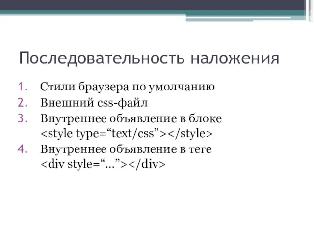
Слайд 5Последовательность наложения
Стили браузера по умолчанию
Внешний css-файл
Внутреннее объявление в блоке
Внутреннее объявление в
Последовательность наложения
Стили браузера по умолчанию
Внешний css-файл
Внутреннее объявление в блоке
Внутреннее объявление в
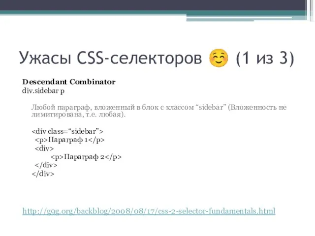
Слайд 6Ужасы CSS-селекторов ☺ (1 из 3)
Descendant Combinator
div.sidebar p
Любой параграф, вложенный в блок
Ужасы CSS-селекторов ☺ (1 из 3)
Descendant Combinator
div.sidebar p
Любой параграф, вложенный в блок
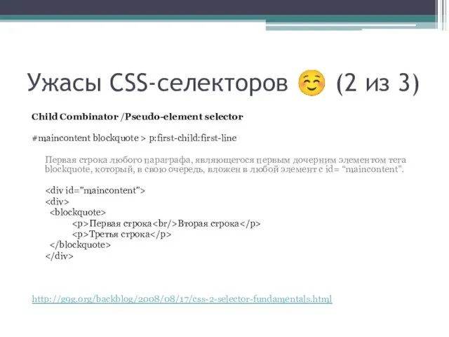
Слайд 7Ужасы CSS-селекторов ☺ (2 из 3)
Child Combinator /Pseudo-element selector
#maincontent blockquote > p:first-child:first-line
Первая
Ужасы CSS-селекторов ☺ (2 из 3)
Child Combinator /Pseudo-element selector
#maincontent blockquote > p:first-child:first-line
Первая
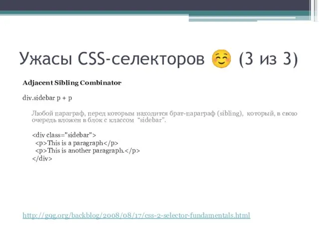
Слайд 8Ужасы CSS-селекторов ☺ (3 из 3)
Adjacent Sibling Combinator
div.sidebar p + p
Любой
Ужасы CSS-селекторов ☺ (3 из 3)
Adjacent Sibling Combinator
div.sidebar p + p
Любой
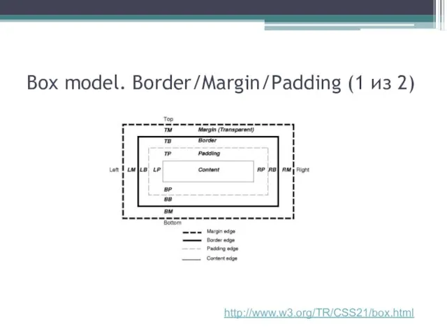
Слайд 9Box model. Border/Margin/Padding (1 из 2)
http://www.w3.org/TR/CSS21/box.html
Box model. Border/Margin/Padding (1 из 2)
http://www.w3.org/TR/CSS21/box.html
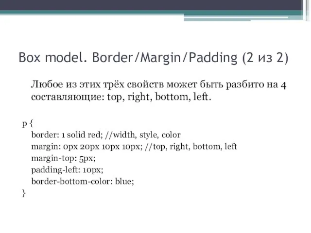
Слайд 10Box model. Border/Margin/Padding (2 из 2)
Любое из этих трёх свойств может быть
Box model. Border/Margin/Padding (2 из 2)
Любое из этих трёх свойств может быть
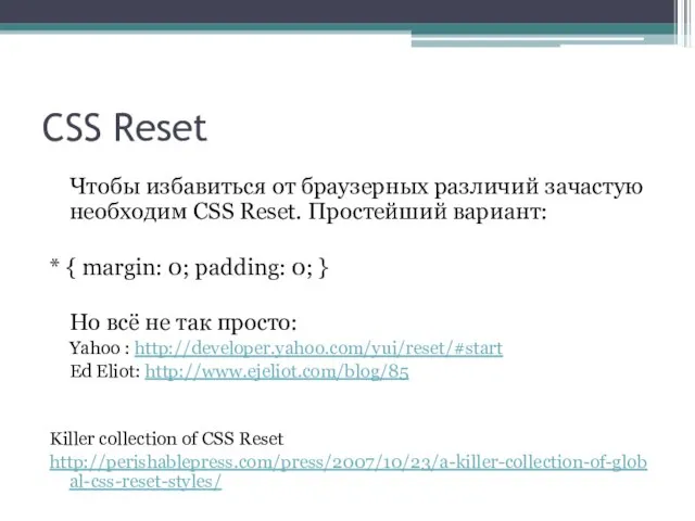
Слайд 11CSS Reset
Чтобы избавиться от браузерных различий зачастую необходим CSS Reset. Простейший вариант:
*
CSS Reset
Чтобы избавиться от браузерных различий зачастую необходим CSS Reset. Простейший вариант:
*
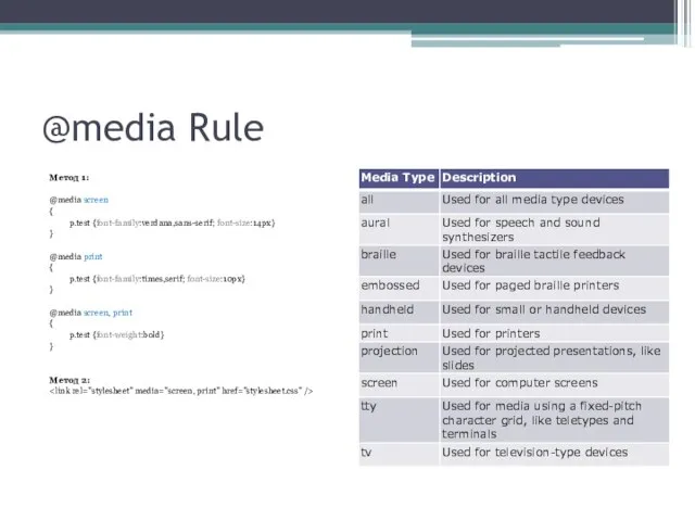
Слайд 12@media Rule
Метод 1:
@media screen
{
p.test {font-family:verdana,sans-serif; font-size:14px}
}
@media print
{
@media Rule
Метод 1:
@media screen
{
p.test {font-family:verdana,sans-serif; font-size:14px}
}
@media print
{
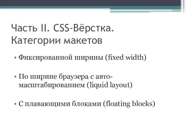
Слайд 13Часть II. CSS-Вёрстка.
Категории макетов
Фиксированной ширины (fixed width)
По ширине браузера с
Часть II. CSS-Вёрстка.
Категории макетов
Фиксированной ширины (fixed width)
По ширине браузера с
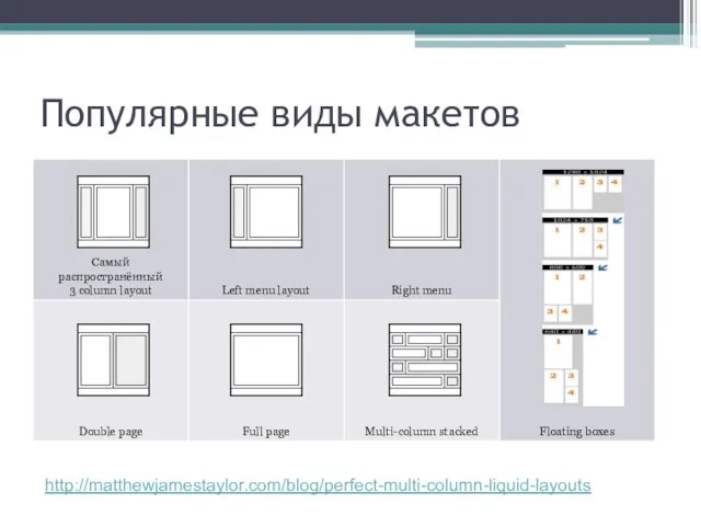
Слайд 14Популярные виды макетов
http://matthewjamestaylor.com/blog/perfect-multi-column-liquid-layouts
Популярные виды макетов
http://matthewjamestaylor.com/blog/perfect-multi-column-liquid-layouts
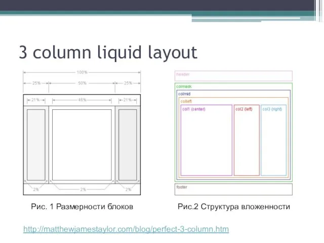
Слайд 153 column liquid layout
http://matthewjamestaylor.com/blog/perfect-3-column.htm
Рис. 1 Размерности блоков
Рис.2 Структура вложенности
3 column liquid layout
http://matthewjamestaylor.com/blog/perfect-3-column.htm
Рис. 1 Размерности блоков
Рис.2 Структура вложенности
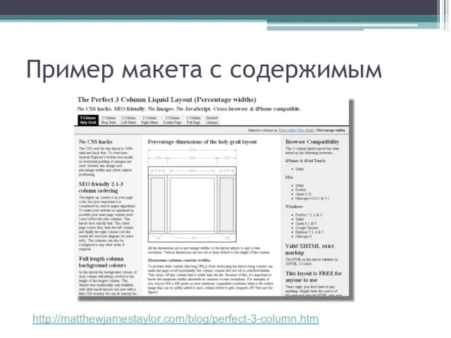
Слайд 16Пример макета с содержимым
http://matthewjamestaylor.com/blog/perfect-3-column.htm
Пример макета с содержимым
http://matthewjamestaylor.com/blog/perfect-3-column.htm
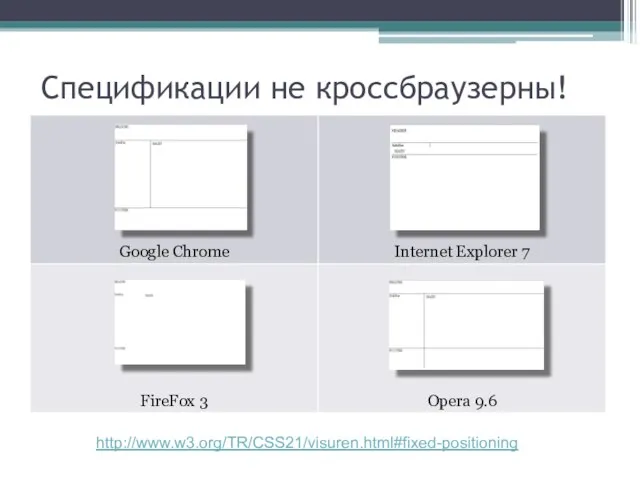
Слайд 17Спецификации не кроссбраузерны!
http://www.w3.org/TR/CSS21/visuren.html#fixed-positioning
Спецификации не кроссбраузерны!
http://www.w3.org/TR/CSS21/visuren.html#fixed-positioning
Слайд 18Как же верстать?
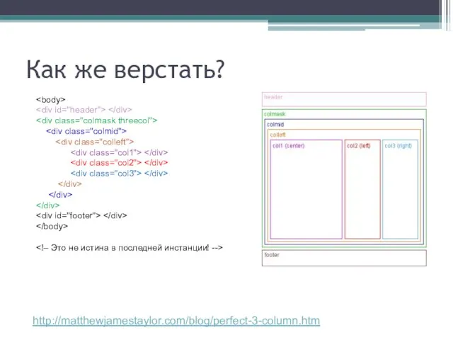
http://matthewjamestaylor.com/blog/perfect-3-column.htm
Как же верстать?
http://matthewjamestaylor.com/blog/perfect-3-column.htm
Слайд 19CSS магия (1 из 3)
#header {
clear:both;
float:left;
width:100%;
border-bottom:1px solid #000;
}
#footer {
clear:both;
float:left;
width:100%;
border-top:1px solid #000;
}
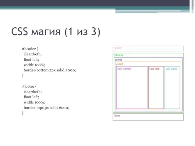
CSS магия (1 из 3)
#header {
clear:both;
float:left;
width:100%;
border-bottom:1px solid #000;
}
#footer {
clear:both;
float:left;
width:100%;
border-top:1px solid #000;
}
Слайд 20CSS магия (2 из 3)
.colmask {
position:relative; /* This fixes the IE7 overflow
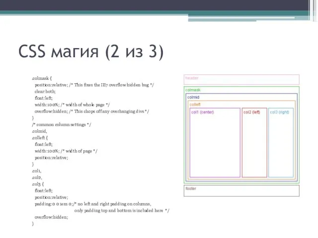
CSS магия (2 из 3)
.colmask {
position:relative; /* This fixes the IE7 overflow
Слайд 21CSS магия (3 из 3)
/* 3 Column settings */
.threecol { background:#eee; /*
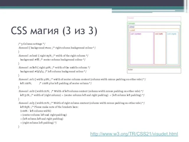
CSS магия (3 из 3)
/* 3 Column settings */
.threecol { background:#eee; /*
Слайд 22Фиксированный «подвал»
CSS
html, body {
margin:0; padding:0; height:100%; }
#container { min-height:100%; position:relative;
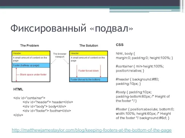
Фиксированный «подвал»
CSS
html, body {
margin:0; padding:0; height:100%; }
#container { min-height:100%; position:relative;
 Зачет ОЗП 2022-2023
 Общественная мысль России 30-х – 50-х гг. XIX века
 Скандинавские боги. Один
 Сухие листья в интерьере
 Презентация COLIBRI:краткое знакомство с программойдля решения комплекса задач по маржинальному кредитованию клиентов брокера
 Флирт и харассмент
 Дружба
 Switzerland
 Статистические методы управления качеством
 Презентация на тему Водоросли
 Путешествие по Вселенным. Часть 1
 Построение занятия на основе целеполагания
 Зимние виды спорта
 Велосипеды. Строение, виды, ремонт (занятие №2)
 7.6.
7.6. Подготовка к ЕНТ
 Дрожжин Спиридон Дмитриевич
 Удобный блоггинг для начинающих (Урок 7)
 Реализация региональной программы профориентационной работы в Костромской области
 Текстовые задачи на ЕГЭ
 bb5881874d90e443
 Направления совершенствования энергосбережения РУП Гродноэнерго, филиал Лидские электрические сети
 Многообразие графического дизайна
 Фонтаны мира от древности до наших дней
 Контекстная реклама: выбор форматов и оценка эффективности
 Установка на практику 1
 Теория лидерства.Общие подходы.
 Свойства четырёхугольников. Решение задач.