- STUDYING PHENOMENA AND PROCESSES

Содержание
- 2. DATA SETS CLASSIFICATION By number of variables there are for each elementary unit (=people, companies, countries,
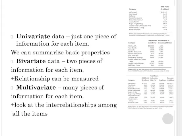
- 3. Univariate data – just one piece of information for each item. We can summarize basic properties
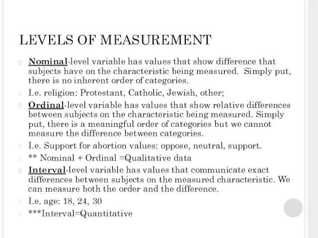
- 4. LEVELS OF MEASUREMENT Nominal-level variable has values that show difference that subjects have on the characteristic
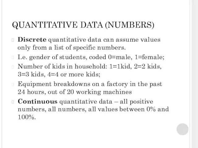
- 5. QUANTITATIVE DATA (NUMBERS) Discrete quantitative data can assume values only from a list of specific numbers.
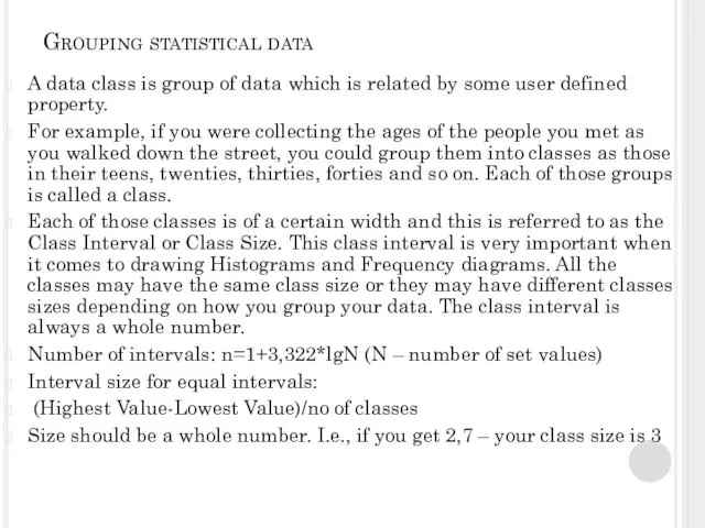
- 6. Grouping statistical data A data class is group of data which is related by some user
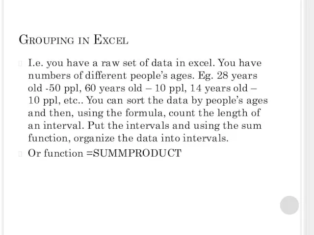
- 7. Grouping in Excel I.e. you have a raw set of data in excel. You have numbers
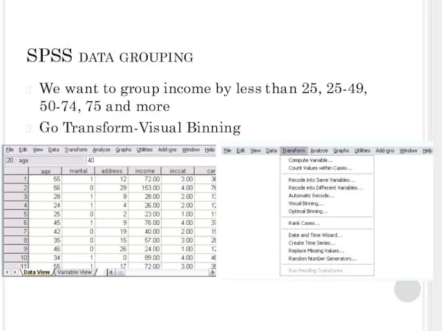
- 8. SPSS data grouping We want to group income by less than 25, 25-49, 50-74, 75 and
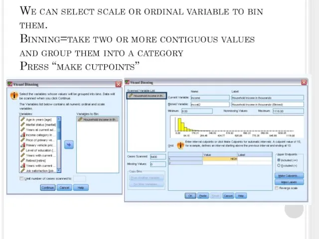
- 9. We can select scale or ordinal variable to bin them. Binning=take two or more contiguous values
- 10. We can select “Equal with Intervals” and put in First Cutpoint Location, Number of Cutpoints and
- 11. We can make labels if we want and choose to exclude or include the last number
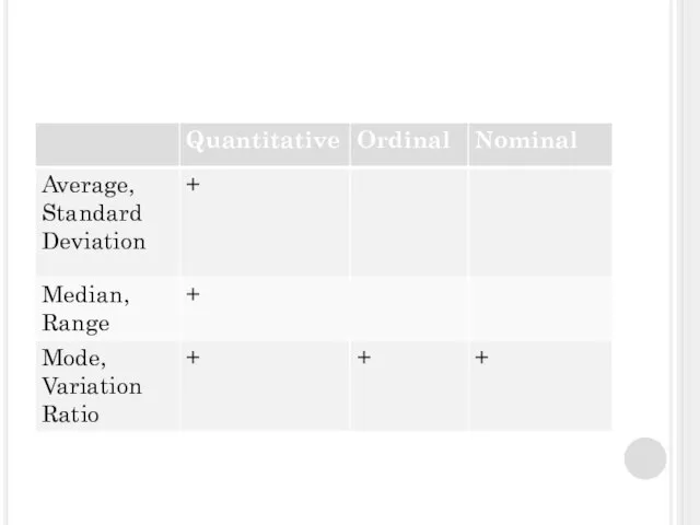
- 12. DESCRIPTIVE STATISTICS Measures of central tendency - identify the most typical value or best representative of
- 13. Descriptive statistics: Nominal level Central Tendency – mode (the most common value of the variable) Dispersion
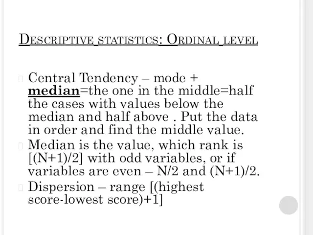
- 14. Descriptive statistics: Ordinal level Central Tendency – mode + median=the one in the middle=half the cases
- 15. Descriptive statistics: Interval level Central tendency: mean [=average] +Weighed Average Dispersion – Standard Deviation Sx= Variation
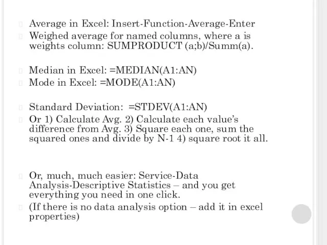
- 17. Average in Excel: Insert-Function-Average-Enter Weighed average for named columns, where a is weights column: SUMPRODUCT (a;b)/Summ(a).
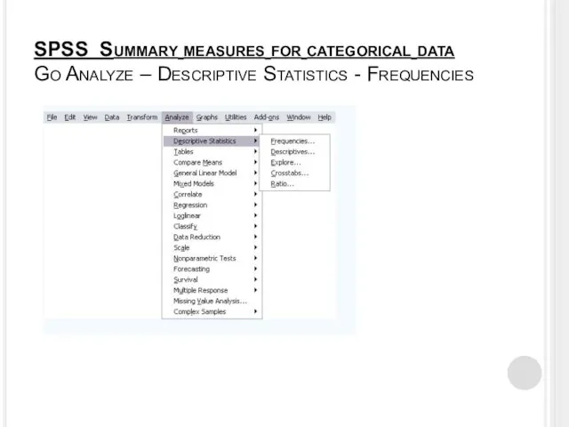
- 18. SPSS Summary measures for categorical data Go Analyze – Descriptive Statistics - Frequencies
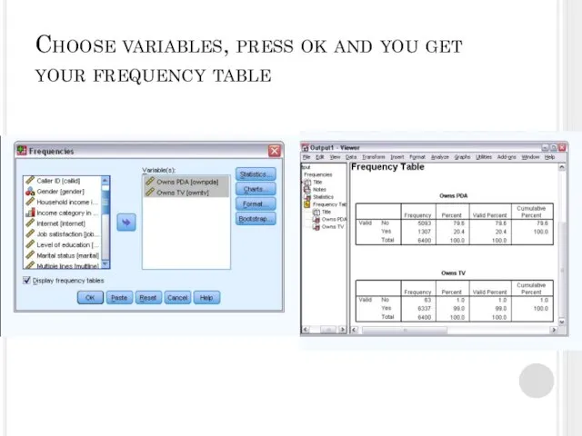
- 19. Choose variables, press ok and you get your frequency table
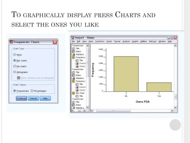
- 20. To graphically display press Charts and select the ones you like
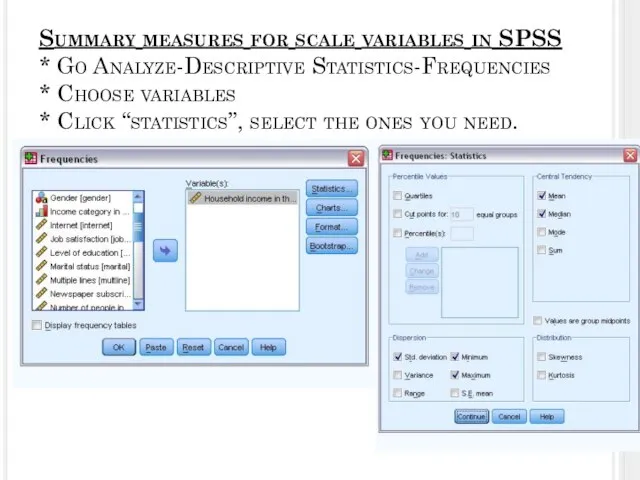
- 21. Summary measures for scale variables in SPSS * Go Analyze-Descriptive Statistics-Frequencies * Choose variables * Click
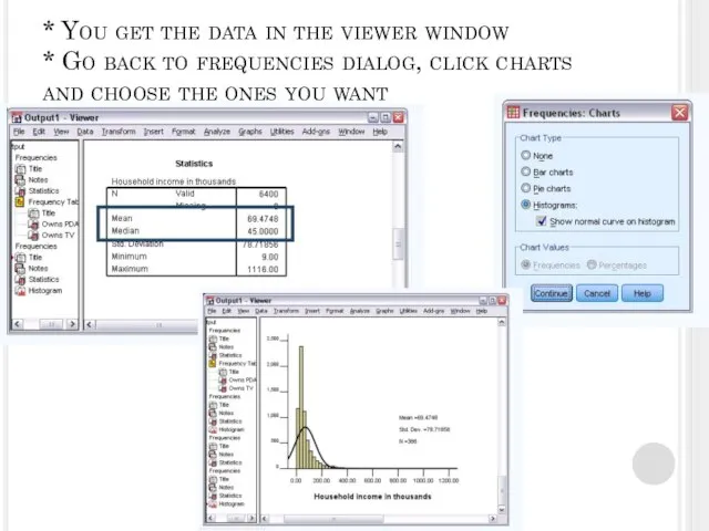
- 22. * You get the data in the viewer window * Go back to frequencies dialog, click
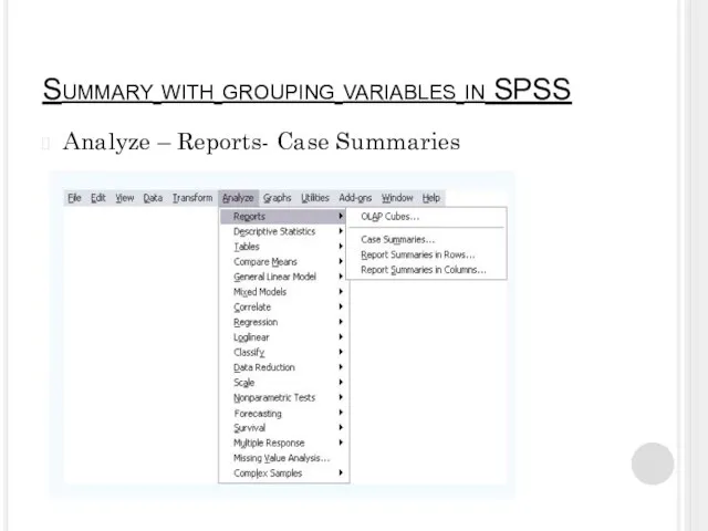
- 23. Summary with grouping variables in SPSS Analyze – Reports- Case Summaries
- 24. * SELECT THE VARIABLE TO BE SUMMARIZED AND A GROUPING VARIABLE, * DESELECT “DISPLAY CASES” AND
- 25. SELECT MEAN, MEDIAN, MINIMUM, MAXIMUM (or any other you might need) * CLICK CONTINUE AND CLICK
- 26. * YOU GET THE DATA GROUPED BY THE VARIABLE. * ALL THE DESCRIPTIVES ARE GIVEN FOR
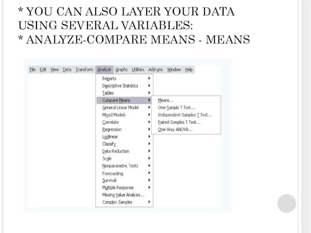
- 27. * YOU CAN ALSO LAYER YOUR DATA USING SEVERAL VARIABLES: * ANALYZE-COMPARE MEANS - MEANS
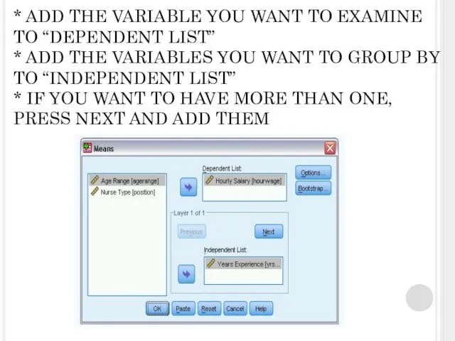
- 28. * ADD THE VARIABLE YOU WANT TO EXAMINE TO “DEPENDENT LIST” * ADD THE VARIABLES YOU
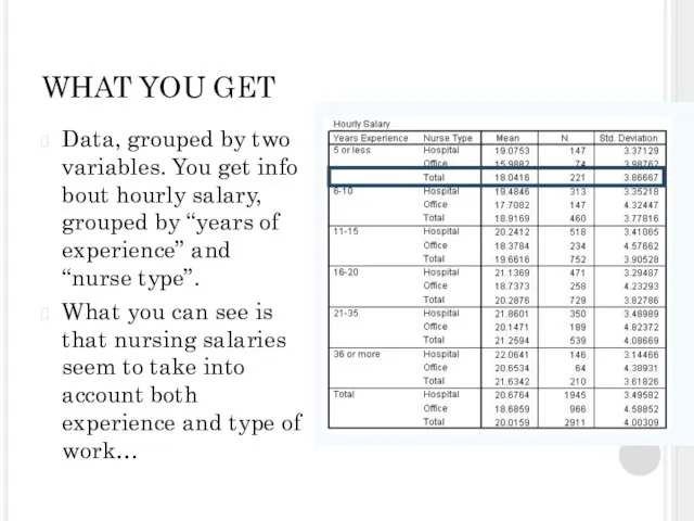
- 29. WHAT YOU GET Data, grouped by two variables. You get info bout hourly salary, grouped by
- 30. You can also select certain cases that follow the rule you choose (using if=, if> and
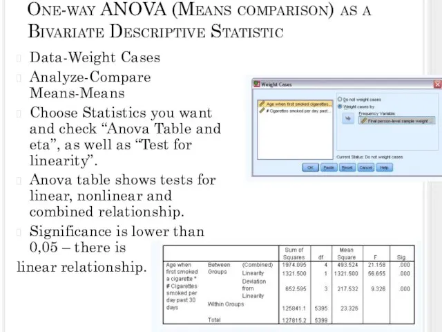
- 31. One-way ANOVA (Means comparison) as a Bivariate Descriptive Statistic Data-Weight Cases Analyze-Compare Means-Means Choose Statistics you
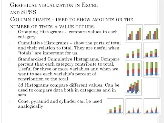
- 32. Graphical visualization in Excel and SPSS Column charts - used to show amounts or the number
- 33. Graphs Can show continuous change of values over time on the same scale. Are perfect for
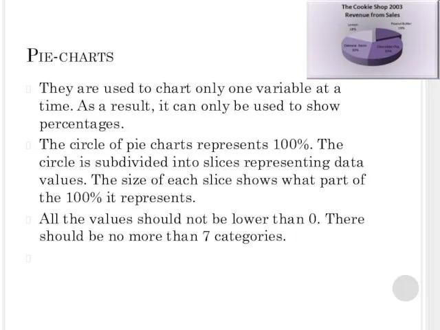
- 34. Pie-charts They are used to chart only one variable at a time. As a result, it
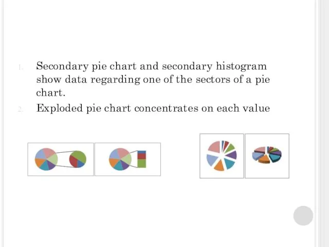
- 35. Secondary pie chart and secondary histogram show data regarding one of the sectors of a pie
- 36. Bar charts Are almost the same as histograms, they illustrate comparison of different elements These are
- 37. Area chart Area charts are much like line charts, but they display different colors in the
- 38. XY (scatter) charts Scatter charts show the relationships among the numeric values in several data series,
- 39. Stock charts Most often used to illustrate the fluctuation of stock prices. However, this chart may
- 40. Surface charts A surface chart is useful when you want to find optimum combinations between two
- 41. Doughnut charts Like a pie chart, a doughnut chart shows the relationship of parts to a
- 42. Bubble chart Bubble or bubble with 3-D effect Both bubble chart types compare sets of three
- 43. Radar chart Radar charts compare the aggregate values of several data series. Radar charts display changes
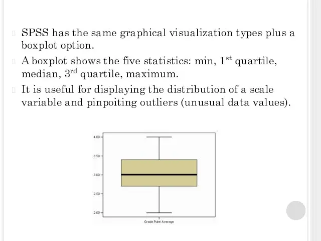
- 44. SPSS has the same graphical visualization types plus a boxplot option. A boxplot shows the five
- 45. Graphical visualization in SPSS
- 46. * Add variables, dragging them from the variables list to the canvas. * Choose graph type
- 47. I.e. you drag Job Satisfaction to X axis, Household Income to Y axis, choose the type
- 49. Скачать презентацию
Слайд 3Univariate data – just one piece of information for each item.
We
Univariate data – just one piece of information for each item.
We
Слайд 4LEVELS OF MEASUREMENT
Nominal-level variable has values that show difference that subjects have
LEVELS OF MEASUREMENT
Nominal-level variable has values that show difference that subjects have
Слайд 5QUANTITATIVE DATA (NUMBERS)
Discrete quantitative data can assume values only from a list
QUANTITATIVE DATA (NUMBERS)
Discrete quantitative data can assume values only from a list
Слайд 6Grouping statistical data
A data class is group of data which is related
Grouping statistical data
A data class is group of data which is related
Слайд 7Grouping in Excel
I.e. you have a raw set of data in excel.
Grouping in Excel
I.e. you have a raw set of data in excel.
Слайд 8SPSS data grouping
We want to group income by less than 25, 25-49,
SPSS data grouping
We want to group income by less than 25, 25-49,
Слайд 9We can select scale or ordinal variable to bin them.
Binning=take two or
We can select scale or ordinal variable to bin them. Binning=take two or
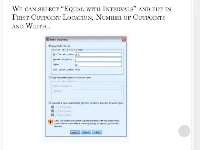
Слайд 10We can select “Equal with Intervals” and put in First Cutpoint Location,
We can select “Equal with Intervals” and put in First Cutpoint Location,
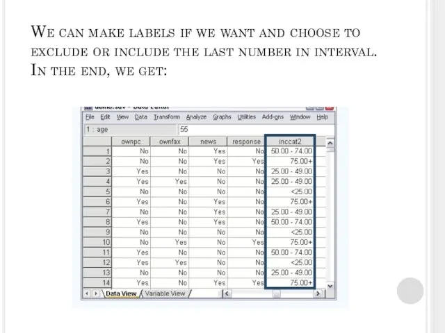
Слайд 11We can make labels if we want and choose to exclude or
We can make labels if we want and choose to exclude or
Слайд 12DESCRIPTIVE STATISTICS
Measures of central tendency - identify the most typical value or
DESCRIPTIVE STATISTICS
Measures of central tendency - identify the most typical value or
Слайд 13Descriptive statistics: Nominal level
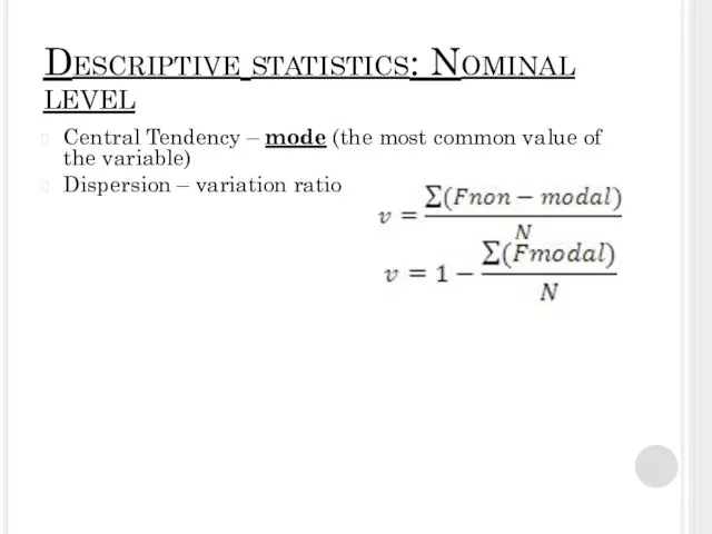
Central Tendency – mode (the most common value of
Descriptive statistics: Nominal level
Central Tendency – mode (the most common value of
Слайд 14Descriptive statistics: Ordinal level
Central Tendency – mode + median=the one in the
Descriptive statistics: Ordinal level
Central Tendency – mode + median=the one in the
Слайд 15Descriptive statistics: Interval level
Central tendency: mean [=average]
+Weighed Average
Dispersion – Standard Deviation Sx=
Variation
Descriptive statistics: Interval level
Central tendency: mean [=average]
+Weighed Average
Dispersion – Standard Deviation Sx=
Variation
![Descriptive statistics: Interval level Central tendency: mean [=average] +Weighed Average Dispersion –](/_ipx/f_webp&q_80&fit_contain&s_1440x1080/imagesDir/jpg/379041/slide-14.jpg)
Слайд 17Average in Excel: Insert-Function-Average-Enter
Weighed average for named columns, where a is weights
Average in Excel: Insert-Function-Average-Enter
Weighed average for named columns, where a is weights
Слайд 18SPSS Summary measures for categorical data
Go Analyze – Descriptive Statistics - Frequencies
SPSS Summary measures for categorical data
Go Analyze – Descriptive Statistics - Frequencies
Слайд 19Choose variables, press ok and you get your frequency table
Choose variables, press ok and you get your frequency table
Слайд 20To graphically display press Charts and select the ones you like
To graphically display press Charts and select the ones you like
Слайд 21Summary measures for scale variables in SPSS
* Go Analyze-Descriptive Statistics-Frequencies
* Choose variables
*
Summary measures for scale variables in SPSS * Go Analyze-Descriptive Statistics-Frequencies * Choose variables *
Слайд 22* You get the data in the viewer window
* Go back to
* You get the data in the viewer window * Go back to
Слайд 23Summary with grouping variables in SPSS
Analyze – Reports- Case Summaries
Summary with grouping variables in SPSS
Analyze – Reports- Case Summaries
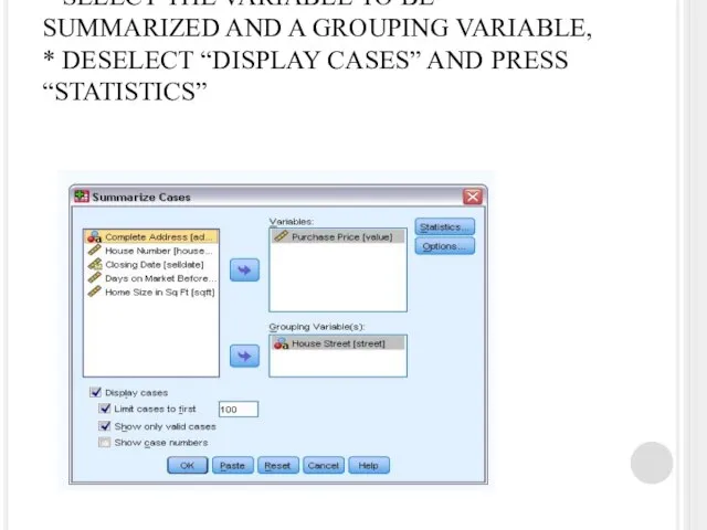
Слайд 24* SELECT THE VARIABLE TO BE SUMMARIZED AND A GROUPING VARIABLE,
*
* SELECT THE VARIABLE TO BE SUMMARIZED AND A GROUPING VARIABLE, *
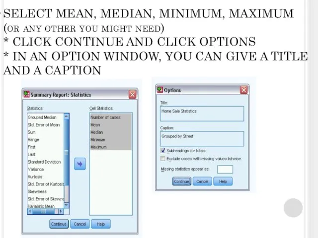
Слайд 25SELECT MEAN, MEDIAN, MINIMUM, MAXIMUM
(or any other you might need)
* CLICK
SELECT MEAN, MEDIAN, MINIMUM, MAXIMUM (or any other you might need) * CLICK
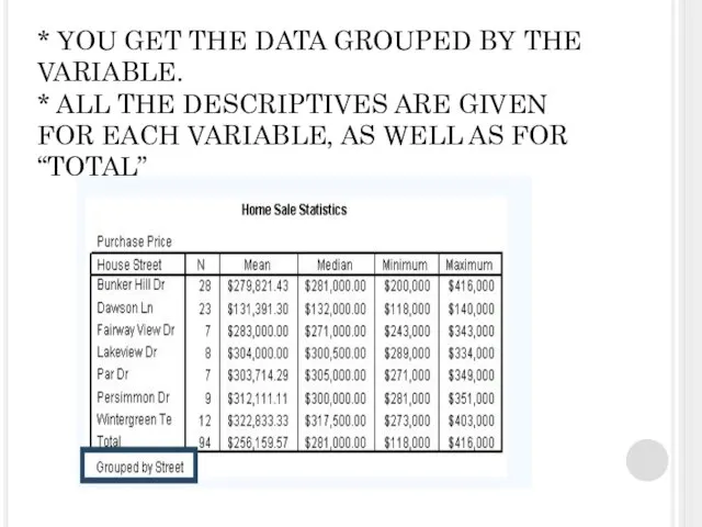
Слайд 26* YOU GET THE DATA GROUPED BY THE VARIABLE.
* ALL THE
* YOU GET THE DATA GROUPED BY THE VARIABLE. * ALL THE
Слайд 27* YOU CAN ALSO LAYER YOUR DATA USING SEVERAL VARIABLES:
* ANALYZE-COMPARE MEANS
* YOU CAN ALSO LAYER YOUR DATA USING SEVERAL VARIABLES: * ANALYZE-COMPARE MEANS
Слайд 28* ADD THE VARIABLE YOU WANT TO EXAMINE TO “DEPENDENT LIST”
* ADD
* ADD THE VARIABLE YOU WANT TO EXAMINE TO “DEPENDENT LIST” * ADD
Слайд 29WHAT YOU GET
Data, grouped by two variables. You get info bout hourly
WHAT YOU GET
Data, grouped by two variables. You get info bout hourly
Слайд 30You can also select certain cases that follow the rule you choose
You can also select certain cases that follow the rule you choose
Слайд 31One-way ANOVA (Means comparison) as a Bivariate Descriptive Statistic
Data-Weight Cases
Analyze-Compare Means-Means
Choose Statistics
One-way ANOVA (Means comparison) as a Bivariate Descriptive Statistic
Data-Weight Cases
Analyze-Compare Means-Means
Choose Statistics
Слайд 32Graphical visualization in Excel
and SPSS
Column charts - used to show amounts or
Graphical visualization in Excel and SPSS Column charts - used to show amounts or
Слайд 33Graphs
Can show continuous change of values over time on the same scale.
Graphs
Can show continuous change of values over time on the same scale.

Слайд 34Pie-charts
They are used to chart only one variable at a time. As
Pie-charts
They are used to chart only one variable at a time. As
Слайд 35Secondary pie chart and secondary histogram show data regarding one of the
Secondary pie chart and secondary histogram show data regarding one of the
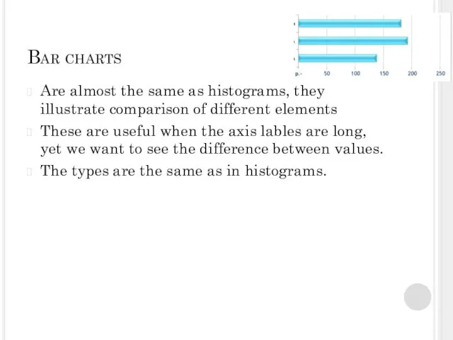
Слайд 36Bar charts
Are almost the same as histograms, they illustrate comparison of different
Bar charts
Are almost the same as histograms, they illustrate comparison of different
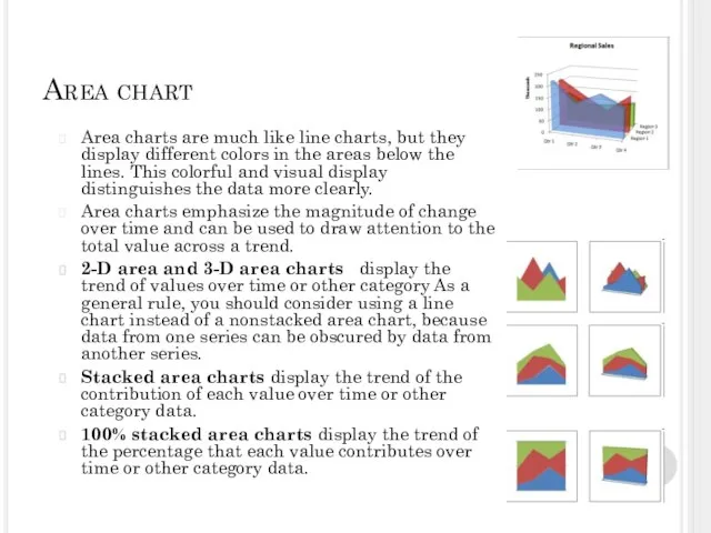
Слайд 37Area chart
Area charts are much like line charts, but they display different
Area chart
Area charts are much like line charts, but they display different
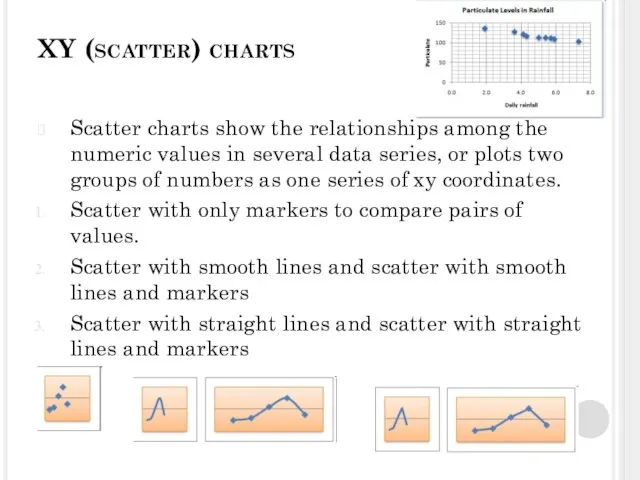
Слайд 38XY (scatter) charts
Scatter charts show the relationships among the numeric values in
XY (scatter) charts
Scatter charts show the relationships among the numeric values in
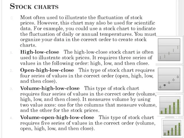
Слайд 39Stock charts
Most often used to illustrate the fluctuation of stock prices. However,
Stock charts
Most often used to illustrate the fluctuation of stock prices. However,
Слайд 40Surface charts
A surface chart is useful when you want to find optimum
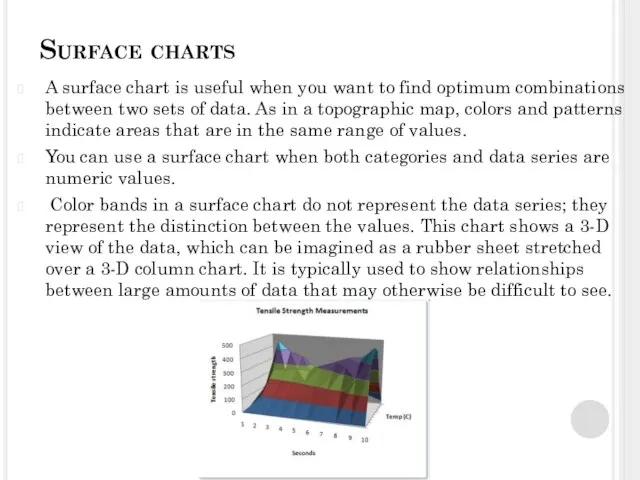
Surface charts
A surface chart is useful when you want to find optimum
Слайд 41Doughnut charts
Like a pie chart, a doughnut chart shows the relationship of
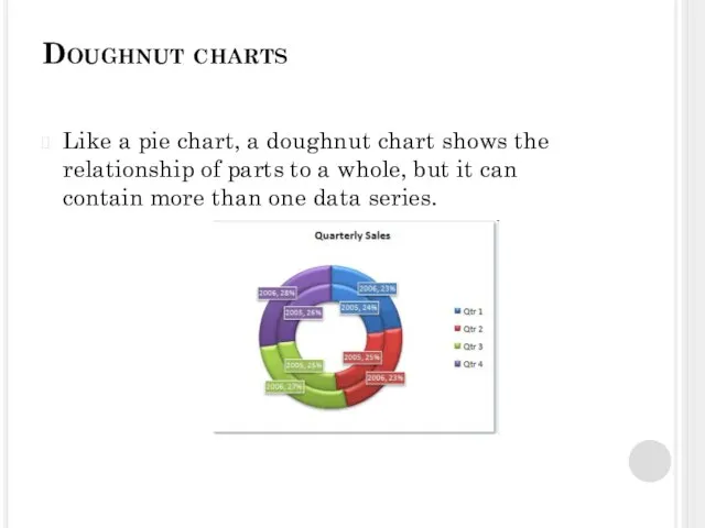
Doughnut charts
Like a pie chart, a doughnut chart shows the relationship of
Слайд 42Bubble chart
Bubble or bubble with 3-D effect Both bubble chart types compare sets
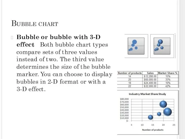
Bubble chart
Bubble or bubble with 3-D effect Both bubble chart types compare sets
Слайд 43Radar chart
Radar charts compare the aggregate values of several data series. Radar
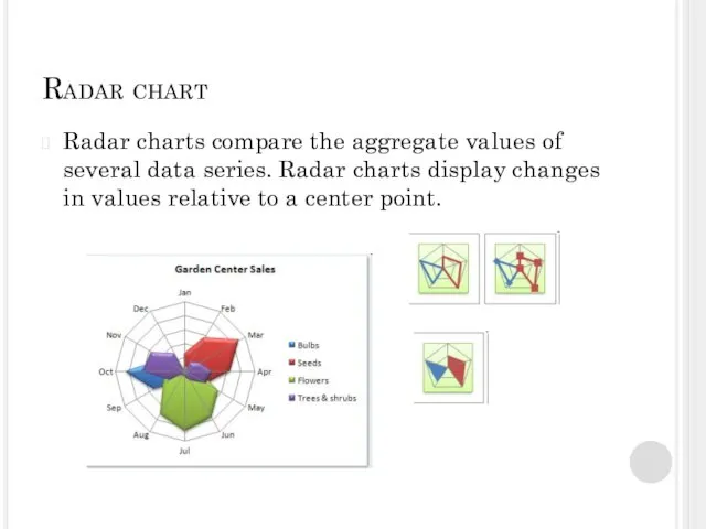
Radar chart
Radar charts compare the aggregate values of several data series. Radar
Слайд 44SPSS has the same graphical visualization types plus a boxplot option.
A boxplot
SPSS has the same graphical visualization types plus a boxplot option.
A boxplot
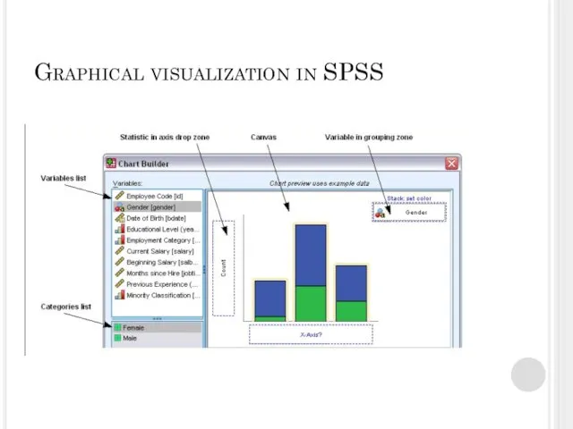
Слайд 45Graphical visualization in SPSS
Graphical visualization in SPSS
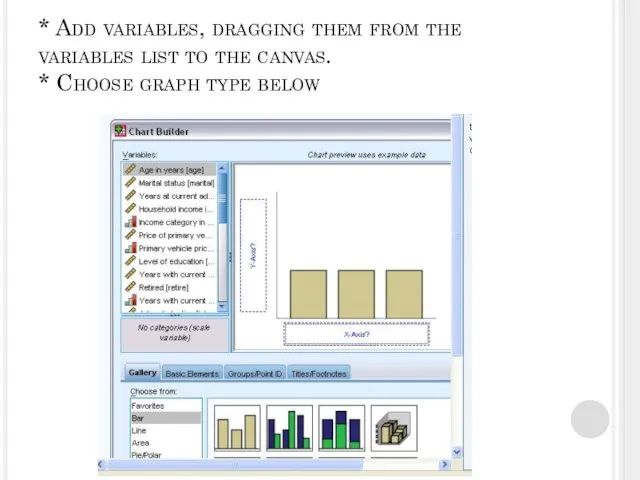
Слайд 46* Add variables, dragging them from the variables list to the canvas.
* Add variables, dragging them from the variables list to the canvas.
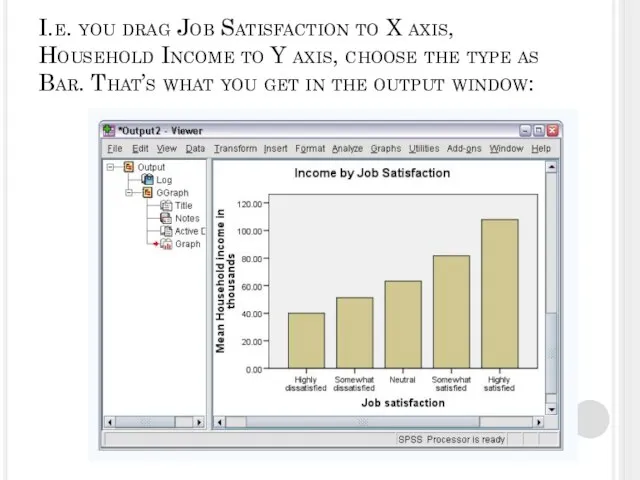
Слайд 47I.e. you drag Job Satisfaction to X axis, Household Income to Y
I.e. you drag Job Satisfaction to X axis, Household Income to Y
 Фекальные установки compli
 Конституция РФ
 «Мгновение слишком яркого света»(Раннее творчество А.А. Блока)
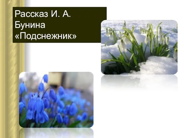 Рассказ И.А. Бунина «Подснежник»
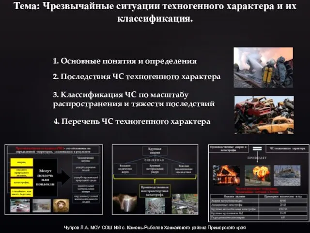 Презентация на тему Чрезвычайные ситуации техногенного характера
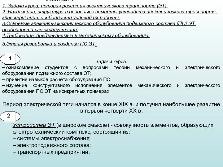 Л1 мех.оборуд
 Презентация на тему Политическая жизнь современной России
  Ворота зимы. Изменения в неживой природе
 Основа роста в бизнесе. Рабочая тетрадь. Шаблон
 Притчи
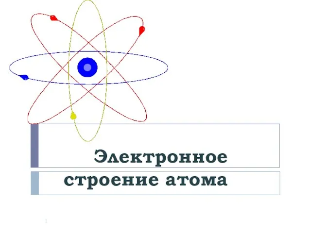 Электронное строение атома
 Детство, опаленное войной
 Необычайные приключения семиклассника Вовочки.
 Из истории крылатых выражений. Шаблон
 Письменная литература Древней Руси. О древнерусском летописании. "Повесть временных лет"
 Методический час по использованию нетрадиционных форм работы
 Управление проектом по временным параметрам
 Гигиена при занятиях физической культуры
 Африка 7 класс
 Презентация на тему Округление чисел
  Берегись автомобиля!
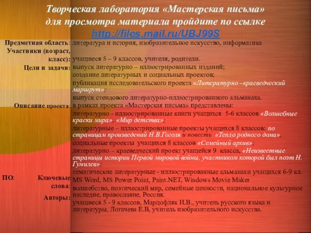 Творческая лаборатория «Мастерская письма»для просмотра материала пройдите по ссылке http://files.mail.ru/UBJ99S
 Свой сайт в интернете.
 Администрирование информационных систем
 Предварительные итоги 3-го каталога. Орифлэйм
 Презентация на тему Лихтенштейн
  Основные категории специальной психологии и коррекционной педагогики. Их краткая характеристика
 Блефариты коньюнктивиты увеиты