- Data PowerPoint

Содержание
- 2. Use this presentation as a guide/inspiration for your own PowerPoints. Format the presentation using your brand’s
- 3. Sharpen your skills With HubSpot Academy Take free courses on Inbound Marketing, Sales, and Customer Service
- 4. Presentation Best Practices Use this presentation as a guide/inspiration for your own PowerPoints. Format the presentation
- 5. Presenter: Chris Pierce
- 6. Introductions Q1 Recap Q2 Goals Q3 Projections Agenda
- 7. Introduce a new section here. What’s this section about? 1
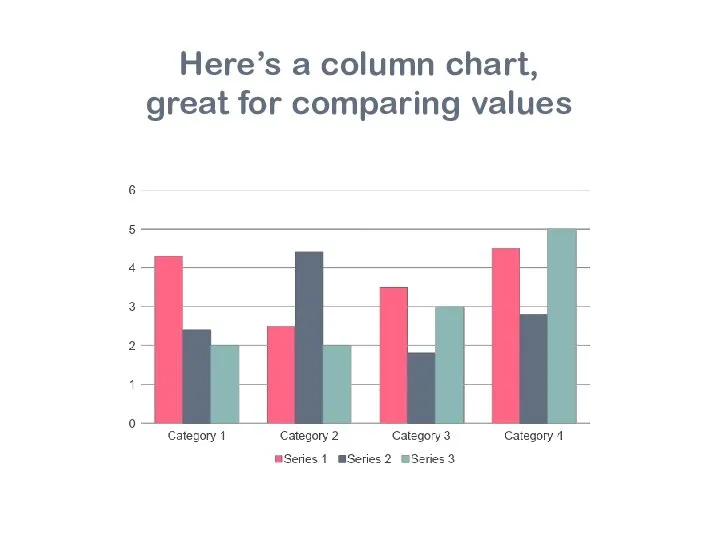
- 8. Here’s a column chart, great for comparing values
- 9. of people think this slide is a great way to display a statistic. 100% Source: Insert
- 10. Introduce a new section here. What’s this section about? 2
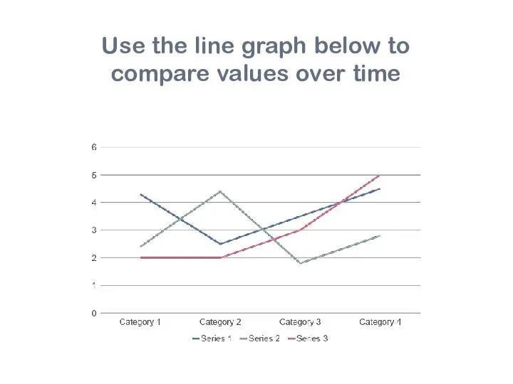
- 11. Use the line graph below to compare values over time
- 12. Source: Insert Here of people think this slide is a great way to display a statistic.
- 13. Introduce a new section here. What’s this section about? 3
- 14. This pie chart is great for displaying percentages
- 15. of people think this slide is a great way to display a statistic. 100%
- 16. QUESTIONS?
- 18. Скачать презентацию
Слайд 3Sharpen your skills
With HubSpot Academy
Take free courses on Inbound Marketing, Sales,
Sharpen your skills
With HubSpot Academy
Take free courses on Inbound Marketing, Sales,

Слайд 4Presentation
Best Practices
Use this presentation as a guide/inspiration for your own PowerPoints.
Presentation
Best Practices
Use this presentation as a guide/inspiration for your own PowerPoints.
Слайд 5Presenter: Chris Pierce
Presenter: Chris Pierce

Слайд 6Introductions
Q1 Recap
Q2 Goals
Q3 Projections
Agenda
Introductions
Q1 Recap
Q2 Goals
Q3 Projections
Agenda

Слайд 7Introduce a new section here.
What’s this section about?
1
Introduce a new section here.
What’s this section about?
1

Слайд 8Here’s a column chart,
great for comparing values
Here’s a column chart,
great for comparing values
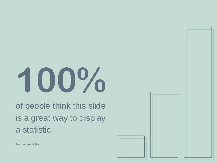
Слайд 9of people think this slide
is a great way to display
a statistic.
100%
Source: Insert
of people think this slide
is a great way to display
a statistic.
100%
Source: Insert

Слайд 10Introduce a new section here.
What’s this section about?
2
Introduce a new section here.
What’s this section about?
2

Слайд 11Use the line graph below to
compare values over time
Use the line graph below to
compare values over time
Слайд 12Source: Insert Here
of people think this slide
is a great way to display
a
Source: Insert Here
of people think this slide
is a great way to display
a
Слайд 13Introduce a new section here.
What’s this section about?
3
Introduce a new section here.
What’s this section about?
3

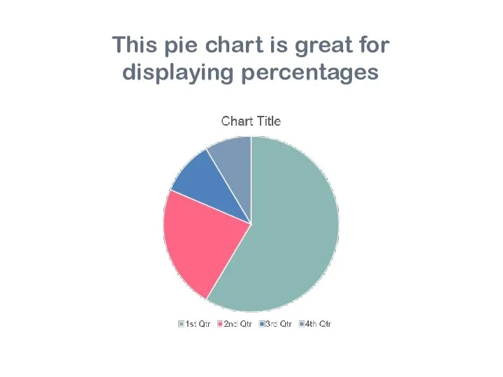
Слайд 14This pie chart is great for
displaying percentages
This pie chart is great for
displaying percentages
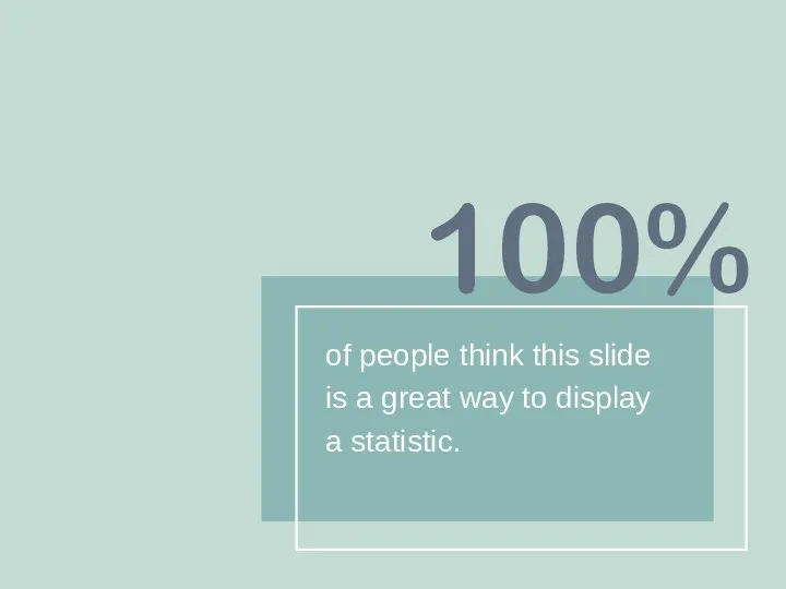
Слайд 15of people think this slide
is a great way to display
a statistic.
100%
of people think this slide
is a great way to display
a statistic.
100%
Слайд 16QUESTIONS?
QUESTIONS?

 Моноблоки (9 класс)
 Data Quality DWBI Test Plan and Test Strategy
 Windows PowerShell
 Компьютерная игра Boss
 Система поддержки принятия решений. Электромеханика
 Как защитить информацию
 Сравнение методов сжатия видео
 Программа Adobe Photoshop
 Передача информации
 Работа в программе Audacity
 Решение проблемы совместимости программного модуля обмена сообщениями
 Системы анализа больших данных (САБД)
 Классификация мемов
 Примеры использования внешних устройств. Программное обеспечение внешних устройств
 Понятие и система средств массовой коммуникации
 Массивы. Основные понятия
 Организация дистанционного обучения на платформе Zoom в объединении Робототехника
 Рейтинг электронных платежных систем
 Строки и записи. Программирование на языке Pascal. Лекция №10
 Безопасный интернет
 Приложение для сортировки аудиофайлов
 Секреты социальных сетей
 Этапы создания сайта. Основы html
 Определение машины Тьюринга
 HTML УРОК №4
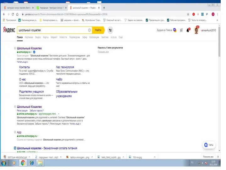 Школьный кошелек для родителей
 Встроенные функции Excel
 7 волн социального анализа